#Brat Style
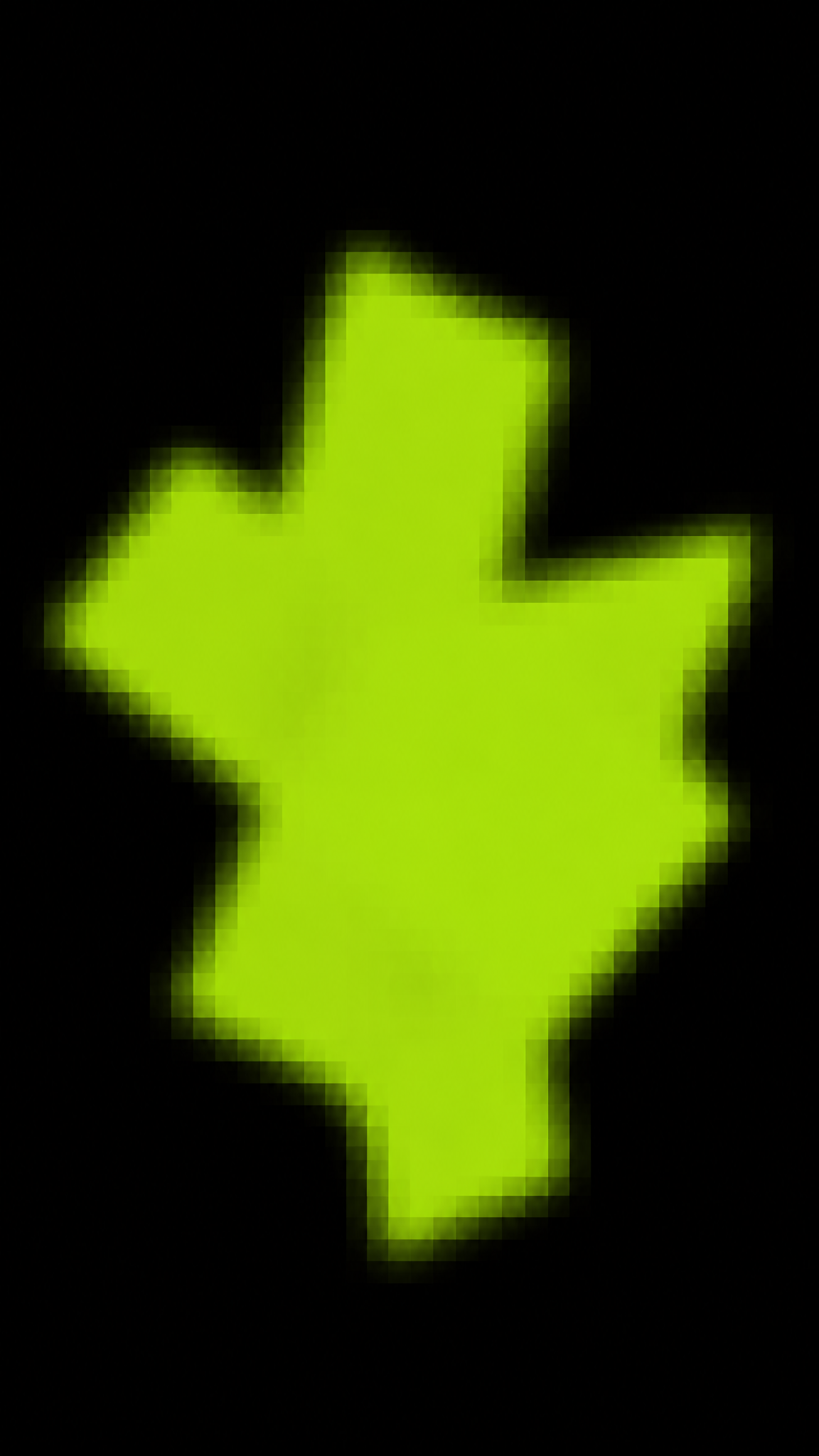
Brat Style wallpapers distill the 2024 Brat visual wave into loud yellow-green color, flat type, low-fidelity bluntness, and an anti-polished mood that feels internet-native, confrontational, and deliberately under-designed.
Acerca del arte de Brat Style
The verified sources support a tightly constrained framing: brat-style is not a long art movement but a 2024 internet-native visual trend anchored in Charli XCX's Brat album cycle. Teen Vogue confirms the plain yellow-green cover and anti-aesthetic framing, while the album reference page documents the artwork-and-marketing and impact sections. For formal JSON, this style should be treated as a recent branding-driven aesthetic, not a timeless design school.
Rasgos visuales
- Acid yellow-green or brat-green dominant field
- Blunt sans-serif type with low-fidelity edge
- Minimal layout that feels rude or intentionally unfinished
- A mood of anti-polish, anti-clean-girl, and online trend energy
Casos de uso
Phone wallpapers with one loud color field
Social-first poster backgrounds
Trend-led cover art experiments
Youth-culture or pop-campaign mood boards
Estilos similares
Diferente de
Guía de prompt
Indicaciones para el prompt
- Lead with brat style and one color command, then define whether the wallpaper is text-led or object-led
- Use words like flat acid green, anti-aesthetic, blunt type, low-fidelity branding, internet trend
- Keep the composition sparse but aggressive rather than elegant
- If it becomes generic neon or Y2K, remove chrome and keep the graphic surface flatter
Consejos
- Internal editorial suggestion: Brat Style wallpapers work best when one visual system stays dominant instead of splitting attention across too many motifs.
- Internal editorial suggestion: specify crop intent early because phone wallpapers usually need one stronger vertical anchor than desktop versions.
- Internal editorial suggestion: cross-link this style with acid-graphics only when the user intent clearly overlaps.
- Internal editorial suggestion: keep factual claims inside the verified evidence boundary and treat prompt advice as editorial guidance only.
Palabras clave recomendadas
Evitar
Errores comunes
- The image becomes generic neon design instead of brat-specific bluntness
- Too many elements kill the album-cover simplicity
- The color loses its harsh impact and becomes ordinary lime green