#Kawaii
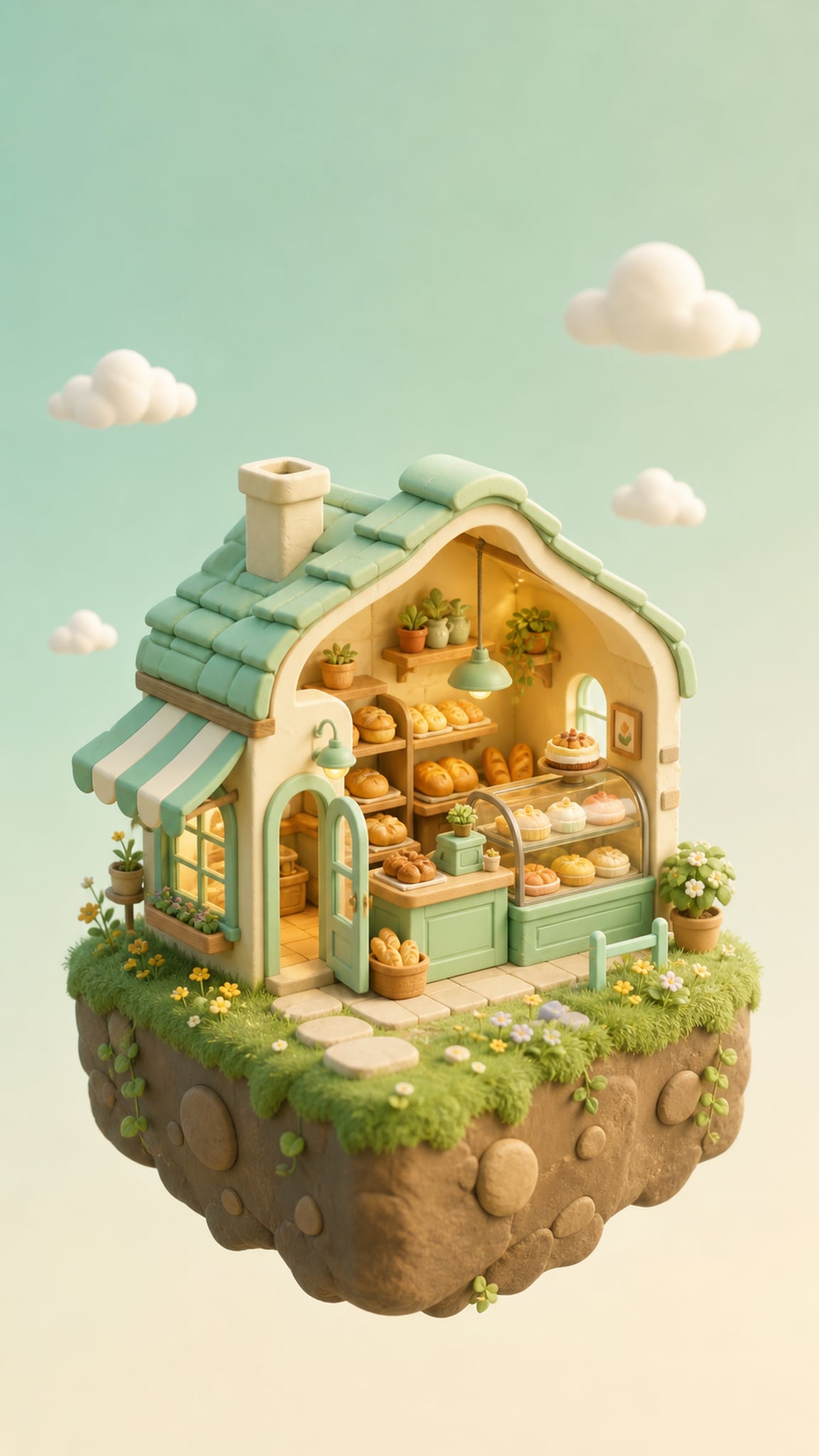
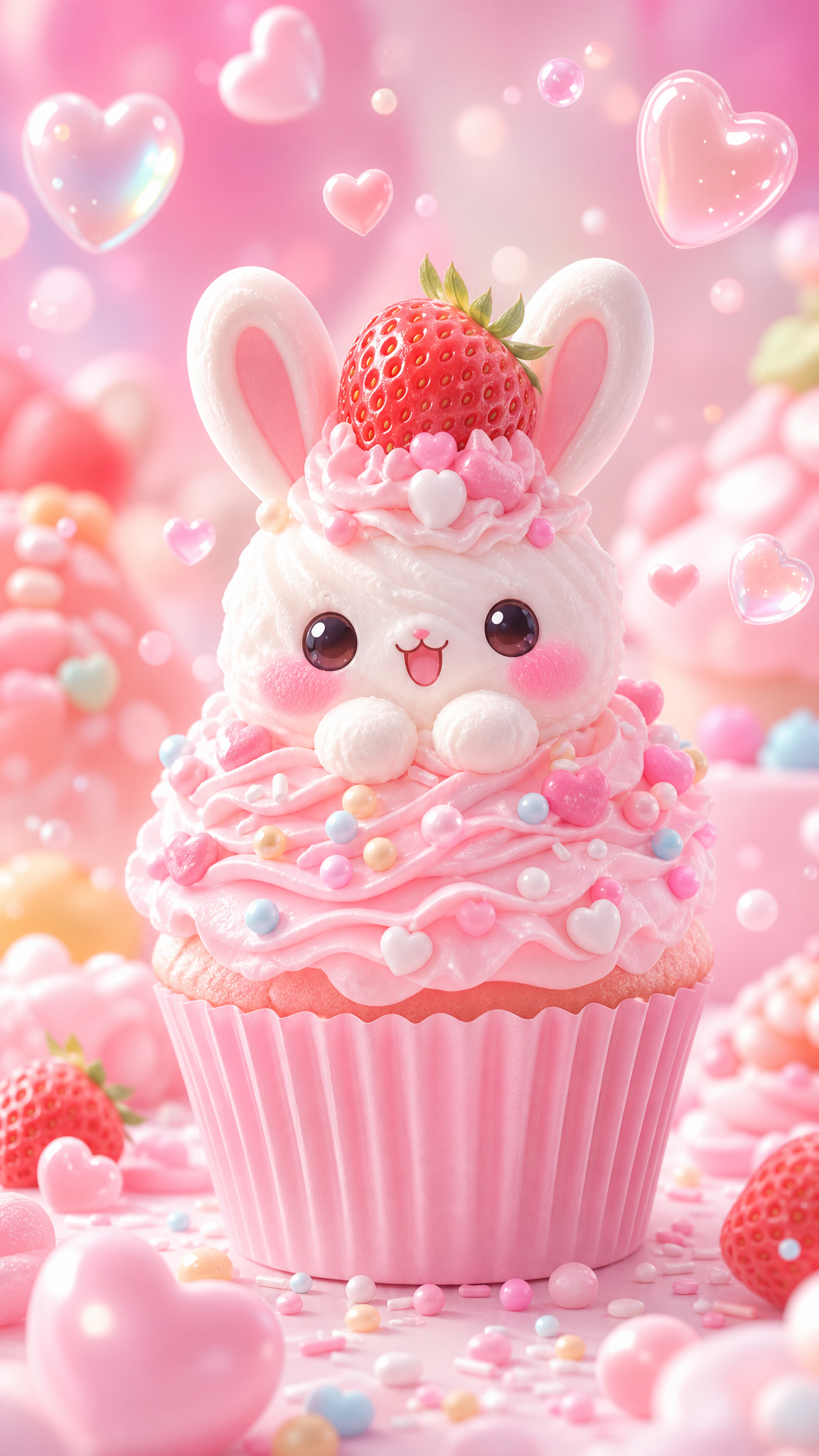
Kawaii wallpapers turn cuteness into a full visual system: rounded shapes, pastel palettes, oversized eyes, simplified faces, and a mood of softness, innocence, and approachability. What makes kawaii durable is that it is not just a color trend. It is a Japanese cultural language with historical roots, commercial power, and emotional function, which is why it can work equally well as character art, decorative pattern, mascot design, and gentle mood wallpaper.
Kawaiiアートについて
The verified evidence supports treating kawaii as both a visual style and a cultural system. Britannica's kawaii entry traces its long background from earlier notions of tenderness and smallness through 1960s student culture, 1970s cute handwriting, and the rise of character merchandising with Hello Kitty in 1974. Japan House LA expands the concept beyond surface sweetness by connecting kawaii to vulnerability, care, community, and psychological response, while its exhibition page confirms kawaii's development into an art and cultural subject in its own right. The Conversation adds a critical social reading of how kawaii functions in youth culture and global reception, and Nippon.com's Hello Kitty history anchors the simplified design logic that made kawaii globally portable.
ビジュアルの特徴
- Rounded forms and softened geometry
- Pastel or candy-bright palettes with low visual aggression
- Oversized eyes or simplified facial features
- Tiny mouths, blush marks, sparkles, bows, and accessory icons
- Anthropomorphized animals, food, objects, or everyday motifs
- Clear silhouettes and low-detail readability
- Friendly repetition in stickers, icons, or pattern fields
- A mood of innocence, comfort, playfulness, or gentle absurdity
活用例
Phone wallpapers built around mascots, creatures, or small pattern loops
Desktop backgrounds that stay cheerful without overwhelming the screen
Stationery-style wallpaper packs with icons, sweets, toys, or Sanrio-adjacent moods
Social profile visuals and lock screens aimed at softness and friendliness
Cute-but-clean brand moods for youth-oriented or comfort-led themes
類似スタイル
異なる点
プロンプトガイド
プロンプトの方向性
- Name the style directly with a subject, such as 'kawaii wallpaper, pastel mascot pattern' or 'kawaii character room scene'
- Use rounded-shape language: soft curves, chubby forms, tiny features, blush, sparkles, bows, stickers
- Choose a focused palette like pastel pink, sky blue, butter yellow, mint, lavender, or cream
- Keep the composition readable and uncluttered so the cuteness comes from shape language, not chaos
- If the output feels too generic, add cultural anchors such as Hello Kitty-like simplicity, Harajuku pop color, or anthropomorphic everyday objects
ヒント
- Internal editorial suggestion: kawaii reads strongest when one silhouette family is repeated consistently.
- Internal editorial suggestion: facial features should usually be simpler than users first expect.
- Internal editorial suggestion: cross-link with `chibi`, `cartoon`, and `anime` helps users separate cute proportion from broader kawaii culture.
- Internal editorial suggestion: pastel backgrounds with one stronger accent color usually crop better than rainbow-heavy mixes.
おすすめキーワード
避けること
よくある失敗
- The image becomes random pink clutter with no clear silhouette hierarchy
- Characters are detailed like anime portraits instead of staying iconically simple
- The composition is too busy for wallpaper and loses the intended softness
- The result feels infantile in a sloppy way rather than deliberately cute and clean