#Noir
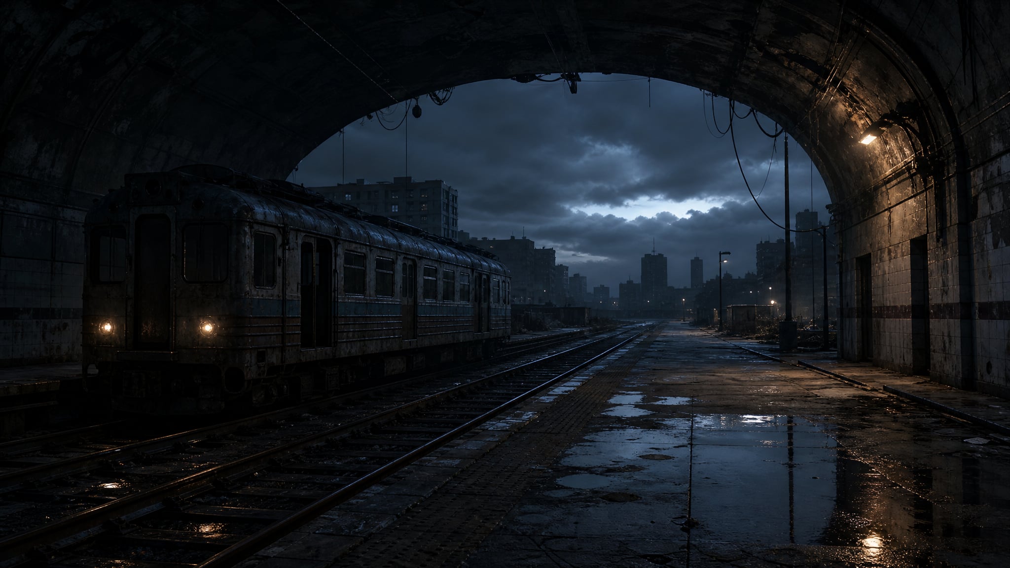
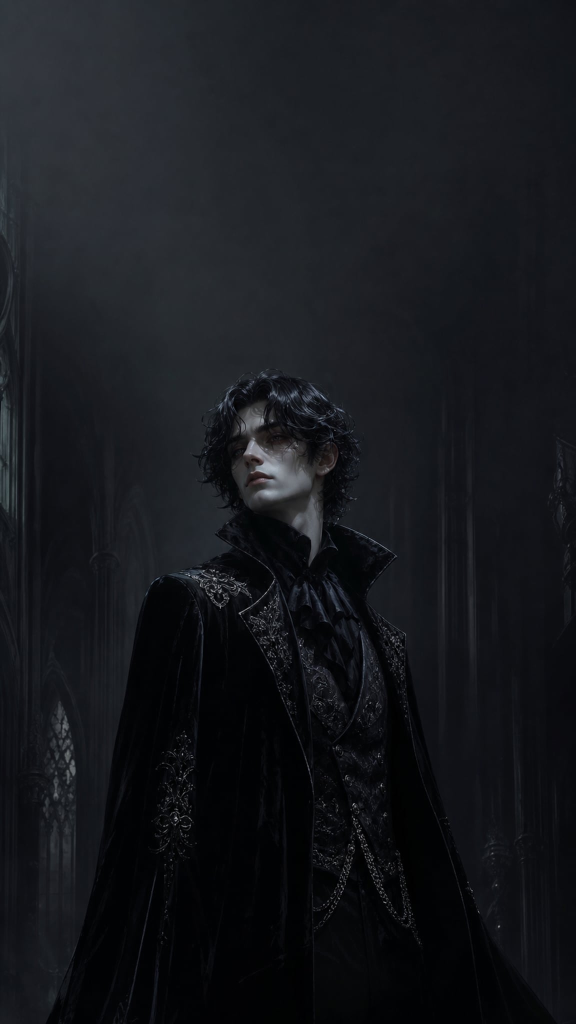
Noir is a visual style rooted in high-contrast lighting, deep shadows, and moody atmospheres drawn from the film noir tradition. As wallpaper art, it translates the chiaroscuro drama of 1940s-1950s cinema into stark digital compositions dominated by black, grey, and selective light accents. Noir wallpapers favor urban nightscapes, silhouetted figures, rain-soaked surfaces, and dramatic angular shadows. The style works across screen sizes because its core language is tonal contrast rather than fine detail.
Noirアートについて
The noir visual style originates from film noir, a category of American thriller and detective films from the 1940s and 1950s. The term itself was coined by French critics after World War II — first applied to Hollywood films by critic Nino Frank in 1946 — to describe these dark, cynical Hollywood productions. The visual language of film noir has roots in German Expressionist cinematography, as directors who had worked in Germany, such as Fritz Lang, Jacques Tourneur, Robert Siodmak, and Michael Curtiz, brought a dramatically shadowed lighting style and a psychologically expressive approach to visual composition to Hollywood. Classic noir cinematography featured low-key lighting, stark light/dark contrasts and dramatic shadow patterning known as chiaroscuro, rain-soaked streets, and unbalanced compositions. The Maltese Falcon (1941) is widely regarded as the first major film noir of the classic era, and Touch of Evil (1958) is frequently cited as the last. Films made outside the classic era that evoke the classics are typically called neo-noir, and the cynical, stylized perspective of classic film noir had a formative effect on the cyberpunk genre of science fiction that emerged in the early 1980s.
ビジュアルの特徴
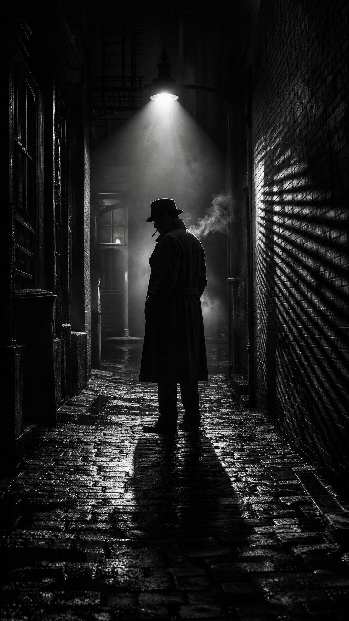
- High-contrast chiaroscuro lighting with deep blacks and selective bright highlights
- Low-key lighting that leaves large areas of the composition in shadow
- Strong diagonal and angular shadow patterns cast by venetian blinds, railings, or architecture
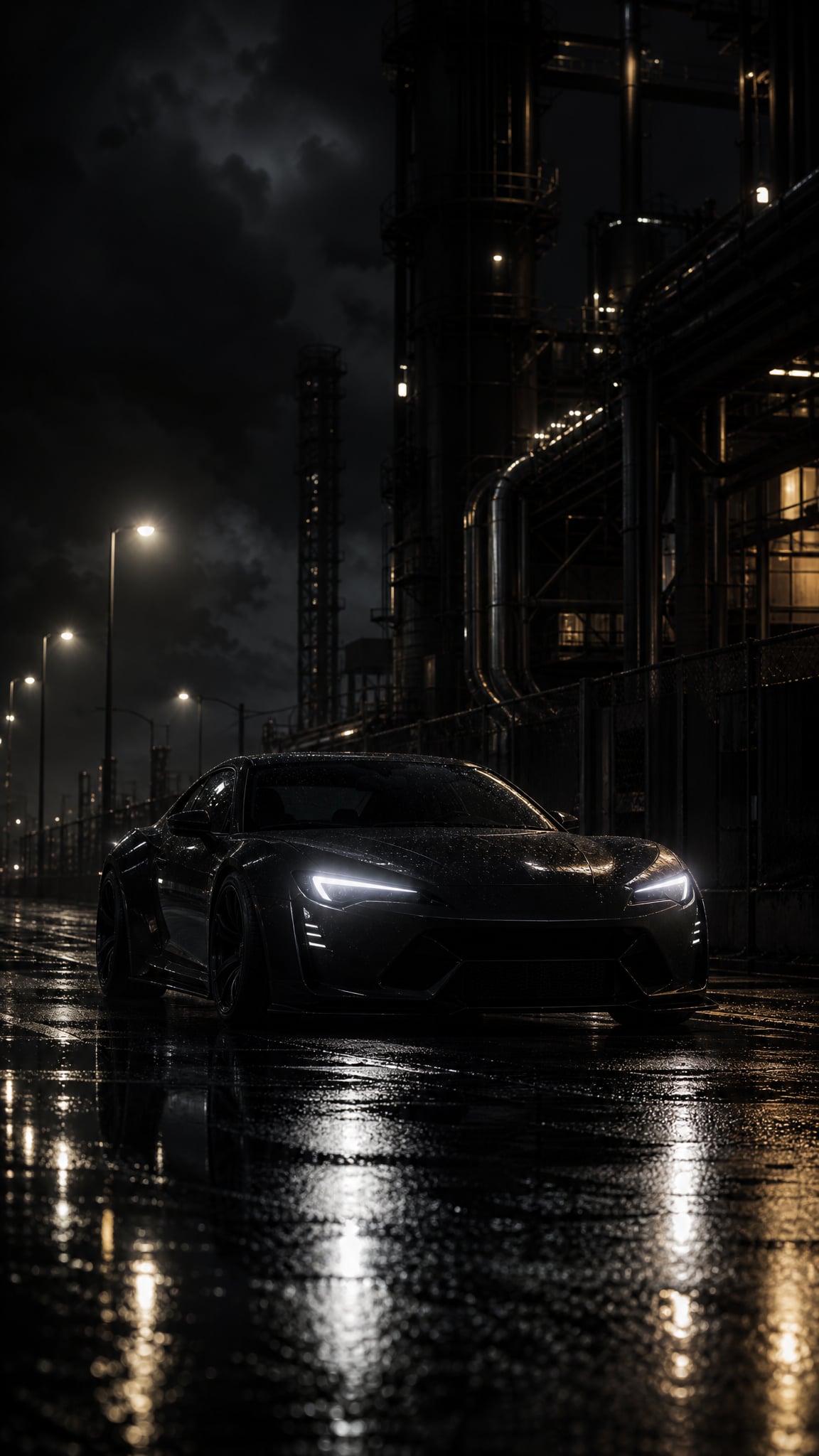
- Rain-slicked streets and reflective wet surfaces amplifying light sources
- Urban nightscapes with neon signs, street lamps, and isolated pools of light
- Silhouetted figures or partially obscured subjects creating mystery
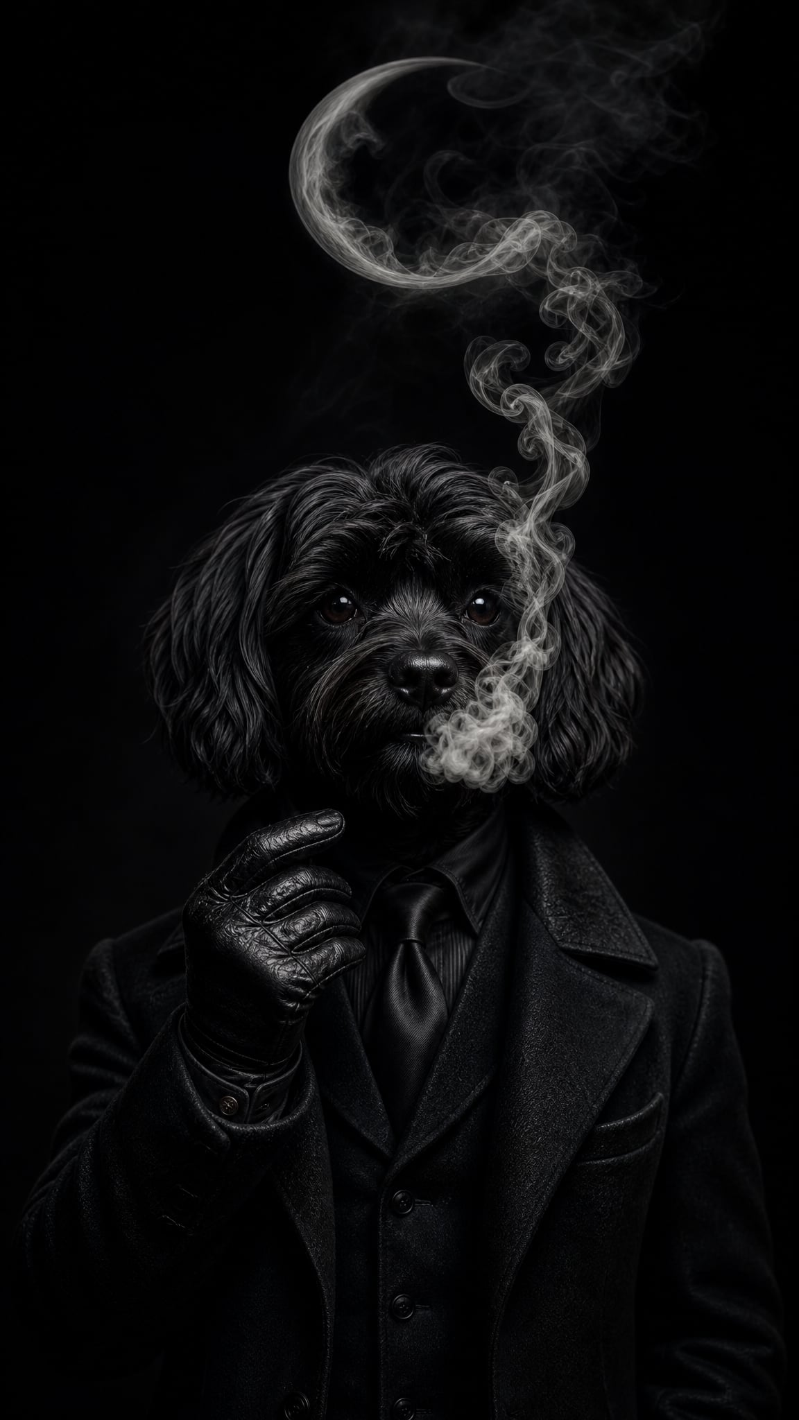
- Predominantly monochrome or desaturated palette with occasional warm accent (amber, red)
- Atmospheric haze, fog, or cigarette smoke diffusing light sources
- Asymmetrical or tilted compositions suggesting unease and tension
- Hard-edged shadows with minimal midtone gradation
- Narrative tension implied through visual framing rather than explicit action
活用例
Desktop wallpapers for professional or creative setups where a moody, cinematic backdrop suits the workflow
Phone lock screens featuring silhouette compositions or single-source light scenes that read well at small scale
Ultrawide monitor displays where a rain-soaked cityscape or shadow-band pattern can extend across the full width
Dual-monitor setups using panoramic noir cityscapes or corridor perspective shots
OLED screens where true-black areas leverage the display technology for striking contrast
Dark-mode desktop environments where the wallpaper complements a dark UI theme
類似スタイル
異なる点
プロンプトガイド
プロンプトの方向性
- Establish the lighting model first: 'noir chiaroscuro lighting,' 'single hard light source,' or 'low-key dramatic shadow'
- Specify the environment: 'rain-soaked city street at night,' 'dimly lit detective office,' 'foggy alleyway with one street lamp'
- Control the palette explicitly: 'monochrome,' 'black and white with warm amber accent,' or 'desaturated with isolated red neon'
- Request compositional drama: 'venetian blind shadow stripes,' 'silhouette against backlight,' 'tilted angle with deep perspective'
- Add atmospheric texture: 'cigarette smoke haze,' 'wet reflections on asphalt,' 'fog diffusing distant lights'
- For wallpaper usability, request negative space or shadow-heavy areas where desktop icons can sit without competing with detail
ヒント
- Internal editorial suggestion: The strongest noir wallpapers usually have one dominant light source and let everything else fall into shadow. Multiple competing light sources weaken the drama.
- Internal editorial suggestion: Wet surfaces are a reliable noir amplifier because they create reflections that double the light-dark interplay without adding new elements.
- Internal editorial suggestion: For desktop usability, the large shadow areas in noir compositions naturally serve as icon-safe zones, making noir one of the more practical dark wallpaper styles.
- Internal editorial suggestion: If the AI output looks like generic dark photography, adding 'film grain' and 'hard shadow edges' in the prompt often pushes it closer to authentic noir.
おすすめキーワード
避けること
よくある失敗
- Too dark overall with no readable highlights — noir needs strategic bright areas to create contrast, not uniform blackness
- Drifting into generic dark art — explicitly request noir-specific elements like shadow stripes, wet streets, and single-source lighting
- Over-saturated neon turning the result into cyberpunk — keep neon minimal and desaturated, or specify 'restrained warm accent only'
- Losing compositional tension by centering everything symmetrically — request asymmetrical framing or diagonal shadow lines
- AI generating faces in full detail when silhouettes were intended — explicitly prompt 'silhouette,' 'backlit figure,' or 'face in shadow'