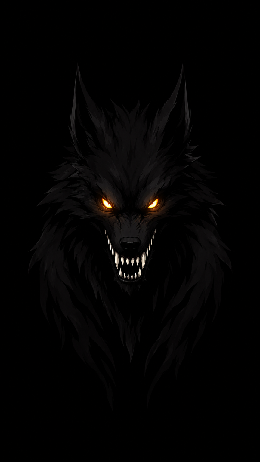
#Oil Painting
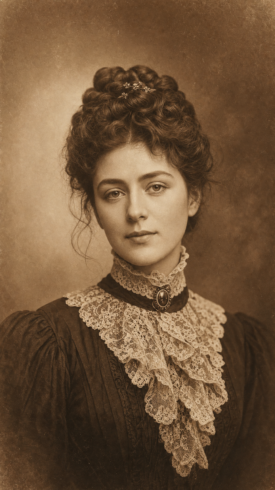
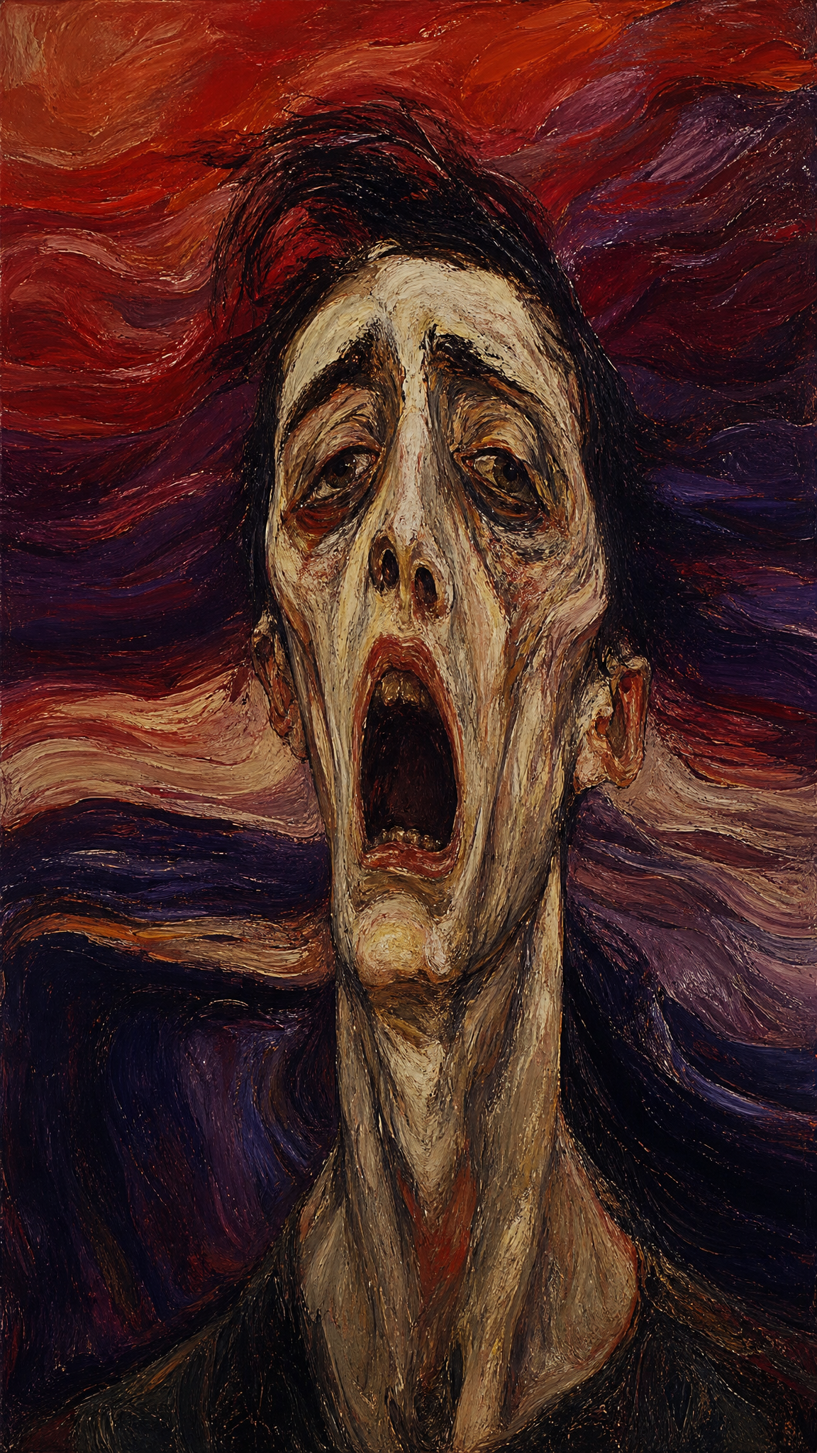
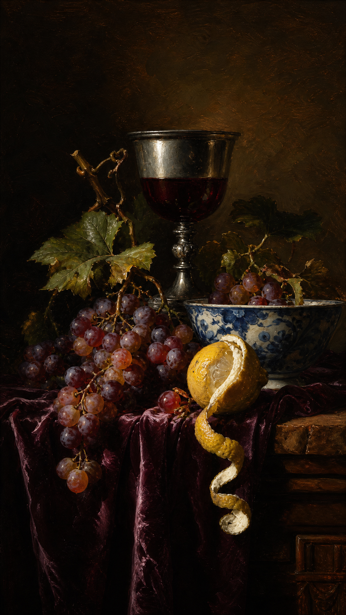
Oil painting wallpapers borrow the visual depth of one of the most influential media in Western painting: rich pigment, visible brushwork, glazing, impasto, and a sense that color has been built slowly rather than laid down instantly. As a wallpaper style, oil painting is less about one movement than about material richness, painterly authority, and the visual memory of museum painting traditions.
Oil Paintingアートについて
Oil painting is a medium made from pigments suspended in drying oils and is distinctive for the range it allows: opaque, transparent, and translucent passages, subtle tone fusion, crisp linear treatment, and dramatic textural variation. Britannica highlights those medium properties directly. Art UK's Renaissance overview, meanwhile, explicitly identifies the use of oil paint as an innovative aspect of Northern Renaissance art and notes how artists such as Jan van Eyck used it to achieve intense detail and color. Together, those sources support a wallpaper treatment that emphasizes glaze, impasto, visible brush marks, and museum-painting depth rather than flat digital finish.
ビジュアルの特徴
- Visible brushwork ranging from smooth blending to thick impasto
- Color depth created through layered-looking surface treatment
- A sense of pigment body rather than flat digital fill
- Rich tonal transitions and luminous highlights
- Canvas-like or panel-like painted material presence
- Classical portrait, still life, landscape, or atmospheric study associations
- Surface texture that suggests hand-built paint application
- Museum-painting seriousness and historical continuity
- Warm shadow structure and complex mixed color
- A stronger sense of substance than watercolor or ink-led styles
活用例
Art-history-driven desktop wallpapers with painterly depth
Portrait or landscape wallpapers meant to feel museum-like rather than digital
Creative studio environments that want cultural and material richness
Classical or premium-themed device backgrounds with visual gravitas
Wallpaper sets organized by brush texture, impasto, or glaze-led mood
類似スタイル
異なる点
プロンプトガイド
プロンプトの方向性
- Name the medium effect directly: 'oil painting wallpaper' or 'museum oil-on-canvas feel'
- Choose whether you want glazing smoothness, visible brushwork, or thick impasto as the dominant surface behavior
- Specify a subject that suits painterly depth: portrait, still life, dramatic sky, flower study, or classical landscape
- Use material cues such as canvas texture, layered pigment, rich oil color, or hand-painted surface
- If the image looks too digital, increase pigment body, brush marks, and tonal blending instead of adding filters
ヒント
- Internal editorial suggestion: Oil-painting intent should usually specify surface behavior first and subject second.
- Internal editorial suggestion: Portrait, floral, and landscape variants each need different brush density to remain wallpaper-safe.
- Internal editorial suggestion: Cross-link with `impressionism`, `expressionism`, and `watercolor` helps users separate movement from medium.
- Internal editorial suggestion: For desktop use, keep the heaviest impasto away from dense icon zones.
おすすめキーワード
避けること
よくある失敗
- Adding generic 'painting' texture without believable oil depth
- Making the result too blurry and losing the brush-built surface
- Using uniformly thick strokes everywhere with no tonal control
- Letting the image look like a filter on a photo rather than an oil-made image