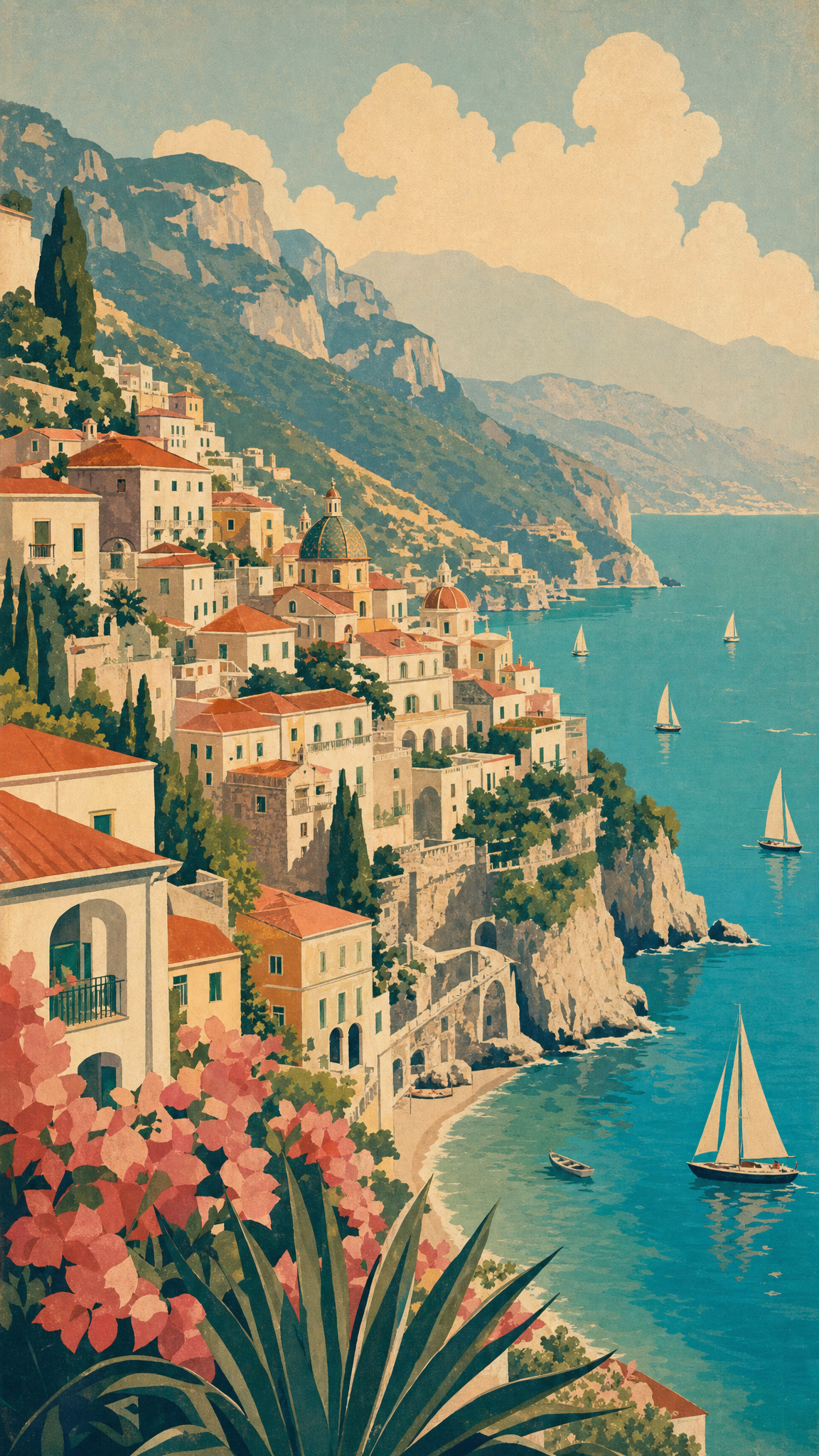

#Retro Vintage
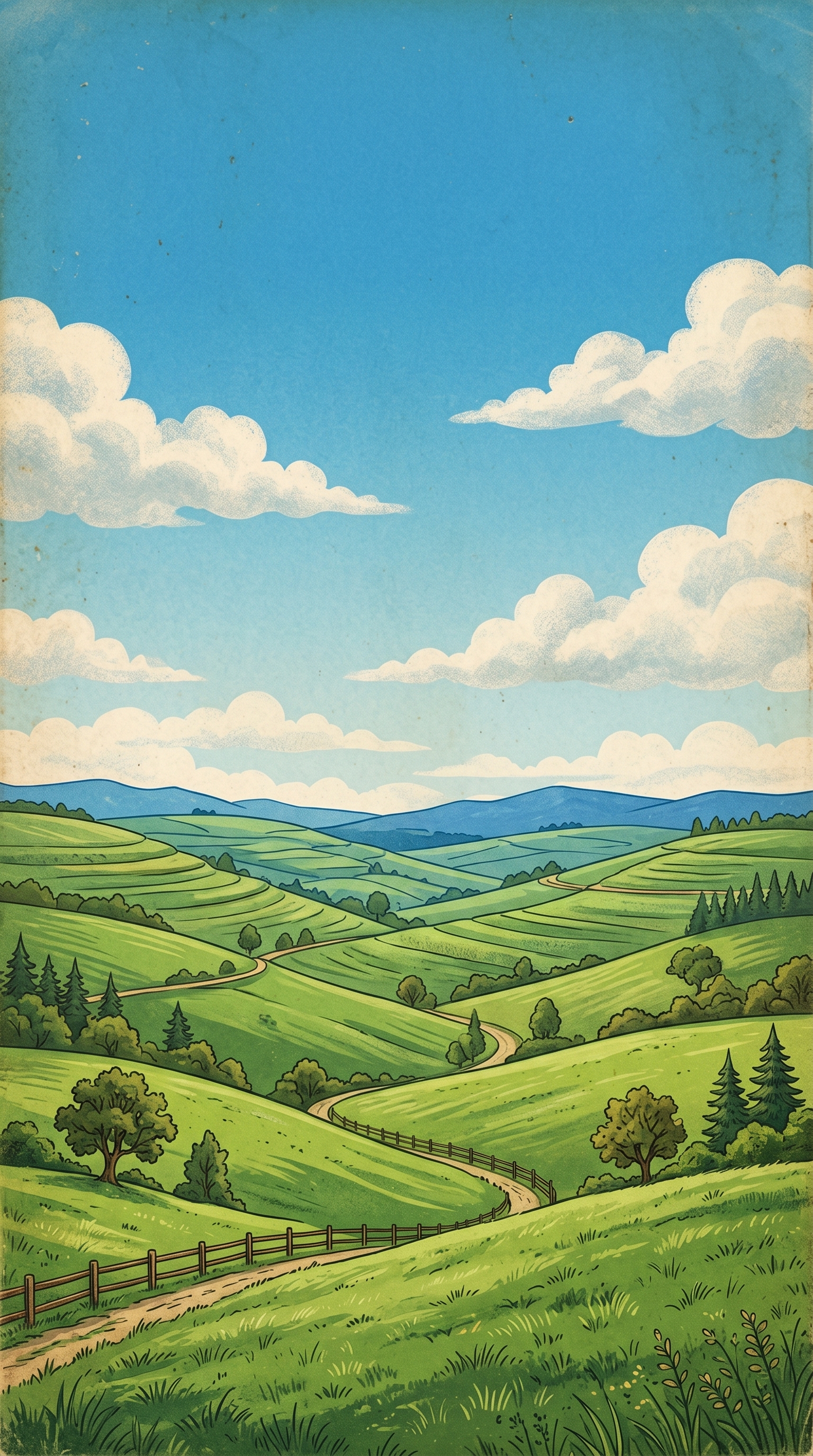
Retro-vintage wallpapers mine the visual memory of earlier decades: print textures, old poster palettes, aged type, nostalgic color systems, and graphic cues that make the present look deliberately borrowed from the past. The style is broad on purpose. It does not point to a single historical movement, but to the selective reuse of older visual languages, which is why it can range from 1950s signage and 1970s earth tones to 1980s neon and 1990s pixel accents.
Retro Vintageアートについて
The verified sources support framing retro-vintage as an umbrella design mode built from nostalgia plus selective period borrowing. Envato Tuts+'s vintage design guide explicitly treats vintage through nostalgia, perceived age, and recognizable historical style cues, while its decade survey gives usable distinctions across the 20th and 21st centuries. Smashing Magazine adds concrete examples from travel posters, transit manuals, NASA graphics, and Swiss modern references, showing how specific historical artifacts are reused as inspiration rather than copied wholesale. Cooper Hewitt's object-poster discussion anchors this reuse in museum-backed design history, and Canva's typography survey reinforces the role of printing irregularities, hand-made letterforms, and aged graphic texture in how retro-vintage is recognized today.
ビジュアルの特徴
- Era-specific palettes such as faded cream, mustard, rust, avocado, dusty teal, neon magenta, or warm sepia
- Aged textures, grain, print wear, halftone, or paper imperfection
- Period typography including sign-painter scripts, groovy serif forms, slab type, or pixel fonts
- Poster-like composition and bold graphic hierarchy
- Selective use of old-school illustrations, badges, labels, or packaging cues
- Intentional nostalgia through color, layout, and material finish
- Less realism and more stylized period reference
- A mix of historical borrowing and contemporary cleanup
活用例
Desktop wallpapers based on poster, signage, or travel-print moods
Phone wallpapers with aged type, badges, or simple retro icons
Brand-style wallpaper packs that need memory, charm, or analog warmth
Music, fashion, and cafe-inspired themes with decade-specific color systems
Graphic wallpaper collections built around print-era nostalgia
類似スタイル
異なる点
プロンプトガイド
プロンプトの方向性
- Name both the style and the decade, such as 'retro-vintage wallpaper, 1970s poster feel' or '1950s travel print mood'
- Choose one historical anchor: signage, transit poster, packaging label, paperback cover, magazine ad, diner menu, old photo print
- Add specific texture language such as grain, faded ink, print wear, halftone, paper edge, or analog imperfection
- Keep the palette period-specific so the image reads like a chosen era rather than a vague old-time blend
- If the result feels costume-like, simplify the number of references and let one decade lead
ヒント
- Internal editorial suggestion: choose one decade and one print medium before adding texture.
- Internal editorial suggestion: retro-vintage reads better when the palette does most of the era signaling.
- Internal editorial suggestion: cross-link with `mid-century-modern`, `y2k`, and `sepia` helps users separate broad nostalgia from narrower period styles.
- Internal editorial suggestion: desktop crops can hold more poster hierarchy, while phone crops should simplify to one badge, type block, or icon cluster.
おすすめキーワード
避けること
よくある失敗
- The wallpaper mixes too many decades and loses any clear identity
- Texture is overdone and looks like fake dirt instead of believable print age
- The image becomes generic sepia without real period design cues
- Typography and color belong to different eras and fight each other