#Pop Art
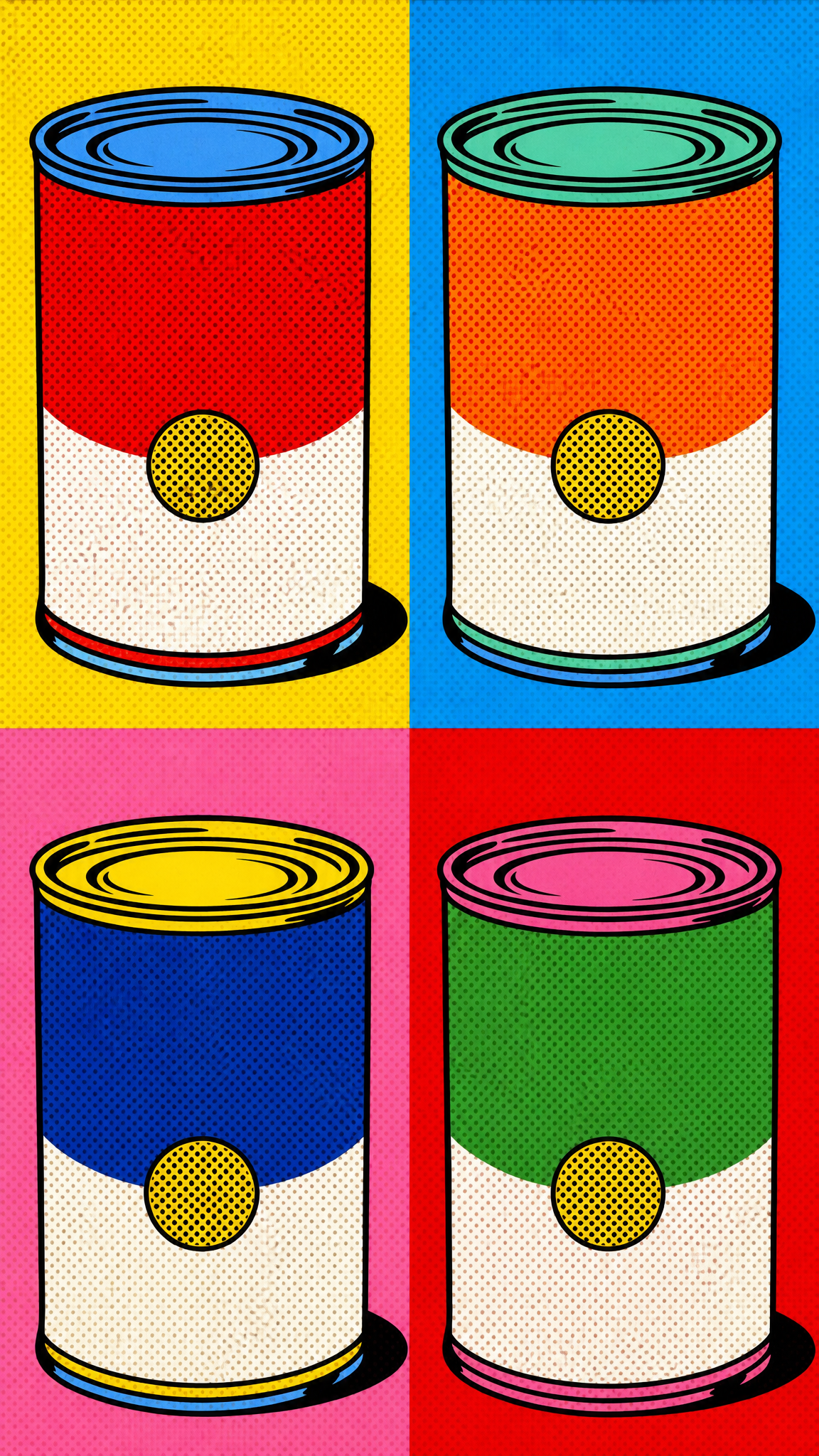
Pop art is a visual art movement that emerged in the mid-to-late 1950s in Britain and America, reaching its peak in the 1960s. The movement deliberately blurred the boundary between 'high' and 'low' culture by incorporating imagery from advertising, comic books, consumer products, and mass media into fine art. Defined by bold flat colors, Ben-Day dots, silkscreen repetition, and appropriated commercial imagery, pop art delivers graphic, high-impact compositions. As a wallpaper style, pop art provides vibrant, eye-catching designs that work across all screen sizes due to their bold simplicity.
Acerca del arte de Pop Art
Pop art emerged in the mid-to-late 1950s in both Britain and the United States. The term's coinage is contested: artist John McHale reportedly coined 'pop art' in 1954; the phrase first appeared in print in 1956 in an article titled 'But Today We Collect Ads' by Alison and Peter Smithson in Ark magazine; and British critic Lawrence Alloway is often credited with popularizing it through his 1958 essay. Eduardo Paolozzi's collage series 'Bunk!' (1947-1949) featured the first appearance of the word 'pop' in an artwork. The British origins trace to the Independent Group, which met at the Institute of Contemporary Art in London from 1952-1955, discussing popular culture including car styling and pulp magazines. Richard Hamilton's 1956 collage 'Just what is it that makes today's homes so different, so appealing?' is a canonical early pop artwork. In a 1957 letter, Hamilton defined pop art as: 'Popular, Transient, Expendable, Low cost, Mass produced, Young, Witty, Sexy, Gimmicky, Glamorous, Big business.' American leaders emerged in the early 1960s: Andy Warhol with 'Campbell's Soup Cans' (1962) and silkscreen portraits of Marilyn Monroe; Roy Lichtenstein with comic-strip paintings like 'Drowning Girl' (1963) and 'Whaam!' (1963); Jasper Johns with flags and targets; and Robert Rauschenberg with 'combines' incorporating everyday objects.
Rasgos visuales
- Bold, flat colors with high saturation and hard edges — no subtle gradients
- Ben-Day dots — Lichtenstein's signature technique mimicking commercial printing halftone patterns
- Silkscreen / screen printing — Warhol's technique for mechanical reproduction of images
- Appropriated commercial imagery — soup cans, Coca-Cola bottles, comic strips, product packaging
- Celebrity portraits — repeated, color-shifted images of cultural icons
- Collage — combining mass-media clippings, photographs, and printed material
- Large scale — works often oversized, mimicking billboard/advertising dimensions
- Irony and parody — deliberate blurring of 'high' and 'low' culture boundaries
- Graphic, flat composition influenced by commercial graphic design rather than fine art traditions
- Repetition and seriality — multiple versions of the same image with color variations (Warhol's Marilyn series)
- Primary and secondary colors — red, yellow, blue, green, orange, often with black outlines
- Speech bubbles and onomatopoeia text (from comic strip influence)
Casos de uso
Any screen size — bold flat graphics and high contrast translate well across all resolutions
Desktop monitors (standard and ultrawide) — repetitive serial compositions (Warhol-style grids) naturally fill wide formats
Phone lock screens — single iconic pop art images (soup can, Lichtenstein-style face) work as strong vertical focal points
Dark and light mode setups — saturated colors pop against both dark and light system themes
Multi-monitor and creative workstations — graphic boldness holds up at any viewing distance
Retro-themed setups — mid-century aesthetic pairs well with vintage or retro computing themes
Estilos similares
Diferente de
Guía de prompt
Indicaciones para el prompt
- Start with a style reference: 'pop art style' or 'Andy Warhol style' or 'Roy Lichtenstein style' for clear direction
- Specify a subject: 'portrait,' 'everyday object,' 'food item,' 'celebrity' — pop art transforms ordinary subjects
- Add technique modifiers: 'Ben-Day dots,' 'flat colors,' 'bold outlines,' 'silkscreen effect'
- Include composition direction: 'four-panel grid' for Warhol-style repetition, or 'single large image' for Lichtenstein-style focus
- Specify color approach: 'primary colors,' 'high contrast,' 'color-shifted variations' for authentic pop art palette
- Always specify aspect ratio: '--ar 16:9' for desktop, '--ar 9:16' for phone
Consejos
- Internal editorial suggestion: 'Warhol style' and 'Lichtenstein style' produce very different results. Warhol = color-shifted portraits/grids. Lichtenstein = single comic-book scenes with Ben-Day dots. Choose one per prompt.
- Internal editorial suggestion: For desktop wallpapers, try 2x2 or 3x3 grid layouts with color-shifted versions of the same image — this creates the Warhol serial effect.
- Internal editorial suggestion: For phone wallpapers, a single Lichtenstein-style portrait or close-up works best — bold, simple, high-impact.
- Internal editorial suggestion: If results look too 'illustration' and not enough 'pop art,' add 'screen print,' 'mechanical reproduction,' 'flat printing' as modifiers.
- Internal editorial suggestion: Pop art's strength as wallpaper is that the bold, flat graphics remain readable at any screen size and don't lose detail when scaled.
Palabras clave recomendadas
Evitar
Errores comunes
- Producing standard illustration instead of pop art's flat, graphic quality — pop art should look printed, not painted
- Using too many colors or gradients — pop art uses limited, flat color palettes with hard edges
- Missing Ben-Day dots or halftone patterns — these are key visual identifiers of the style
- Making the composition too complex — pop art celebrates single subjects boldly, not busy scenes
- Forgetting bold black outlines — the graphic quality depends on strong contour lines