#3D Isometric
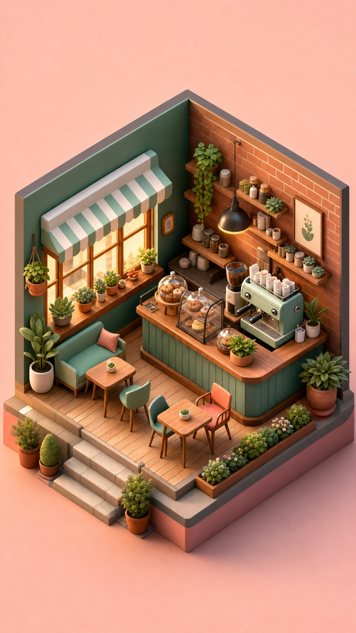
3D isometric wallpapers use an axonometric drawing method to make flat images feel spatial without using perspective convergence. The result is a clean, diagram-like look: parallel lines stay parallel, dimensions remain readable, and scenes feel structured rather than cinematic. As a wallpaper style, 3D isometric sits between technical projection and friendly digital illustration, which is why it works well for city blocks, miniature rooms, product scenes, and tidy geometric worlds.
3D Isometricアートについて
Britannica defines isometric drawing, also called isometric projection, as a method of representing three-dimensional objects used by engineers, technical illustrators, and sometimes architects. Its purpose is to combine the illusion of depth with an undistorted presentation of principal dimensions. Autodesk's AutoCAD documentation explains that a 2D isometric drawing is a flat representation of a 3D isometric projection aligned to three major axes, with standard isoplanes organized around 30-, 90-, and 150-degree relationships. Adobe's isometric-art guide shows how that same projection logic now appears across architectural layouts, icons, infographics, logos, and video game art. Together, those sources support treating 3D isometric as a projection-led visual system that later became a flexible digital-illustration style.
ビジュアルの特徴
- Parallel projection with no vanishing point
- Equal-measure logic across the main axes instead of perspective shrinkage
- A fixed elevated corner view that makes objects feel miniature and diagram-like
- 30-degree slant conventions commonly used for the main horizontal axes
- Clean edges and simplified geometric construction
- Readable top, left, and right planes that separate form clearly
- Modular scene building that works well with grids, tiles, and repeated units
- A balance between flat graphic clarity and three-dimensional depth
活用例
Miniature office or workspace wallpapers
Isometric city blocks, rooms, and product scenes
Geometric tech backgrounds that stay organized behind icons
Game-inspired maps or diorama-like wallpaper sets
Exploded or cutaway object scenes where structure matters
類似スタイル
異なる点
プロンプトガイド
プロンプトの方向性
- Name the projection explicitly: 'isometric illustration' or 'isometric projection'
- Tell the model to avoid perspective convergence and vanishing points
- Ask for clean geometric planes and readable top/side surfaces
- Use scene nouns that suit miniature structure, such as room, city block, desk setup, or product cutaway
- If the result becomes too cinematic, reduce lens language and increase diagram-like clarity
ヒント
- Internal editorial suggestion: lead with projection control before subject matter.
- Internal editorial suggestion: icons and widgets stay readable when the busiest geometry is pushed away from the center.
- Internal editorial suggestion: city, room, and workspace variants are usually stronger than abstract shape piles.
- Internal editorial suggestion: cross-link with `3d-render`, `geometric`, and `pixel-art` helps users separate projection from medium.
おすすめキーワード
避けること
よくある失敗
- Perspective creep causes lines to converge and breaks the isometric read
- Scenes become too empty because the composition has structure but no focal object
- Overly realistic materials make the image feel like a generic 3D render instead of isometric art
- Inconsistent angle handling makes different objects feel as if they belong to different scenes