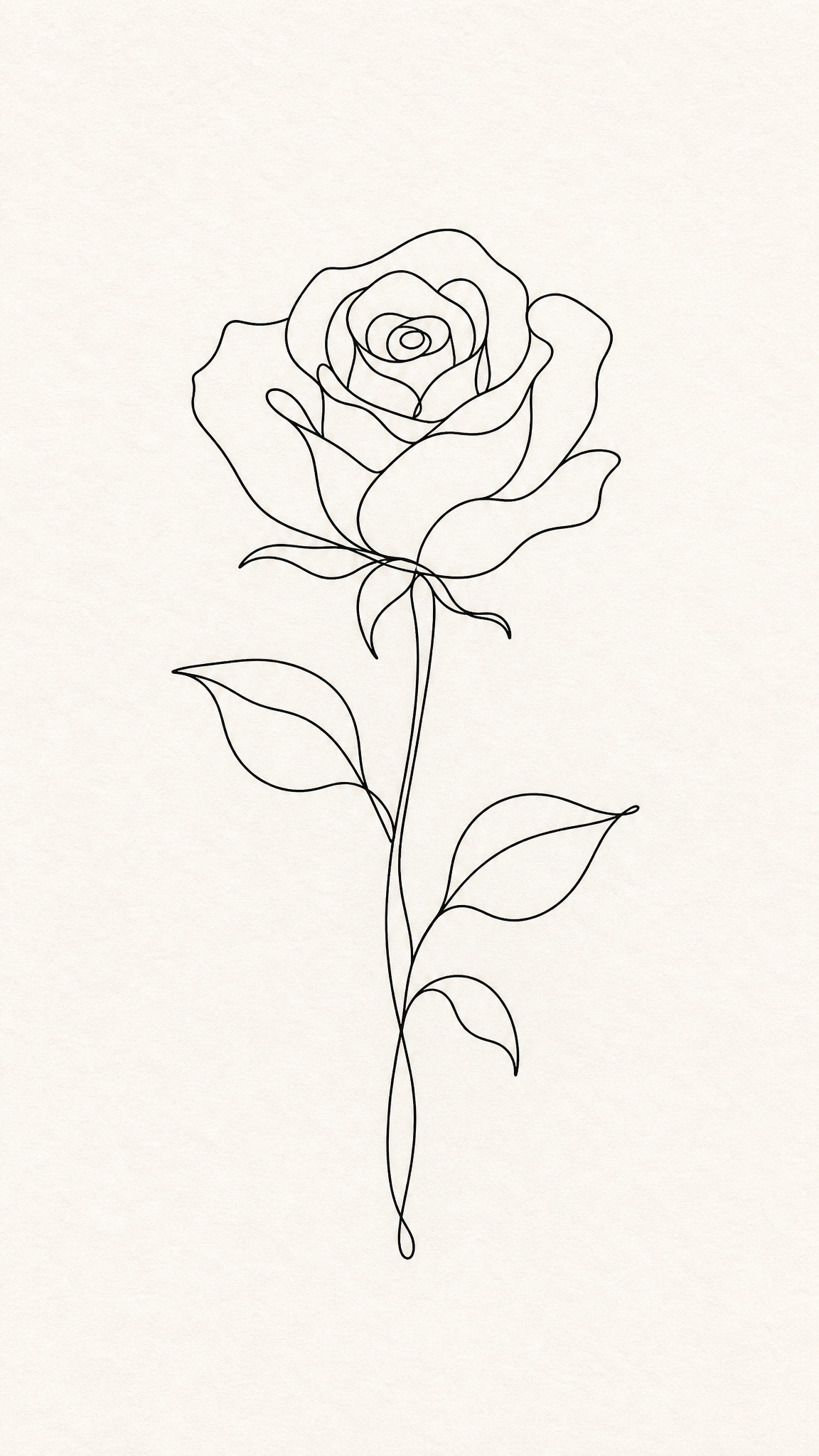
#Hand Drawn
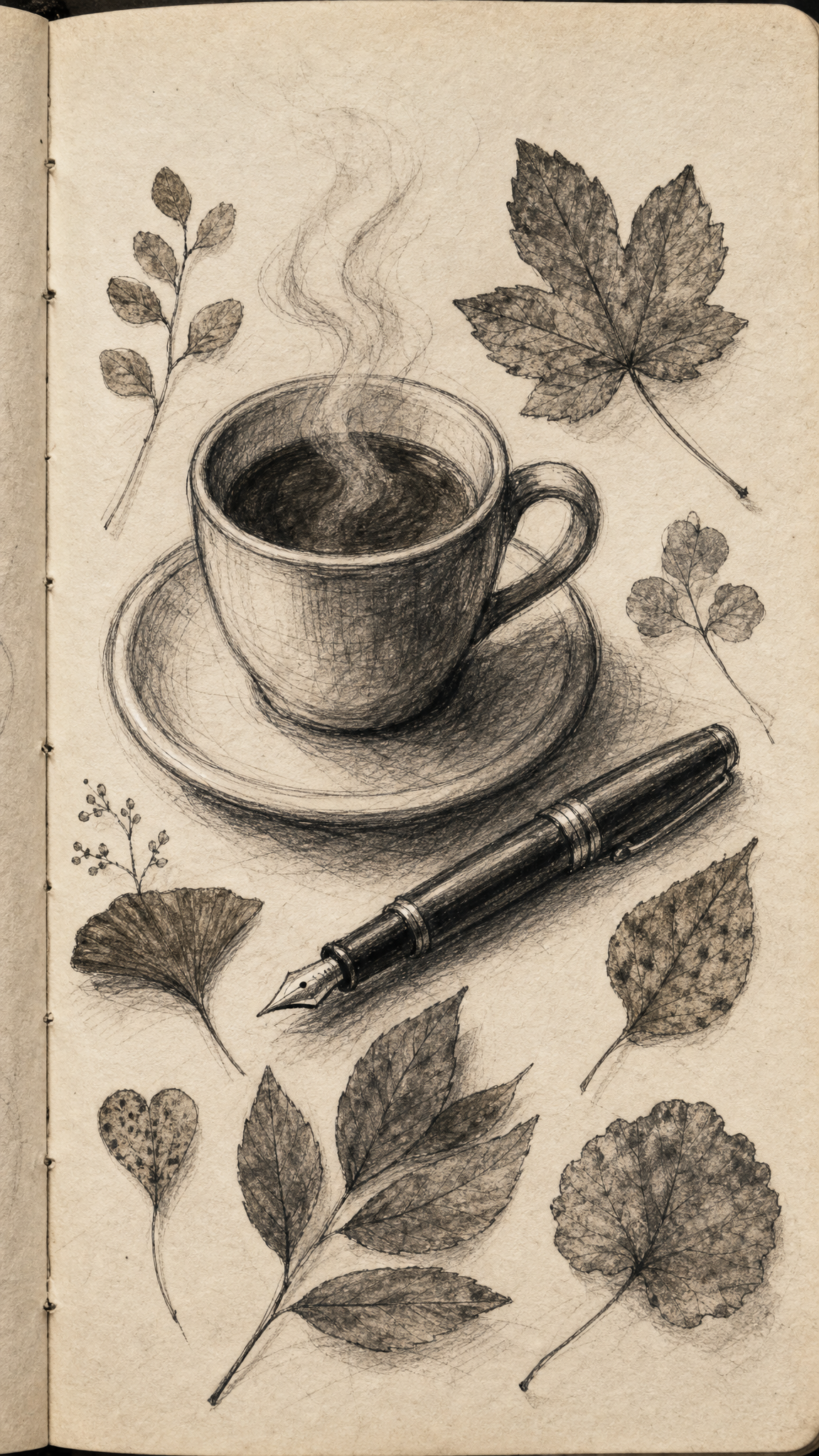
Hand Drawn wallpapers foreground line, imperfection, and makerly touch, using visible marks, sketch energy, and human irregularity to keep the image warm, personal, and less mechanically polished.
Hand Drawnアートについて
The verified sources do not support hand-drawn as a single historical movement, so the JSON should keep the framing disciplined. A List Apart argues for imperfection and organic irregularity in design, while Letterform Archive grounds the value of drawn and written marks in lettering history. That is enough to define hand-drawn as a deliberate visual mode rather than a named art school.
ビジュアルの特徴
- Visible strokes, uneven lines, and natural mark variation
- A sense of sketching, doodling, or direct hand intervention
- Less rigid geometry and more human rhythm
- Texture that feels paper-based, ink-based, or pencil-based
活用例
Warm editorial or notebook-like wallpapers
Craft-led or children’s-brand mood boards
Phone wallpapers with doodle icons or lettering
Illustration-heavy backgrounds that should feel personal
類似スタイル
異なる点
プロンプトガイド
プロンプトの方向性
- Specify the drawing medium or mark quality early: pencil, ink, brush, doodle, rough sketch
- Ask for visible line variation and paper-like warmth
- Keep one clear focal area so the drawing stays decorative rather than messy
- If the output becomes too polished, ask for imperfect edges and visible handwork
ヒント
- Internal editorial suggestion: Hand Drawn wallpapers work best when one visual system stays dominant instead of splitting attention across too many motifs.
- Internal editorial suggestion: specify crop intent early because phone wallpapers usually need one stronger vertical anchor than desktop versions.
- Internal editorial suggestion: cross-link this style with line-art only when the user intent clearly overlaps.
- Internal editorial suggestion: keep factual claims inside the verified evidence boundary and treat prompt advice as editorial guidance only.
おすすめキーワード
避けること
よくある失敗
- The result becomes generic vector art with no hand feel
- Imperfection turns into sloppiness with no hierarchy
- The image loses warmth because the marks are too uniform