#Vaporwave
Vaporwave is an internet-born visual and musical aesthetic that emerged around 2010-2011, defined by its ironic recontextualization of late-20th-century consumer capitalism. Visually, the style features pastel pink and teal gradients, Greco-Roman busts, 1990s mall interiors, Japanese text, and early CGI artifacts. As a wallpaper style, vaporwave delivers dreamy, surreal compositions with soft color palettes that pair well with light-mode and retro-themed desktop setups.
Vaporwaveアートについて
The term 'vaporwave' derives from 'vaporware' (software announced but never released). The first reported use of the term appeared in an October 2011 blog post reviewing 'Surf's Pure Hearts' by Girlhood; Robin Burnett (Internet Club) is credited with coining the term to unify the online creator circle, though the original blog sources are no longer accessible for independent verification. The genre's musical foundations were laid by Daniel Lopatin (as Chuck Person) with 'Eccojams Vol. 1' (August 2010), which pioneered the sampling-and-slowing technique. James Ferraro's 'Far Side Virtual' (October 2011) was an early conceptual work. Ramona Langley, performing as Macintosh Plus under the Vektroid alias, released 'Floral Shoppe' in December 2011 — widely considered the first proper vaporwave album and the genre's blueprint. Blank Banshee's 'Blank Banshee 0' (September 2012) further expanded the sound. The aesthetic originated as an ironic variant of chillwave, evolving from post-noise and hypnagogic pop trends of the 2000s, and critiques the 'lost futures' promised by corporate marketing that never materialized.
ビジュアルの特徴
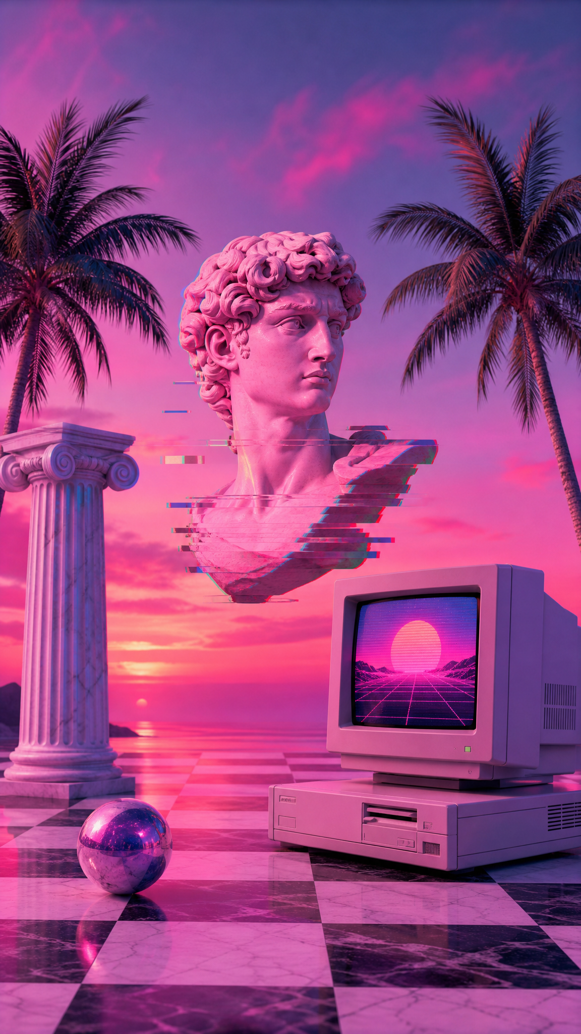
- Pastel color palette dominated by pink, teal/cyan, lavender, and soft purple
- Greco-Roman busts and classical statuary, often floating or fragmented
- 1990s shopping mall interiors — tiled floors, indoor palm plants, columns, escalators
- Early CGI and low-resolution 3D renders with visible polygon edges
- Japanese text (katakana/hiragana) and imagery from Japan's 1980s economic boom era
- Retro computing interfaces — Windows 95/98 UI elements, old Macintosh windows
- VHS degradation artifacts, glitch art, chromatic aberration, scan lines
- Tropical elements — palm trees, sunsets, dolphins, ocean horizons
- Memphis design patterns — geometric shapes and bold patterns from the 1980s Memphis Group
- Surreal collage composition — digital bricolage with ironic pastiche quality
- Soft gradients and dreamy atmospheric depth, lighter and more abstract than synthwave
活用例
Desktop widescreen (16:9) — horizontal collage and gradient landscape compositions
Ultrawide monitors (21:9, 32:9) — panoramic vaporwave cityscapes and sunset gradients
Phone lock screens (9:16) — single-subject compositions like a Roman bust on gradient background
Dual/triple monitor setups — panoramic pastel cityscapes spanning multiple screens
Light-mode desktop themes — the pastel palette complements light system themes
Creative workspaces and music production setups
類似スタイル
異なる点
プロンプトガイド
プロンプトの方向性
- Start with a setting: 'vaporwave cityscape' or 'empty mall interior with palm plants' establishes the scene
- Add color direction: 'pastel pink and teal gradient,' 'lavender and cyan tones' to anchor the palette
- Include signature motifs: 'Greek bust,' 'Roman statue,' 'retro computer screen,' 'Japanese text' for authentic vaporwave feel
- Specify atmosphere: 'dreamy,' 'surreal,' 'lo-fi,' 'glitch aesthetic' for the right mood
- For collage-style output, add: 'digital collage,' 'surreal composition,' 'multiple layered elements'
- Always specify aspect ratio: '--ar 16:9' for desktop, '--ar 9:16' for phone, '--ar 21:9' for ultrawide
ヒント
- Internal editorial suggestion: Layer pastel gradients as the foundation, then add motifs (bust, palms, text) as floating elements. This creates the signature collage feel.
- Internal editorial suggestion: Add 'VHS grain' or 'scan lines' as a final texture modifier to enhance the retro digital quality.
- Internal editorial suggestion: For phone wallpapers, center a single iconic element (Greek bust, retro monitor) on a clean gradient background — simpler compositions work better at small sizes.
- Internal editorial suggestion: Japanese katakana text adds authenticity but ensure it's decorative, not making specific claims — use it as texture, not content.
- Internal editorial suggestion: Iterate 3-5 times per concept. First generations often blend vaporwave with synthwave; refine by emphasizing 'pastel,' 'soft,' 'dreamy' on subsequent attempts.
おすすめキーワード
避けること
よくある失敗
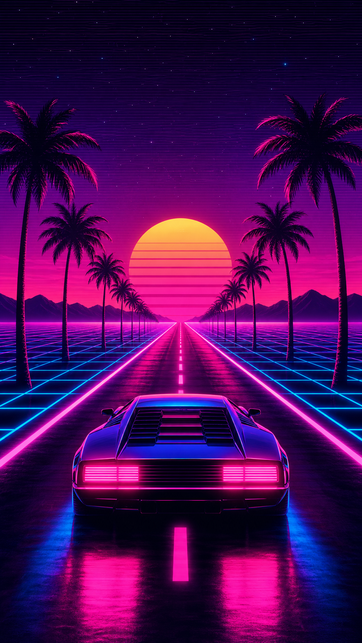
- Using synthwave's dark/neon palette instead of vaporwave's soft pastels — the most common mistake
- Prompting only 'vaporwave' without specific visual elements — produces generic or confused results
- Over-sharpening or over-detailing — vaporwave benefits from a slightly soft, lo-fi quality
- Missing the ironic tone — vaporwave should feel dreamlike and slightly melancholic, not energetic
- Forgetting aspect ratio — default square outputs waste the horizontal composition potential