#Aura Gradient
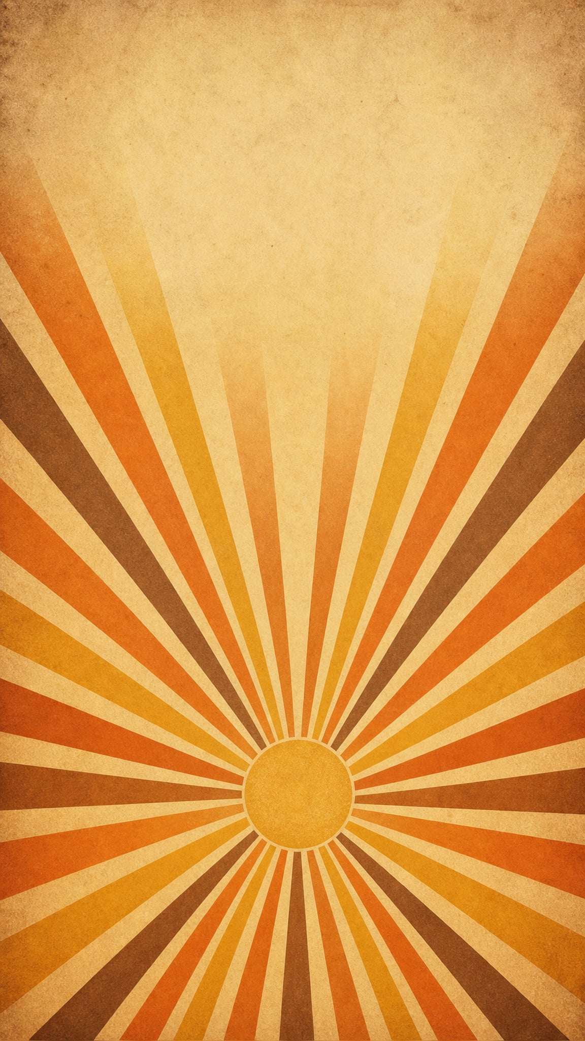
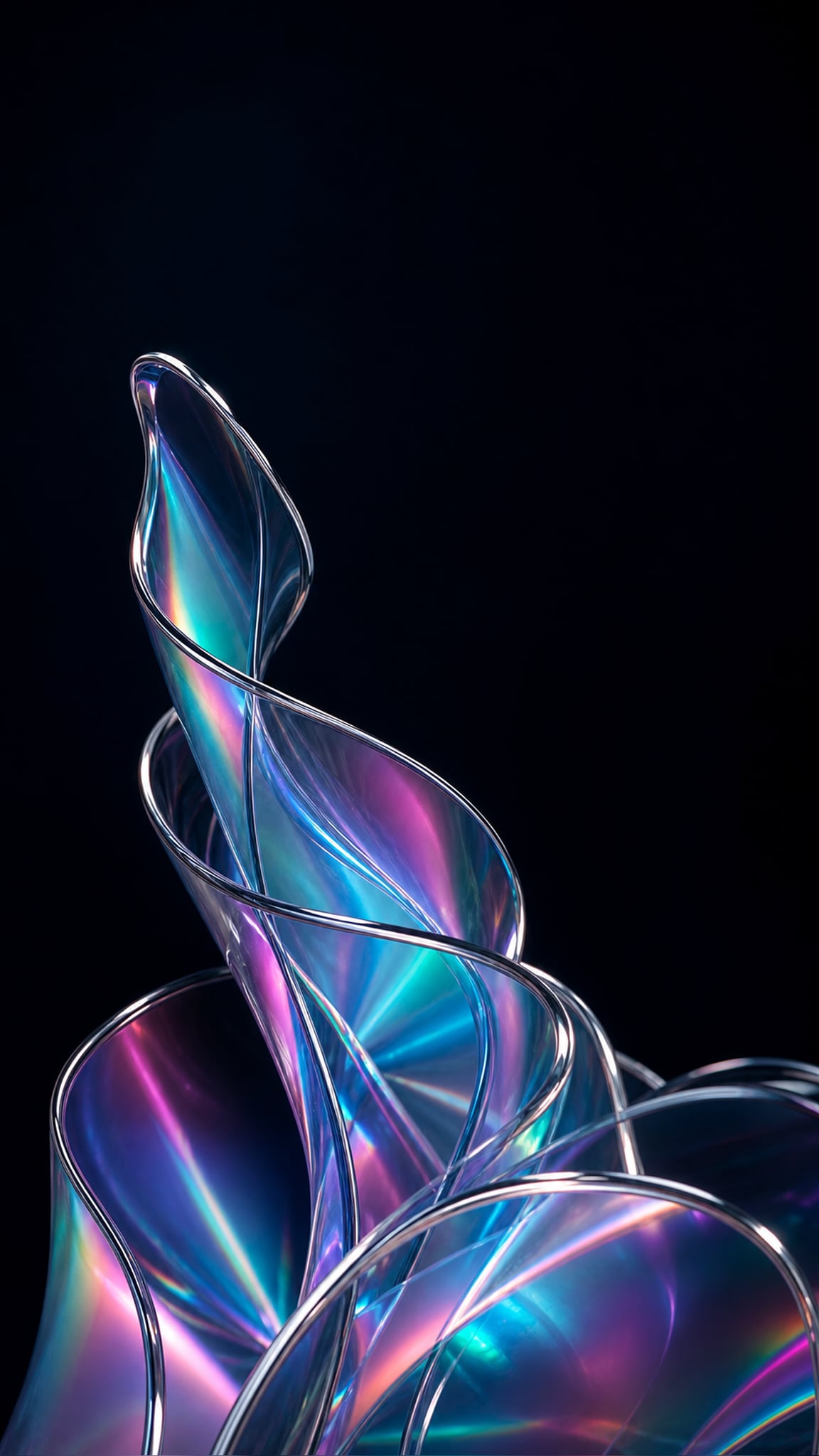
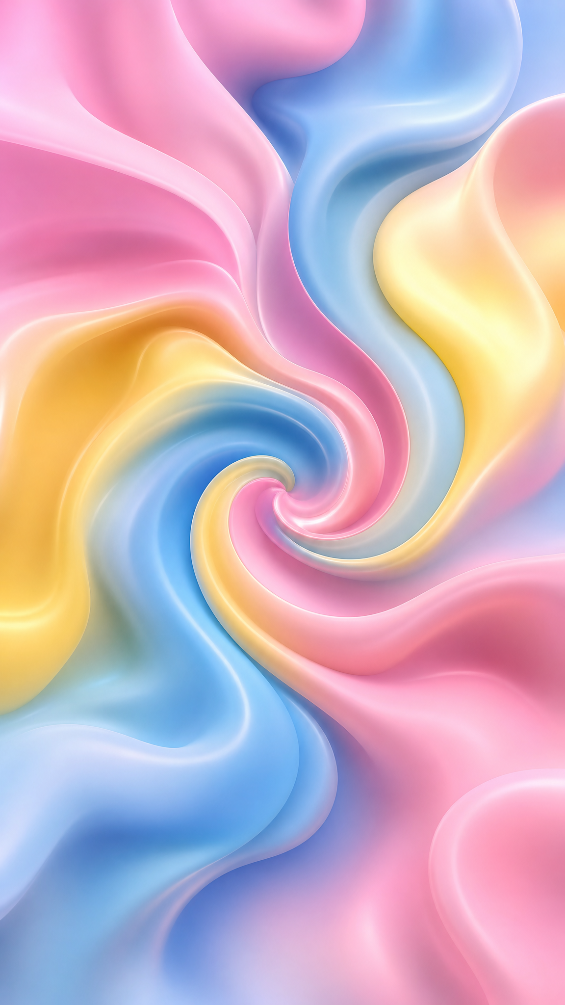
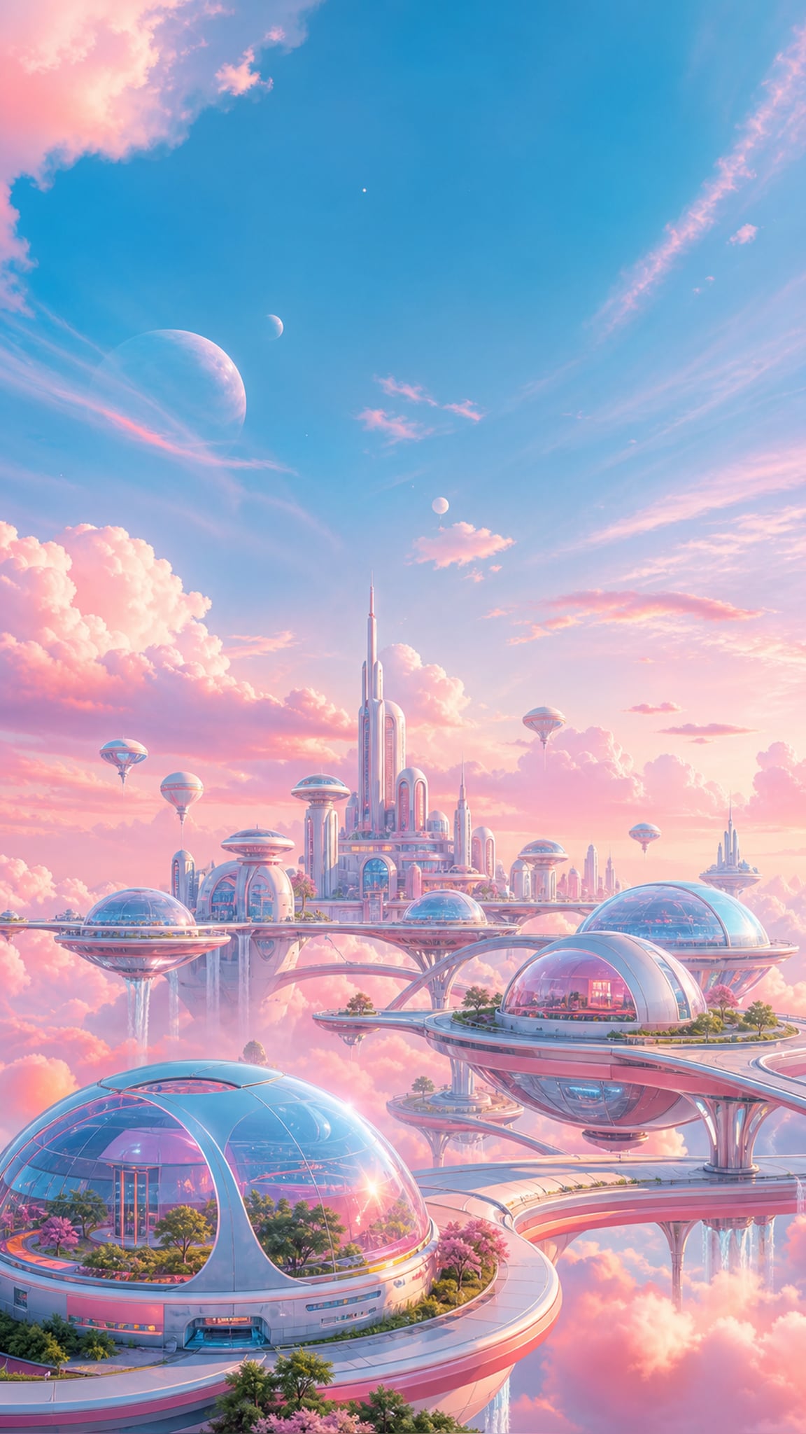
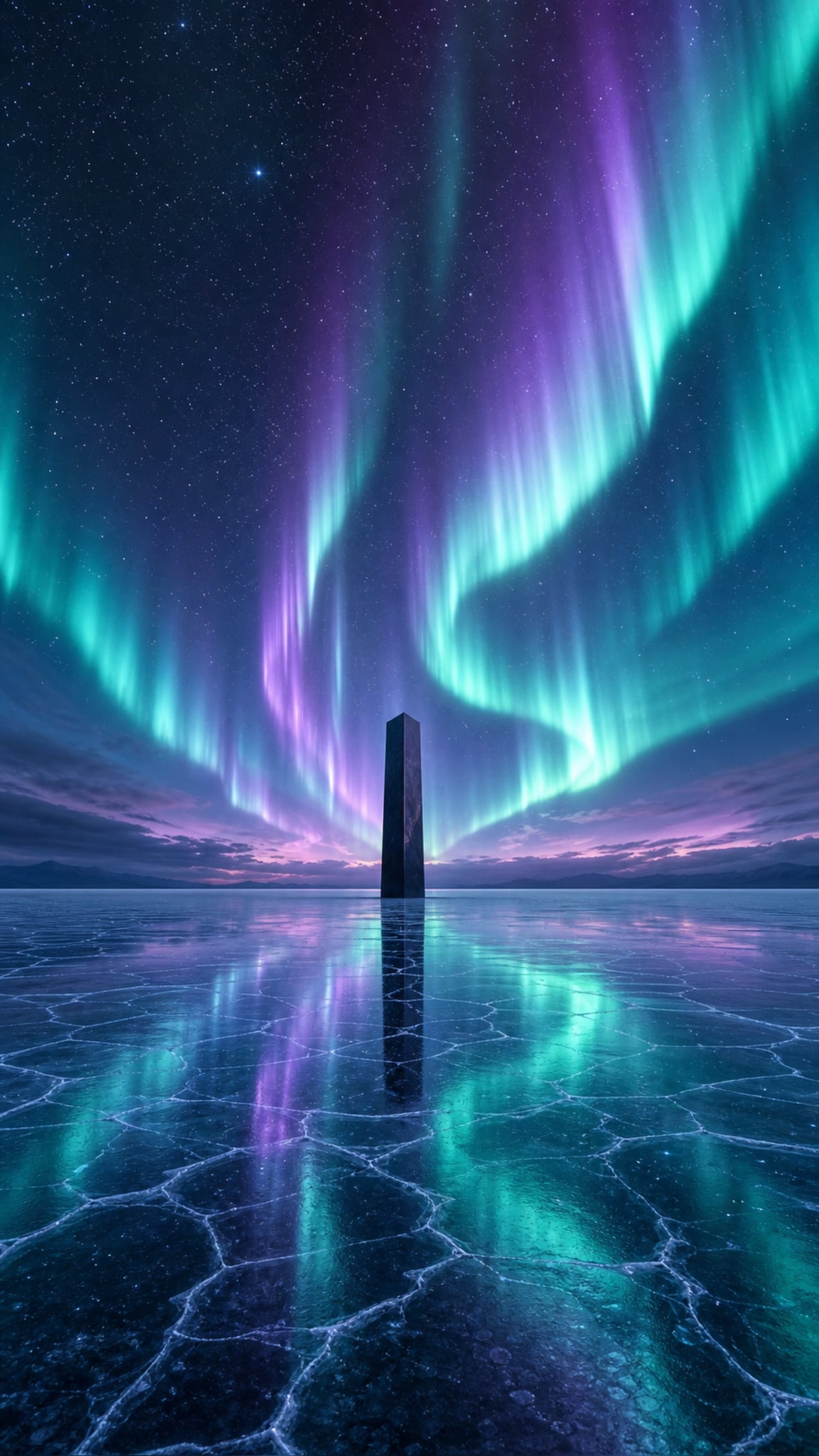
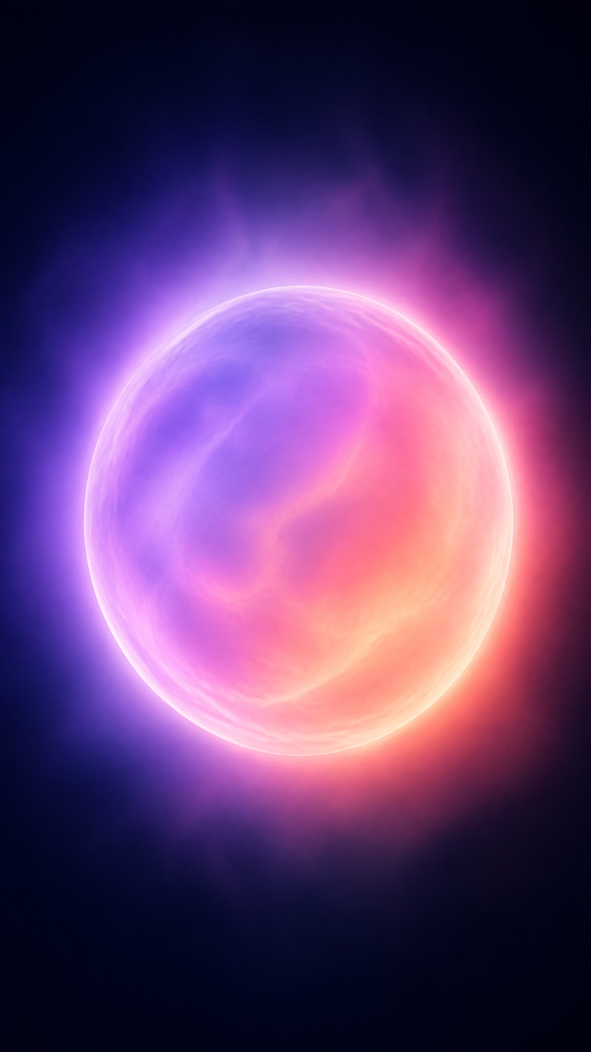
Aura-gradient wallpapers turn color into atmosphere: soft chromatic bloom, blurred radiant edges, and a glowing field that feels more spiritual, emotional, or dreamlike than geometric. Unlike hard-edged gradient systems used in interface design, aura gradients usually feel diffuse and bodily, as if color were breathing outward from a center.
Aura Gradientアートについて
The verified sources support aura gradient as a recent design direction with a looser cultural lineage rather than a formal historical movement. Artsy's aura-photography history provides the clearest visual ancestor by explaining the cultural and image-making background of aura fields and chromatic energy halos. Updivision confirms that aura-like gradients now operate as a current digital color trend, while TODAY shows how aura photography and aura-color language have re-entered contemporary culture. Together, these sources justify aura gradient as a present-day digital style borrowing from aura-photography color logic and spiritualized chromatic imagery.
ビジュアルの特徴
- Soft blurred color bloom instead of hard linear transition
- Luminous edges and glowing centers
- Pastel-to-vivid spectral shifts that feel atmospheric rather than schematic
- A hazy, ethereal, low-contrast mood
- Rounded, cloud-like, or field-like color distribution
- Dreamlike softness rather than sharp graphic boundaries
- A sense of energy radiating outward from one or more soft centers
- A palette that often leans intuitive, emotional, or symbolic
活用例
Phone wallpapers that need softness without losing color interest
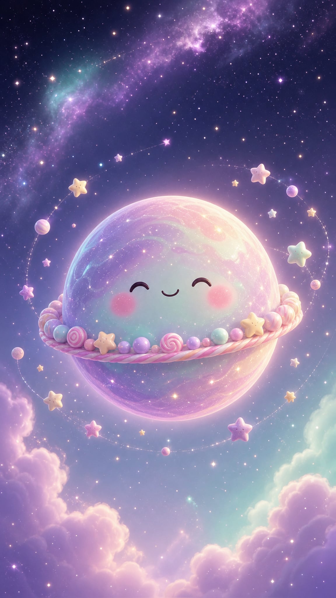
Desktop backgrounds for wellness, creative, or dreamy digital moods
UI and app hero backgrounds where atmosphere matters more than precision
Poster-like digital art built around spiritual or emotional color identity
Lock screens that want a glowing field rather than a figurative subject
類似スタイル
異なる点
プロンプトガイド
プロンプトの方向性
- Use direct style language such as 'aura gradient wallpaper' or 'soft glowing aura color field'
- Describe the light quality: diffuse, blurred, blooming, radiating, dreamy, spiritual, or hazy
- Choose a palette family early, such as pink-lilac-blue, warm sunrise gold-pink, or cool cyan-violet
- Avoid too many hard objects unless you want the gradient to remain purely atmospheric
- If the result becomes a normal gradient, ask for softer edges, glow bloom, and aura-like chromatic haze
ヒント
- Internal editorial suggestion: aura gradients work best when one or two soft centers control the whole field.
- Internal editorial suggestion: avoid too many competing hues unless the gradient still feels breathable.
- Internal editorial suggestion: cross-link with `gradient`, `aurora`, and `dreamy` helps users navigate nearby soft-color styles.
- Internal editorial suggestion: phone wallpapers benefit from one vertical light bloom instead of many scattered glows.
おすすめキーワード
避けること
よくある失敗
- The image becomes a generic linear gradient with no aura-like bloom
- Colors are too muddy because there is no luminous center or soft radiance
- The wallpaper introduces too many hard objects and loses its atmospheric identity
- The palette is too harsh to feel meditative or ethereal