#Black and White
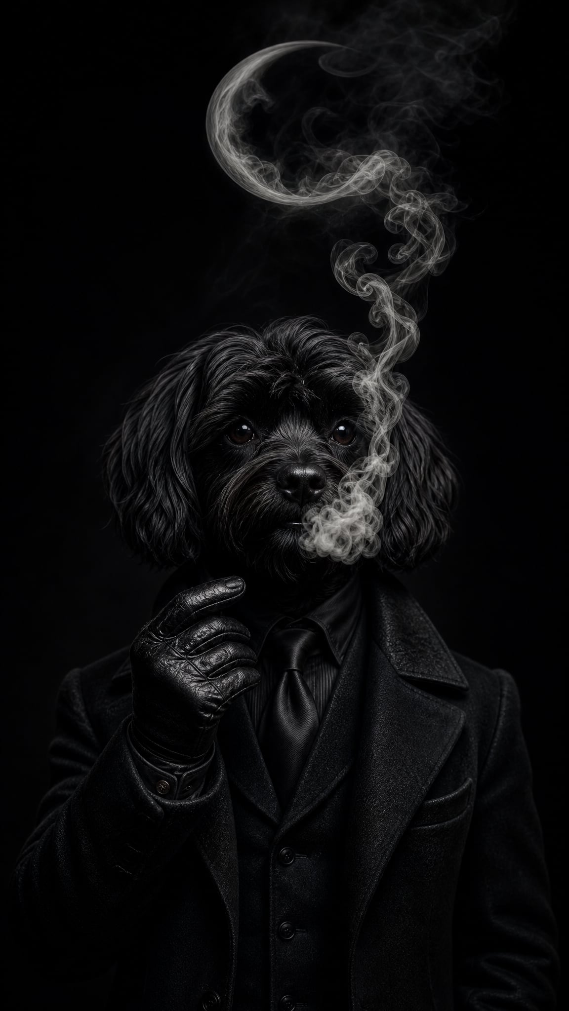
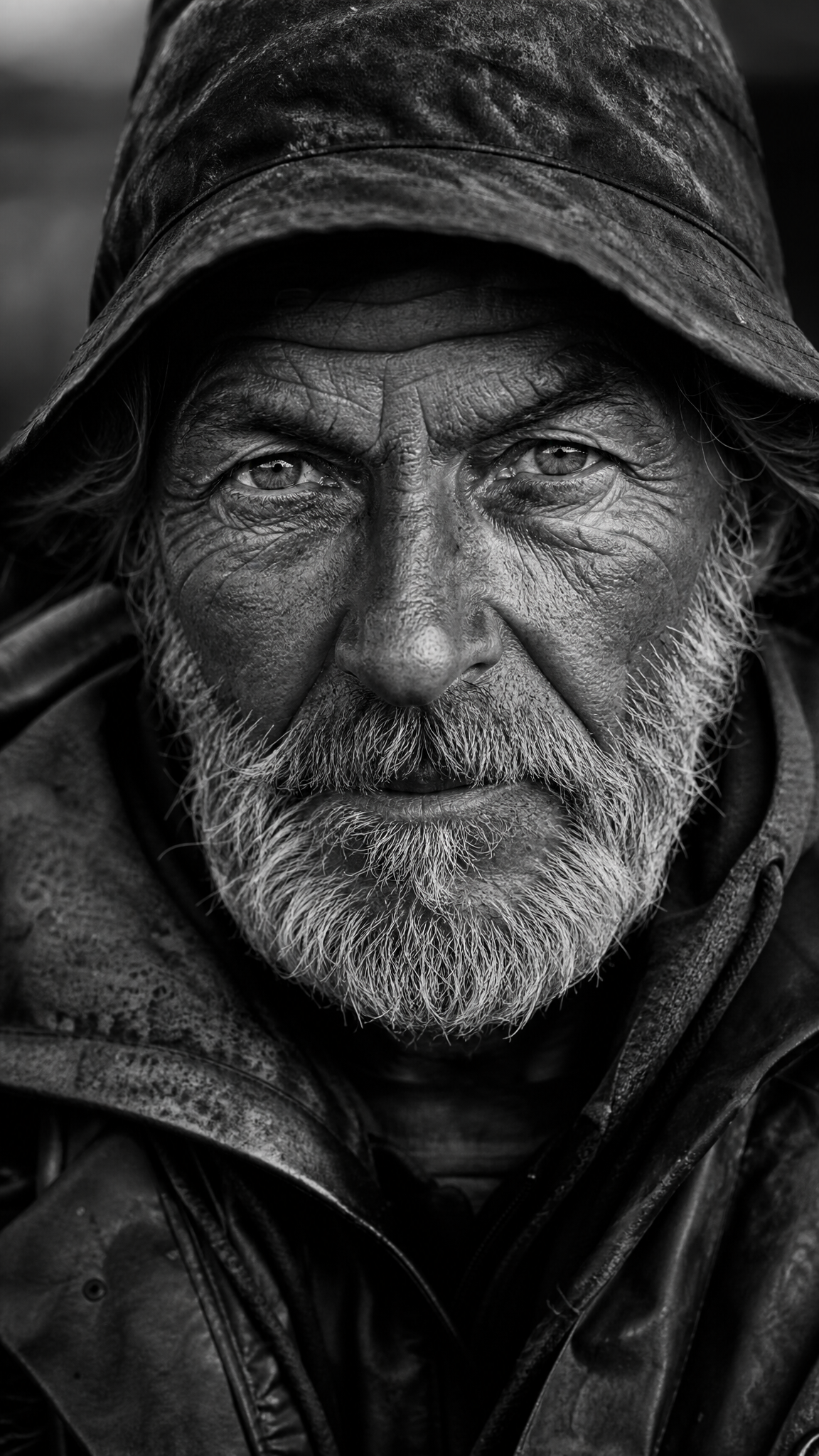
Black-and-white wallpapers strip color away so that contrast, tone, silhouette, and structure do the emotional work. The style can feel elegant, severe, cinematic, documentary, graphic, or meditative depending on how the grayscale range is handled. Its strength is reduction with purpose: when color disappears, composition becomes louder.
Black and Whiteアートについて
The verified sources support black-and-white as a broad visual language spanning photography and art rather than a narrow niche. Independent Photo's overview anchors the photographic history of black-and-white imagery, Tate's monochrome definition broadens the discussion into fine art, and RMCAD explains why monochrome remains powerful for contrast, tone, and emotional emphasis. Together, these sources support black-and-white as a durable cross-medium aesthetic built around tonal structure rather than color storytelling.
ビジュアルの特徴
- High contrast between light and dark shapes
- Attention to tonal range rather than hue
- Stronger silhouette and edge readability
- A sense of seriousness, elegance, or starkness depending on contrast
- Texture becoming more noticeable without color distraction
- Mood carried by shadow, highlight, and composition
- A graphic or cinematic look when contrast is pushed hard
- A quieter, contemplative feel when grays stay soft and balanced
活用例
Photography-led wallpapers that need timelessness or drama
Minimal device themes that still want emotional depth
Architectural, portrait, or street-scene wallpapers with strong shape structure
Graphic monochrome backgrounds for reading, work, or low-noise setups
Poster-like black-and-white compositions where typography and image must coexist cleanly
類似スタイル
異なる点
プロンプトガイド
プロンプトの方向性
- Name the subject first, then add 'black and white wallpaper' or 'monochrome composition'
- Specify tonal style: high contrast, soft grayscale, cinematic shadow, matte monochrome, or grainy documentary
- If you want photography energy, mention light direction and shadow shape
- If you want graphic energy, mention silhouette clarity, negative space, and strong foreground/background separation
- Avoid mixing too many textures unless the tonal hierarchy stays clear
ヒント
- Internal editorial suggestion: decide early whether the wallpaper should feel cinematic, graphic, or contemplative.
- Internal editorial suggestion: black-and-white wallpapers often crop better when one shadow mass or bright plane dominates.
- Internal editorial suggestion: cross-link with `noir`, `minimalist`, and `sepia` helps users explore nearby low-color styles.
- Internal editorial suggestion: do not assume every monochrome wallpaper needs extreme contrast; soft grayscale is a distinct branch.
おすすめキーワード
避けること
よくある失敗
- The image is technically grayscale but tonally flat and lifeless
- Too much mid-gray removes both drama and clarity
- Heavy grain is used to fake mood without strong composition
- The wallpaper tries to keep color-based logic even after color is removed