#Aurora
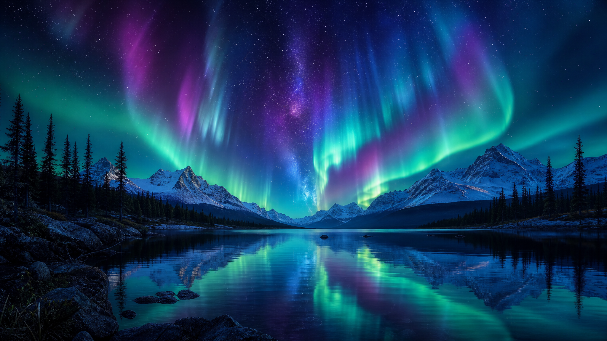
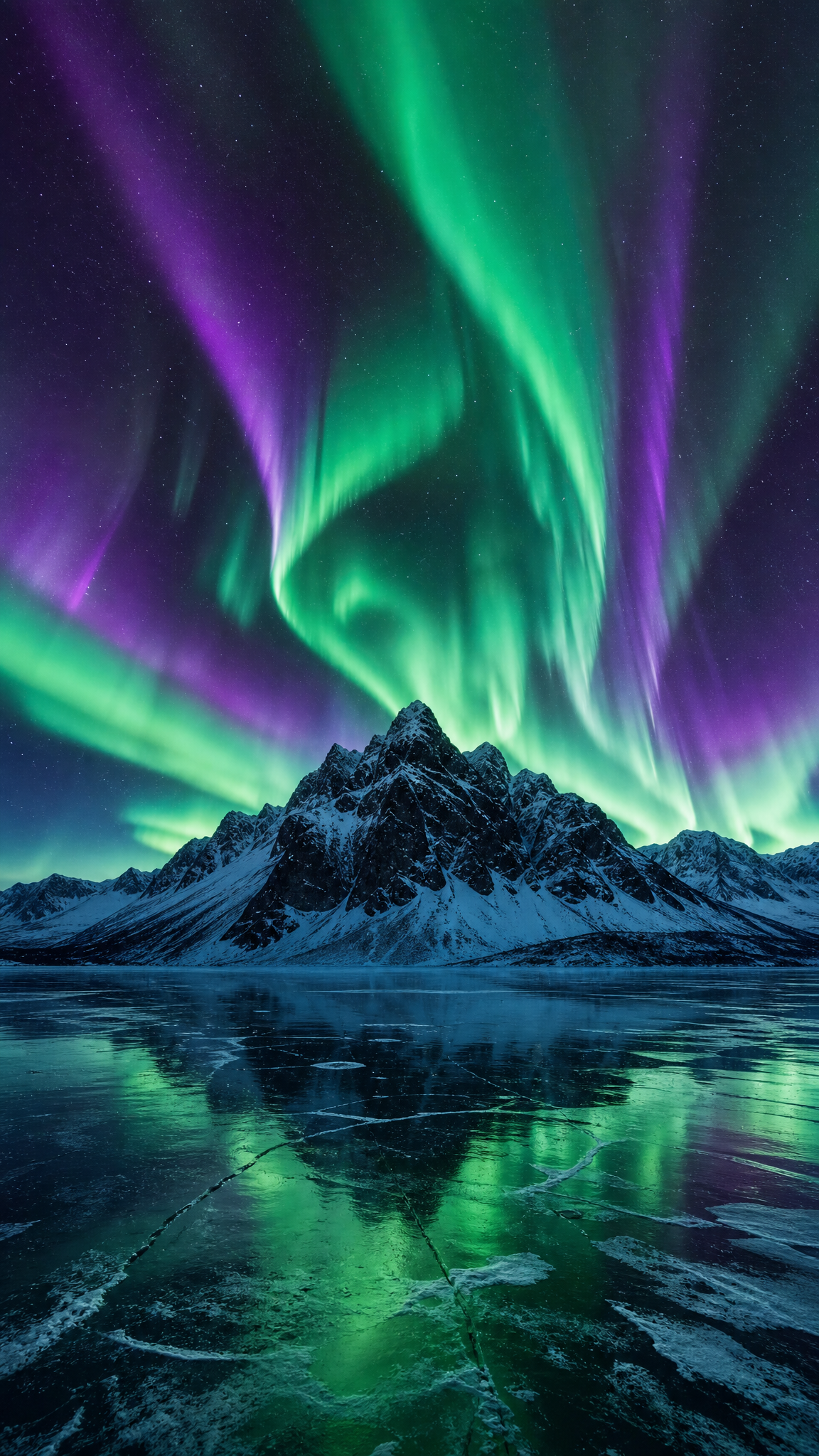
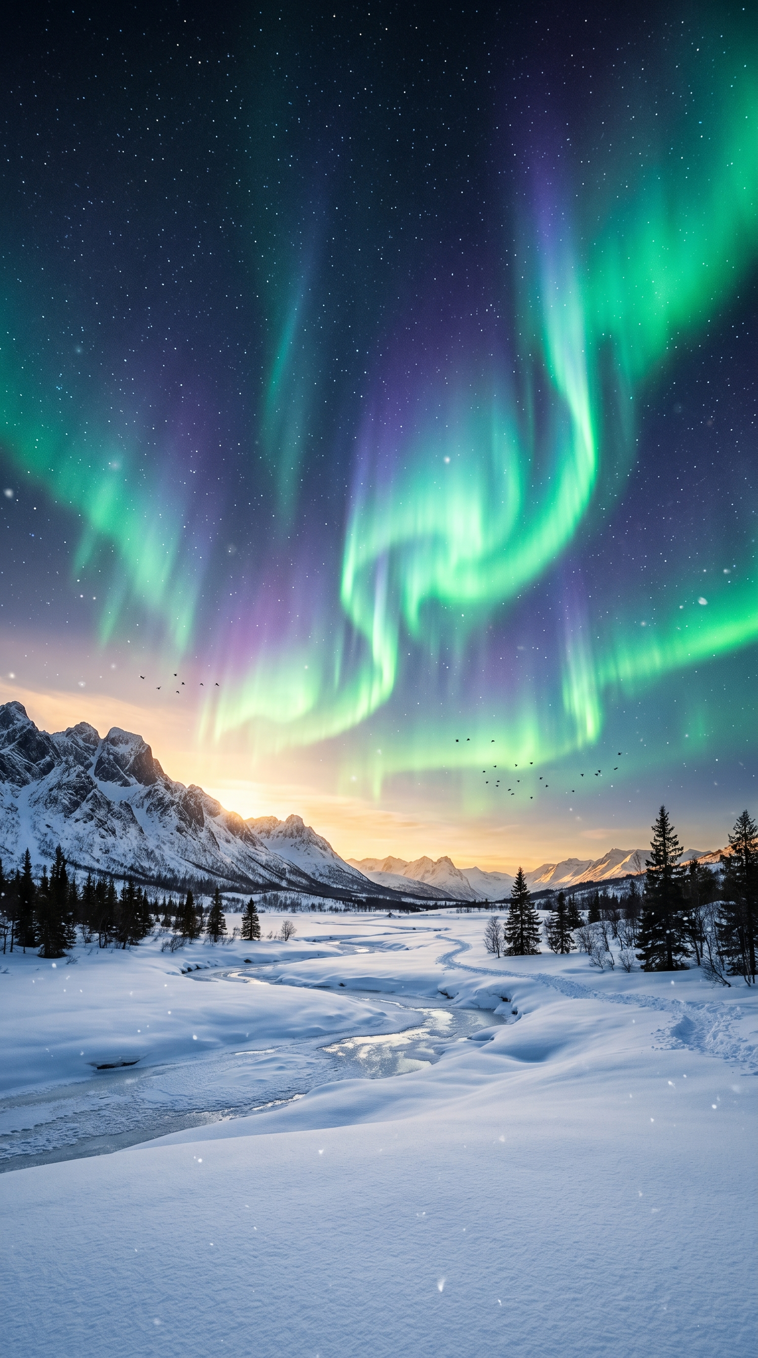
Aurora-style wallpapers draw from the visual language of the aurora borealis and aurora australis — the luminous curtains of color that form when charged solar particles collide with atmospheric gases near Earth's magnetic poles. As a wallpaper aesthetic, the style translates those flowing bands of green, violet, pink, and blue into sweeping gradients, translucent layering, and soft luminous motion. Aurora wallpapers feel cosmic, calm, and expansive, making them effective backgrounds for both desktop productivity and immersive phone lock screens.
Auroraアートについて
The aurora borealis takes its name from Aurora, the Roman goddess of dawn, and Boreas, the Greek north wind. NASA and NOAA explain auroras as light produced when energetic solar particles follow Earth's magnetic field into the upper atmosphere and excite oxygen and nitrogen. Wikipedia's historical overview records an early datable mention in the Bamboo Annals and a description by Pytheas in the 4th century BC. Space.com's aurora-color guide explains that oxygen is responsible for the familiar greens and some reds, while nitrogen contributes blue and purple tones, which is why aurora-inspired wallpapers usually emphasize translucent green-violet curtains against dark skies. In digital art, the style refers to this natural light display rather than to any branded product category.
ビジュアルの特徴
- Sweeping curtain-like bands of light flowing across a dark sky
- Dominant green hues from excited oxygen atoms, often mixed with violet, magenta, and teal
- Soft luminous gradients that transition smoothly between two or three spectral colors
- Translucent layering where light bands appear to overlap with varying opacity
- Dark background (night sky, horizon silhouette) providing high contrast for the light display
- Subtle star field or cosmic dust visible behind or through the aurora
- Organic, non-repeating flow patterns that follow magnetic-field-like curves
- Vertical ray or pillar structures within the broader curtain shape
- Reflections on water, snow, or landscape surfaces that double the color range
- A sense of vast scale — the composition suggests an immense sky above a small horizon
- Soft-focus edges rather than hard outlines, giving the light a diffused, atmospheric quality
活用例
Desktop wallpapers where the dark sky provides strong icon contrast and the color bands add visual interest without clutter
Phone lock screens that use vertical aurora curtains to complement the portrait orientation
Ultrawide monitor wallpapers where the horizontal sweep of light naturally fills a wide aspect ratio
Dual-monitor setups where a continuous aurora band can span both screens
Dark-mode environments where the deep sky background pairs well with dark UI themes
Ambient or relaxation-themed device setups where a calm, cosmic mood is desired
類似スタイル
異なる点
プロンプトガイド
プロンプトの方向性
- Lead with the natural phenomenon: 'aurora borealis wallpaper,' 'northern lights over landscape,' or 'aurora curtain in night sky'
- Specify the color palette by referencing the science: 'green and violet aurora,' 'oxygen-green with magenta bands,' or 'teal-to-pink aurora gradient'
- Define the landscape context: 'reflected on a still lake,' 'above snow-covered mountains,' or 'over a dark treeline silhouette'
- Control the composition scale: 'wide panoramic aurora,' 'close-up aurora curtain filling the frame,' or 'aurora with visible star field'
- Add atmospheric depth cues: 'translucent light layers,' 'soft luminous glow,' 'diffused curtain edges,' or 'vertical aurora rays'
- For abstract interpretations, specify: 'abstract aurora gradient wallpaper, no landscape, flowing color bands on dark background'
ヒント
- Internal editorial suggestion: Green-dominant palettes with violet accents are the most recognizable aurora color combination and the safest default for AI generation.
- Internal editorial suggestion: Including a simple reflective surface (water, ice) in the lower third doubles the color impact and improves composition balance.
- Internal editorial suggestion: For desktop wallpapers, keep the brightest aurora bands in the upper two-thirds to leave a darker lower area where taskbar and icons sit.
- Internal editorial suggestion: Abstract aurora wallpapers (no landscape) work better for ultrawide formats because they avoid the problem of stretching a specific horizon.
おすすめキーワード
避けること
よくある失敗
- Colors too uniform — real auroras have variation within each band; request 'color variation within the curtain' to avoid flat gradients
- Missing dark sky contrast — the aurora needs a deep dark background to glow; if the sky is too bright, the effect is lost
- Landscape overpowering the aurora — the foreground should be a silhouette or reflection, not a detailed scene competing for attention
- Losing the curtain structure — aurora should have visible vertical rays or flowing band shapes, not just a blurred color wash
- Generic space background — adding too many galaxies or planets shifts the result from aurora to generic cosmic art