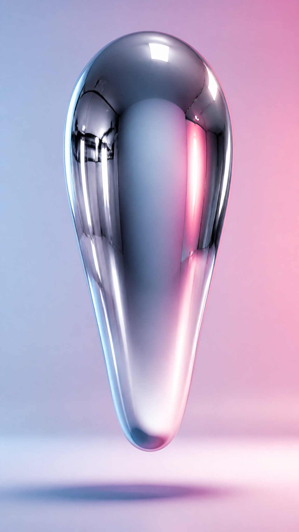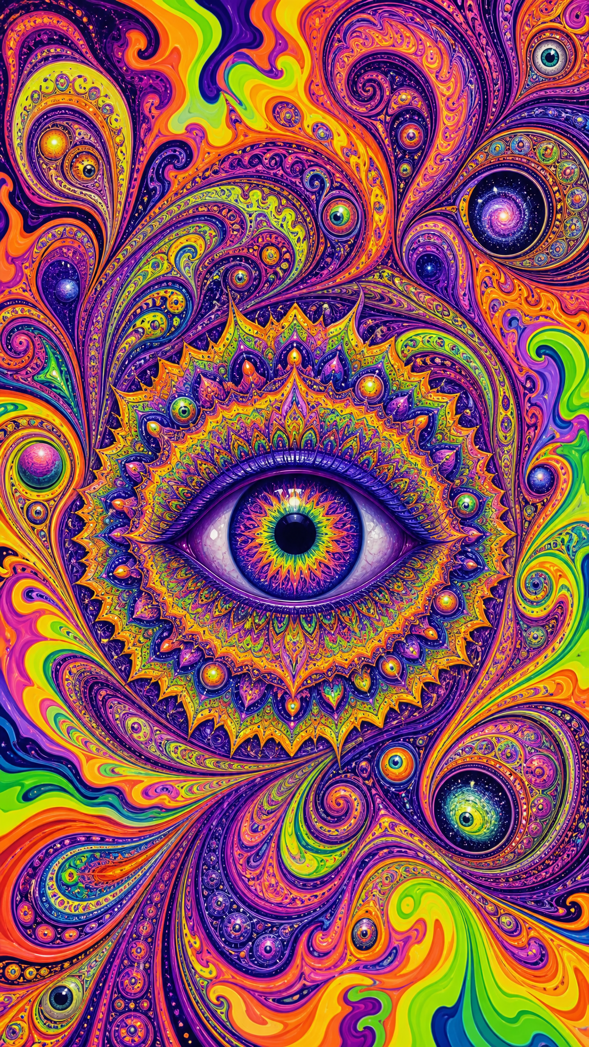
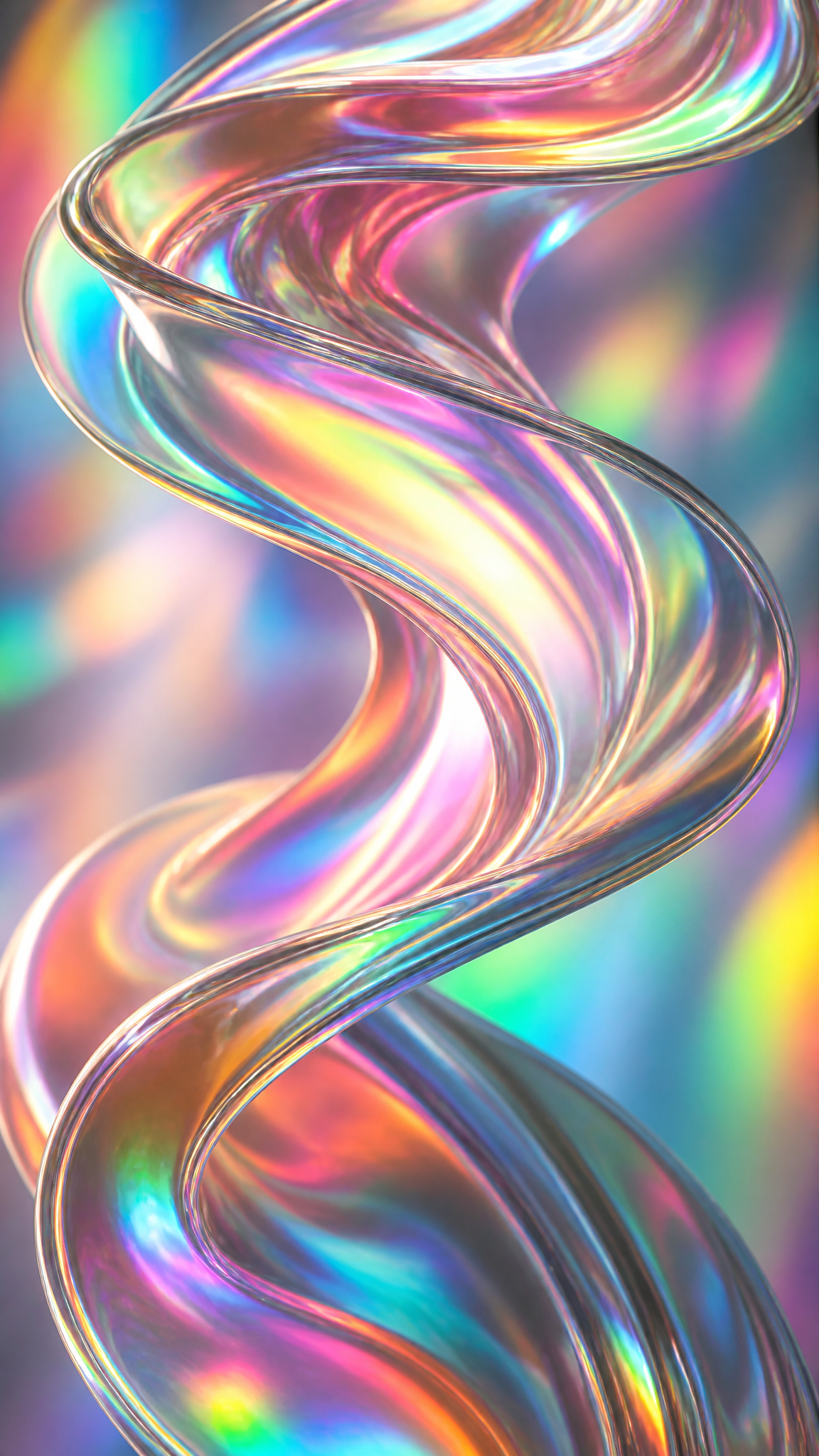
#Holographic
Holographic wallpapers build around iridescent color shift: surfaces that seem to change hue with angle, rainbow-metal sheen, and a future-coded finish that feels somewhere between science, packaging, fashion, and fantasy material. The strongest versions work because they balance spectacle with surface logic, so the image feels like a real reflective phenomenon rather than random rainbow gloss.
Holographicアートについて
The verified sources support a necessary distinction inside this style. American Scientist and Holocenter provide the actual technological and historical background of holography and holograms, while Fast Company explains how iridescence and holographic-looking finishes became a design craze, and Dieline confirms the style's strong packaging and commercial-design usage. Together, these sources justify holographic as a design style built from real holography's cultural aura plus iridescent surface language in contemporary design.
ビジュアルの特徴
- Rainbow-like iridescent color shift across one surface
- Reflective metallic or film-like sheen
- A future-coded or otherworldly material finish
- Strong highlights that appear to move across the surface
- Pastel-to-vivid spectral transitions
- A synthetic, glossy, special-effect mood
- Material interest becoming the main subject of the wallpaper
- A balance between technological coolness and decorative spectacle
活用例
Fashion- or beauty-adjacent wallpapers with reflective material drama
Packaging-inspired digital themes that want a premium special-finish look
Phone wallpapers built around one iridescent object or foil-like field
Y2K- and future-adjacent wallpapers needing color-shifting shine
Abstract material wallpapers where surface behavior matters more than scene content
類似スタイル
異なる点
プロンプトガイド
プロンプトの方向性
- Name the style directly, such as 'holographic wallpaper' or 'iridescent foil aesthetic'
- Ask for color-shifting reflectivity, rainbow sheen, and metallic film-like highlights
- Choose whether the subject is an object, typography, foil field, or abstract material surface
- If the result looks like a plain gradient, increase reflectivity and angle-dependent color shift
- If it becomes random rainbow gloss, add material cues like foil, film, laminated surface, or iridescent coating
ヒント
- Internal editorial suggestion: holographic style is strongest when one surface behaves believably, not when every object becomes equally iridescent.
- Internal editorial suggestion: pair strong sheen with a simpler composition so the material effect can stay legible.
- Internal editorial suggestion: cross-link with `liquid-chrome`, `y2k`, and `glassmorphism` helps users compare adjacent futuristic material styles.
- Internal editorial suggestion: phone wallpapers often work better with one foil-like object than with a full busy reflective scene.
おすすめキーワード
避けること
よくある失敗
- The image becomes a plain rainbow gradient with no material logic
- Too much shine destroys shape readability
- The wallpaper looks like glossy plastic instead of iridescent film or foil
- Every area shifts color equally, making the surface feel fake