#Frutiger Aero
Frutiger Aero is a design aesthetic that dominated digital interfaces, advertising, and consumer electronics from roughly 2004 to 2013. Characterized by glossy textures, translucent glass-like surfaces, vibrant nature imagery, and an optimistic techno-utopian mood, it was the visual language of the Windows Vista/7 era, early iPhones, and the Web 2.0 boom. The style was named retroactively in 2017 by Sofi Xian of the Consumer Aesthetics Research Institute, combining the Frutiger typeface family (designed by Swiss typographer Adrian Frutiger) with Microsoft's Windows Aero design language. After being largely replaced by flat design in the early 2010s, Frutiger Aero experienced a major nostalgia-driven revival starting in early 2023, particularly among Generation Z on TikTok and Reddit.
Frutiger Aeroアートについて
Frutiger Aero emerged in the mid-2000s as a successor to the Y2K aesthetic. Windows Vista (developed 2001-2006) was described by scholar Emirhan Avci as 'one of the first mature examples' of the style, with its translucent Aero Glass window borders and nature-themed default wallpapers. The aesthetic quickly spread to iOS 1-6, Mac OS X 10.5-10.9, Android 1.0-4.4, gaming consoles (Wii, Xbox 360, PS3), and consumer product branding. The name 'Frutiger Aero' was coined in 2017 by Sofi Xian (formerly Sofia Lee) of the Consumer Aesthetics Research Institute (CARI). The style waned by the early 2010s as flat design (led by Windows 8's Metro and iOS 7) took over. A nostalgia-driven revival began in early 2023, with the #frutigeraero hashtag accumulating over 28 million TikTok views and the r/FrutigerAero subreddit growing 400% in a single month. Critics attribute the resurgence to Generation Z's longing for the optimistic, pre-social-media digital era, and a reaction against the current AI boom and environmental anxiety. Apple's 2025 Liquid Glass design language was noted by TechRadar as likely influenced by Frutiger Aero.
ビジュアルの特徴
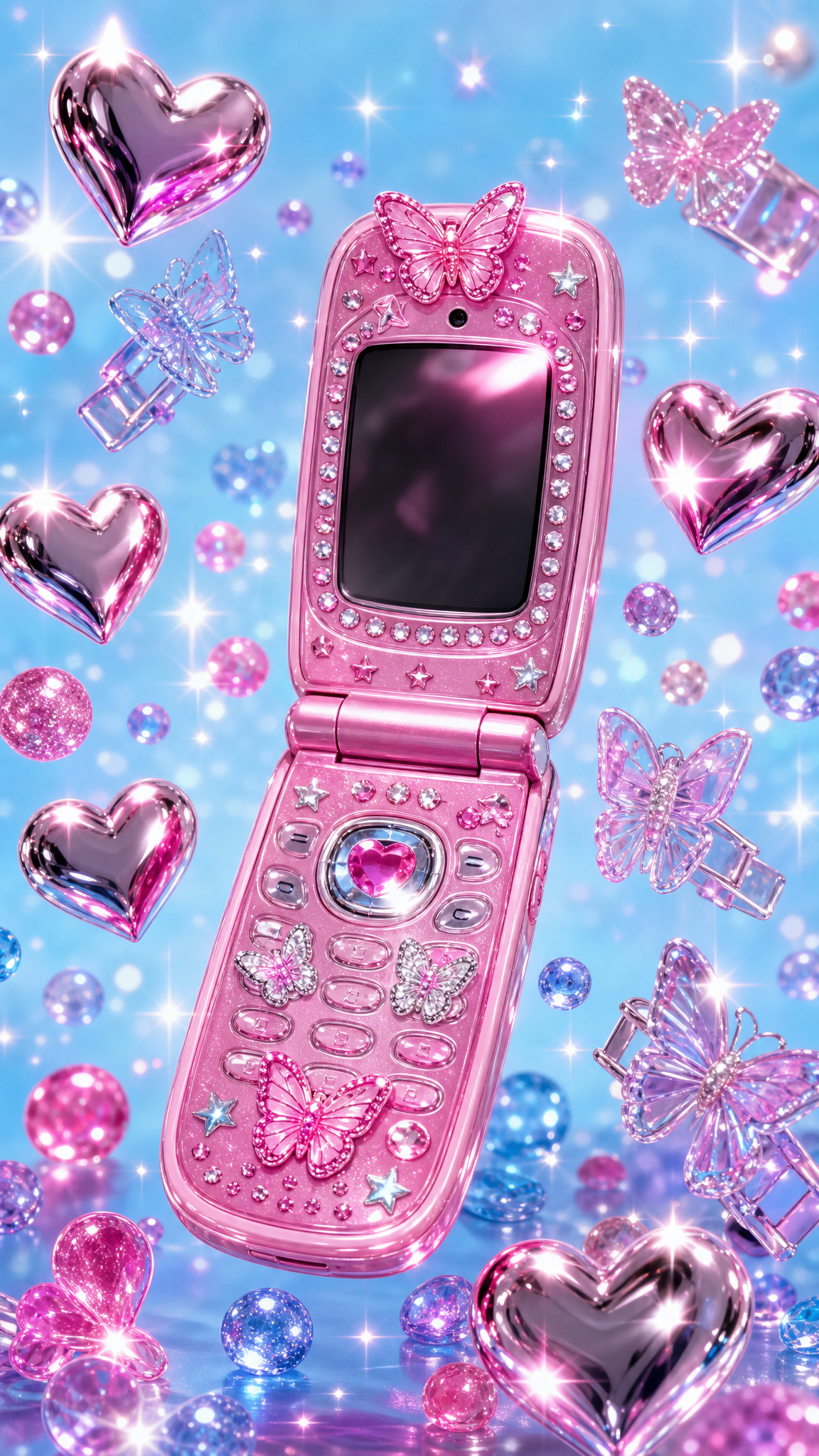
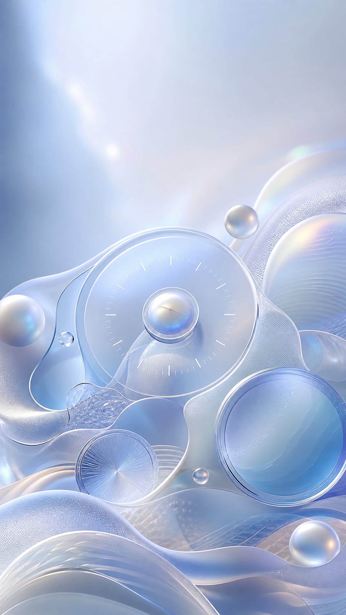
- Glossy, reflective surfaces mimicking glass and water
- Skeuomorphic 3D icons and UI elements with realistic depth
- Translucent and semi-transparent layers (glass-like panels)
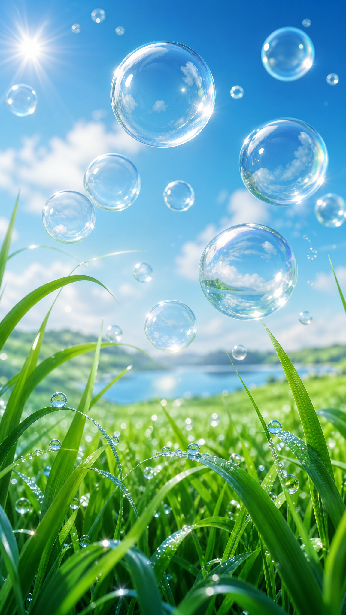
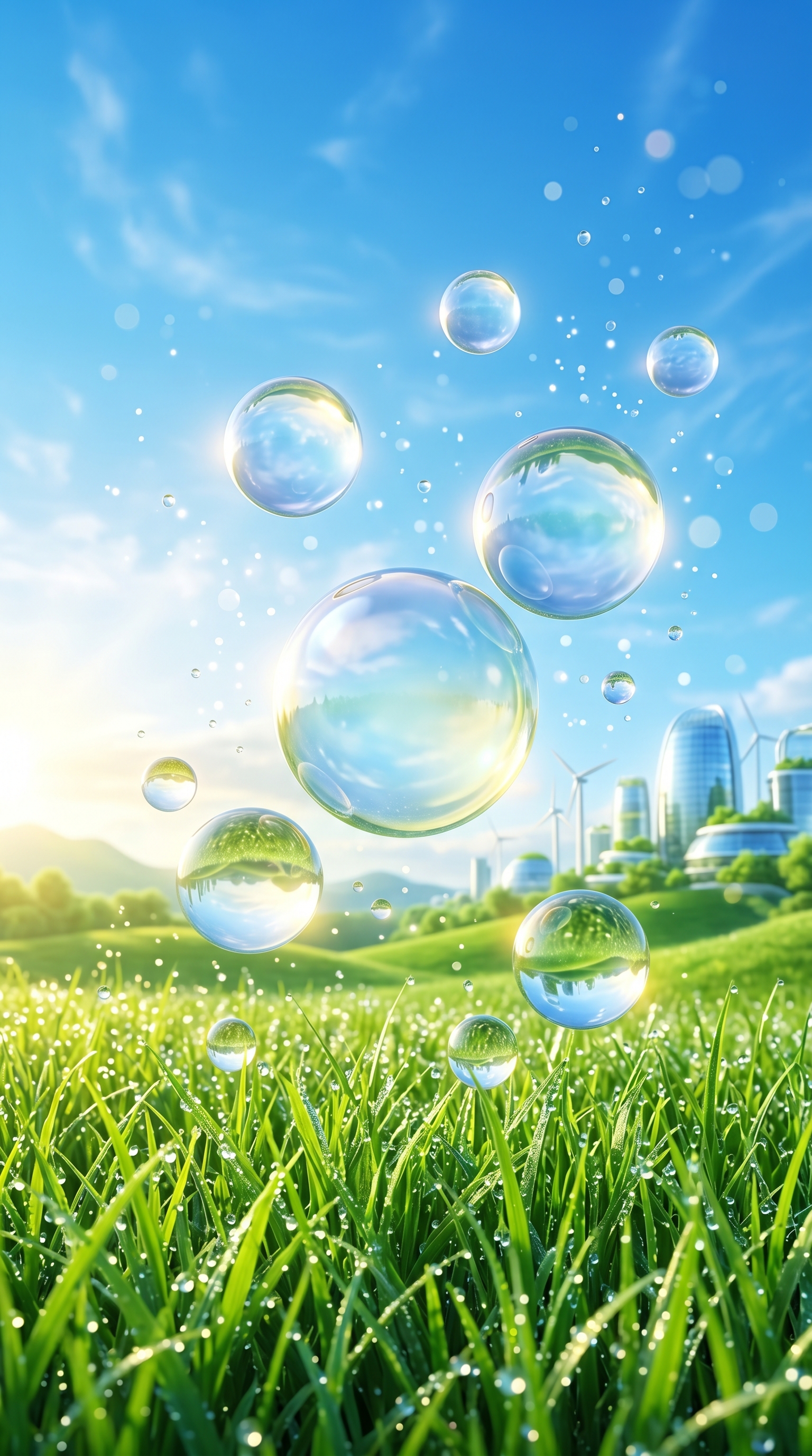
- Nature imagery: blue skies, green fields, tropical fish, water, bubbles, butterflies, flowers
- Bright optimistic color palette dominated by blues, greens, and yellows
- Linear gradients, bloom effects, and soft glowing highlights
- Lens flares, auroras, and bokeh light effects
- Rounded edges and smooth organic shapes
- Clean sans-serif typography (Frutiger, Segoe UI, Helvetica)
- Earth globes symbolizing global connectivity
- Abstract human silhouettes (as in iPod campaigns)
- Water droplets, dew, and crystal-clear aquatic scenes
- Integration of nature with technology in a harmonious utopian vision
活用例
Nostalgia wallpapers evoking the 2004-2013 computing era (Windows Vista/7, early iPhone)
Retro-digital desktop backgrounds for modern minimalist setups — the glossy maximalism creates striking contrast
Optimistic, calming mood pieces blending nature and technology
Aesthetic content for social media (TikTok, Instagram) tapping into the ongoing Frutiger Aero revival trend
Companion visuals for lofi/ambient playlists and study backgrounds
類似スタイル
異なる点
プロンプトガイド
プロンプトの方向性
- Emphasize the marriage of nature and technology: lush green fields under clear blue skies with glossy digital elements floating in the scene
- Include water and light effects: bubbles, water droplets, lens flares, bokeh, soft glowing highlights
- Reference specific era touchstones: 'Windows Vista wallpaper style', 'mid-2000s interface aesthetic', 'Web 2.0 era visual design'
- Describe materials explicitly: 'glossy translucent surfaces', 'glass-like panels', 'reflective 3D objects'
- Combine organic and digital: tropical fish swimming through abstract digital space, butterflies near translucent UI panels, flowers growing beside glossy spheres
ヒント
- Internal editorial suggestion: Start with a nature scene (blue sky + green landscape or underwater) and layer in glossy translucent tech elements for the most authentic feel
- Internal editorial suggestion: Use 4:3 or 16:9 landscape orientation — this aesthetic was born in the desktop/widescreen monitor era
- Internal editorial suggestion: Reference specific Frutiger Aero touchstones in prompts: 'Windows 7 default wallpaper style', 'early iPhone interface glossiness', 'Wii menu screen aesthetic'
- Internal editorial suggestion: For Stable Diffusion users, dedicated LoRAs exist (e.g., by Skeuoss on Civitai) that encode the style more accurately than text prompts alone
- Internal editorial suggestion: Add light effects last in your prompt hierarchy — lens flare and bokeh are accent elements, not the main subject
おすすめキーワード
避けること
よくある失敗
- Over-saturating colors into neon territory — Frutiger Aero colors are vibrant but not garish; they should feel natural and optimistic, not rave-like
- Producing vaporwave instead — adding 1980s elements, roman statues, or ironic/surreal tones breaks the earnest optimism of Frutiger Aero
- Missing the nature element — pure glossy tech without any natural imagery (sky, water, plants, animals) loses the core identity of the style
- Too much text or UI chrome — wallpapers should evoke the aesthetic, not literally replicate a Windows Vista screenshot
- Flat rendering — without the characteristic glossy sheen, gradients, and 3D depth, the result reads as generic rather than Frutiger Aero