#Nature Inspired
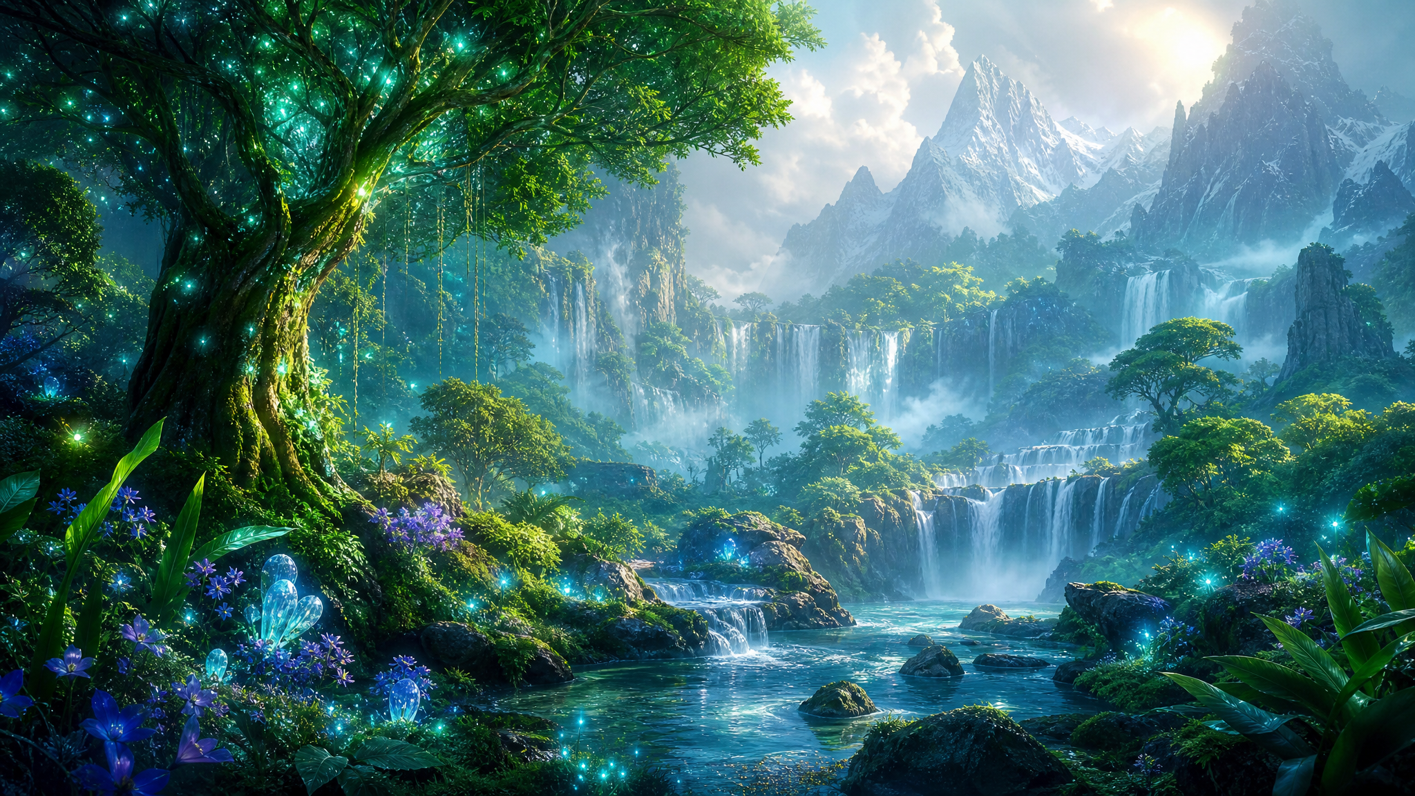
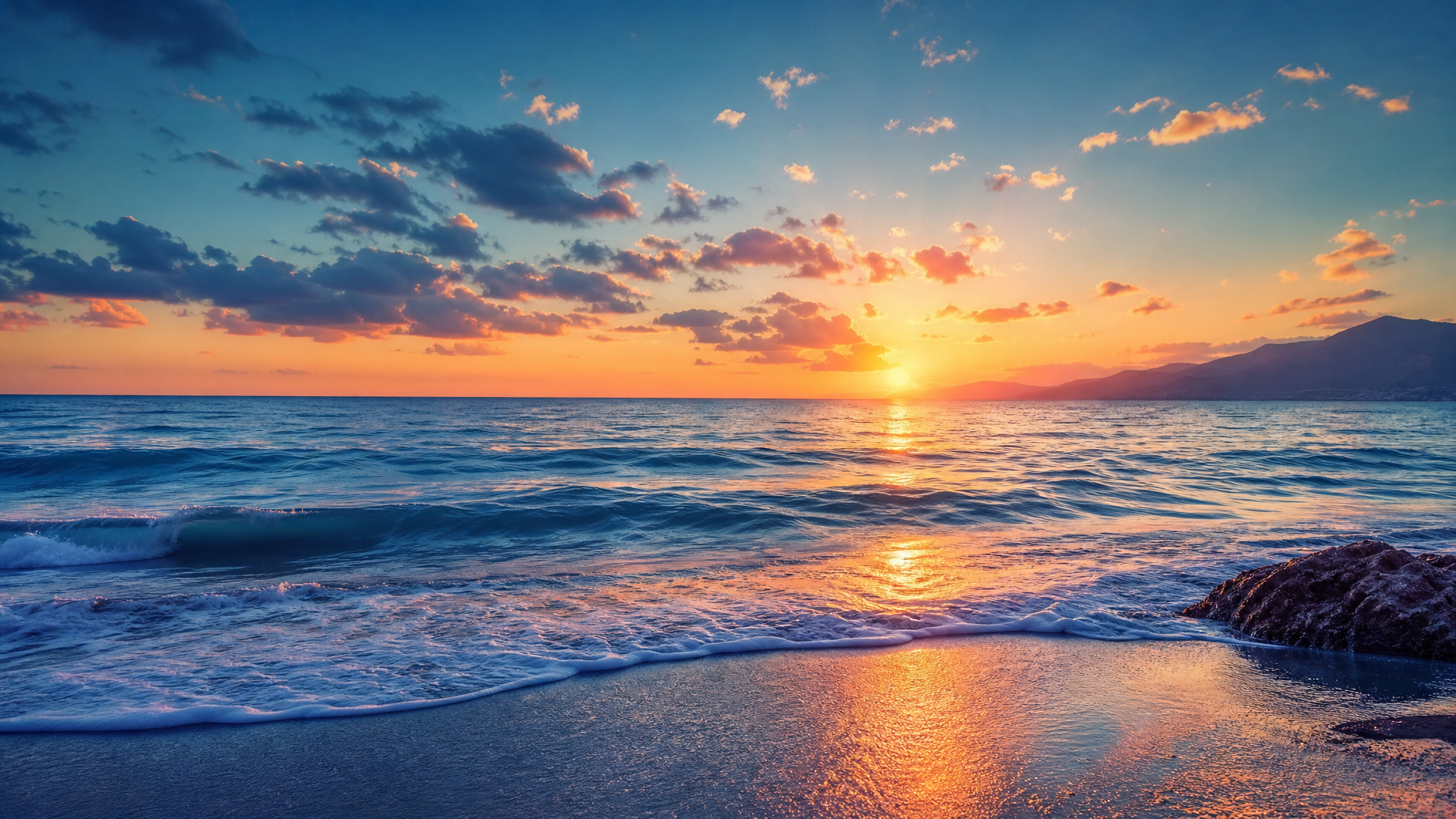
Nature-inspired design draws its visual vocabulary from the natural world — landscapes, botanicals, water, minerals, organic textures, and biological forms. As a wallpaper aesthetic, it favors earth tones, flowing organic shapes, leaf and branch motifs, stone and water textures, and compositions that evoke calm, growth, or seasonal atmosphere. Nature-inspired wallpapers sit in what biophilic design calls the indirect experience of nature — contact with images of nature and with colours, shapes, and forms that evoke and mimic it — which makes them effective across professional, personal, and ambient device setups.
Nature Inspiredアートについて
Nature has long supplied decorative design with its most persistent motifs. The Victoria and Albert Museum notes that William Morris produced over 50 wallpapers, that every one centres on plant-based forms built from his close observation of nature, and that his designs were subtle, stylised evocations of natural forms rather than literal transcriptions. Britannica describes Art Nouveau as a style that flourished between about 1890 and 1910, characterized by a long, sinuous, organic line often taking the form of flower stalks and buds, vine tendrils, and other sinuous natural objects; the Metropolitan Museum of Art dates the movement from the 1880s until the First World War and describes it as taking inspiration from the unruly aspects of the natural world. In contemporary design language, biophilic design treats contact with nature and with nature-like representations as beneficial to human wellbeing. Miles Richardson's discussion of Stephen Kellert and Elizabeth Calabrese's framework summarizes direct experience of nature, indirect experience through images, materials, and forms, and experience of space and place. Nature-inspired wallpapers sit within that indirect experience category, translating natural forms into digital surfaces that still feel calming, organic, and restorative.
ビジュアルの特徴
- Organic, non-geometric shapes — curves, irregular edges, asymmetric compositions following natural growth patterns
- Earth-tone palettes: greens, browns, warm grays, ochre, terracotta, sage, forest, and stone tones
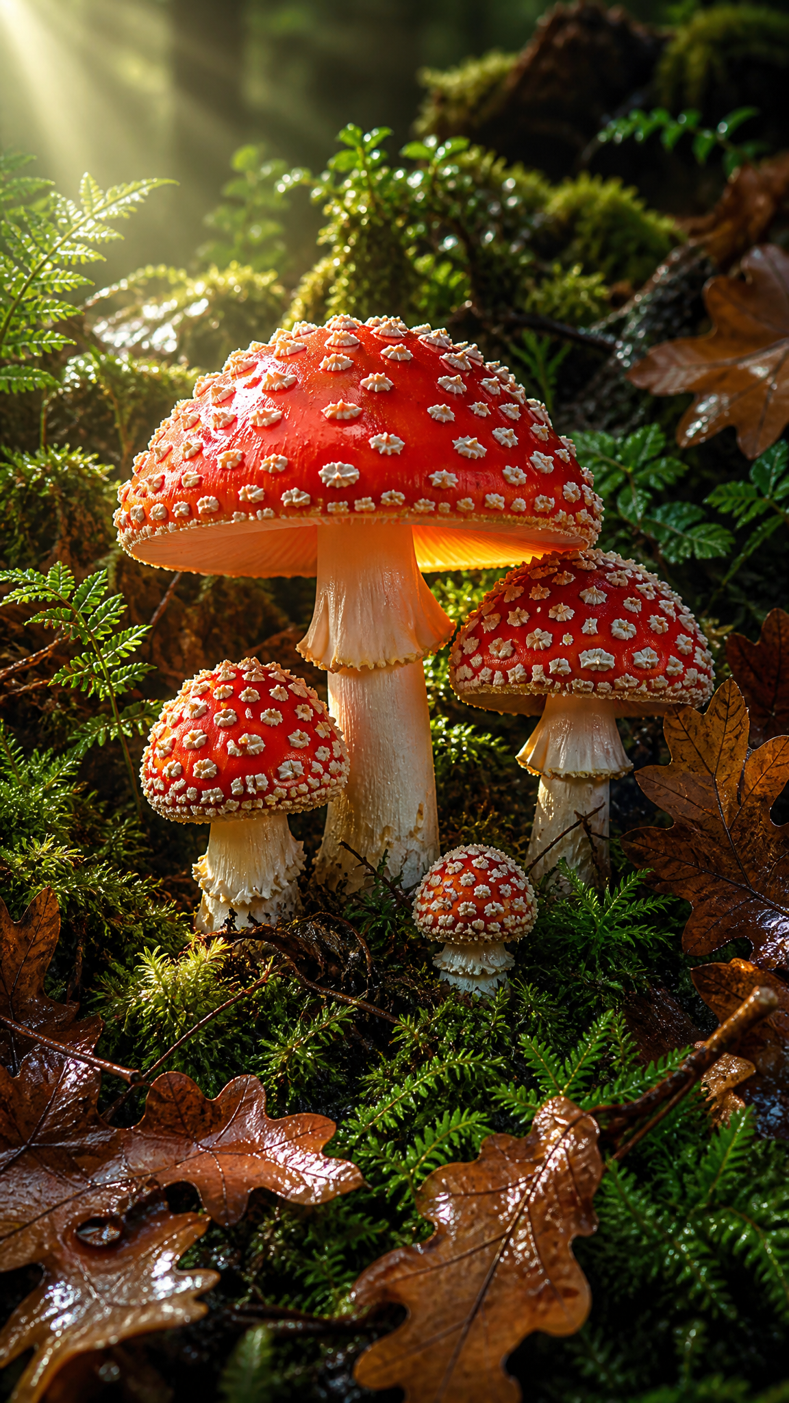
- Botanical motifs: leaves, branches, ferns, flowers, seed pods, moss, and vine structures
- Natural textures: wood grain, stone surface, water ripple, bark, lichen, or mineral crystal patterns
- Landscape compositions: mountain ranges, forest canopies, meadows, coastlines, or misty valleys
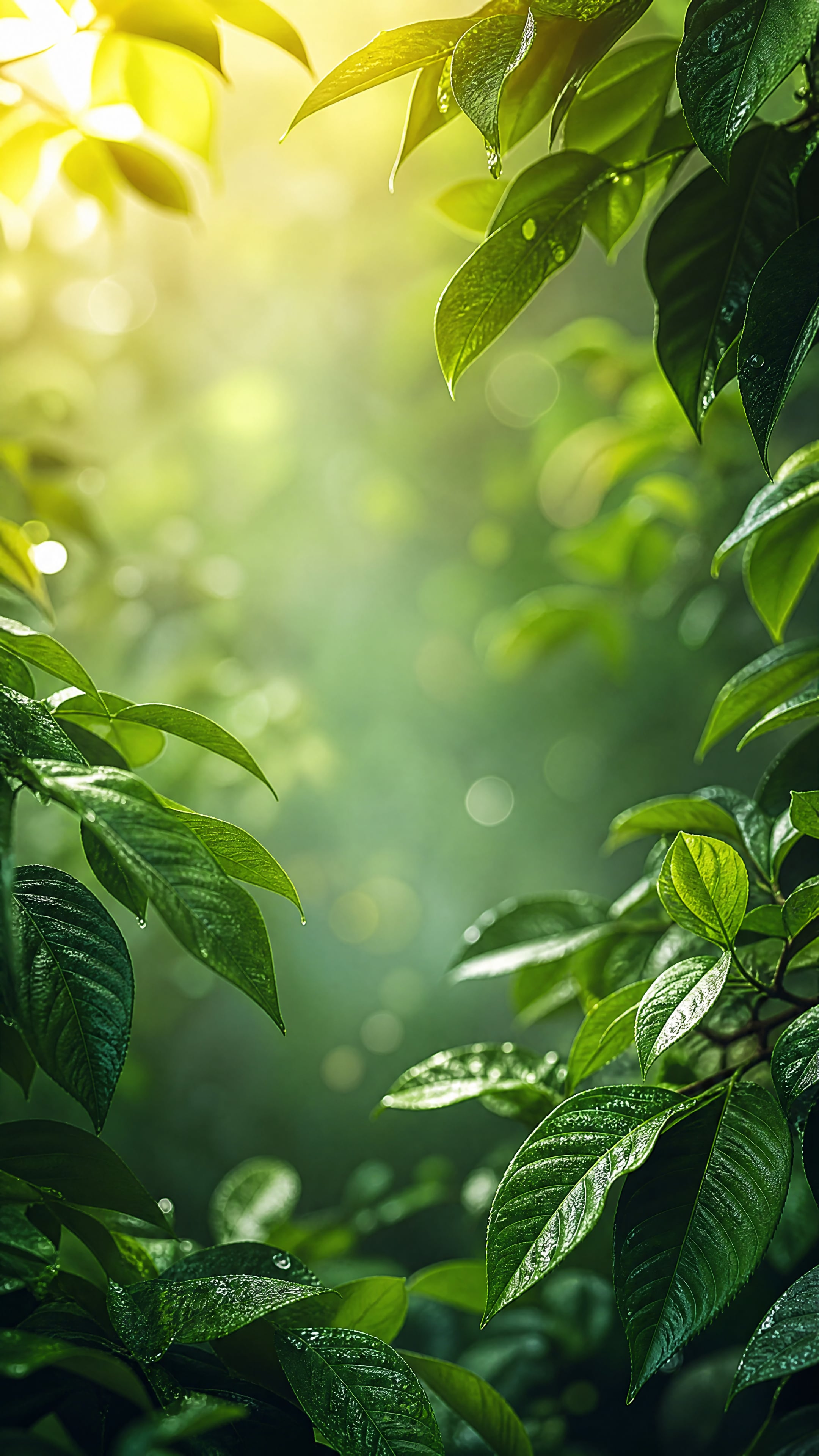
- Soft, diffused light suggesting golden hour, overcast skies, or filtered forest light
- Layered depth with foreground botanicals, mid-ground landscape, and atmospheric background
- Seasonal color shifts: spring pastels, summer greens, autumn amber-reds, winter cool grays
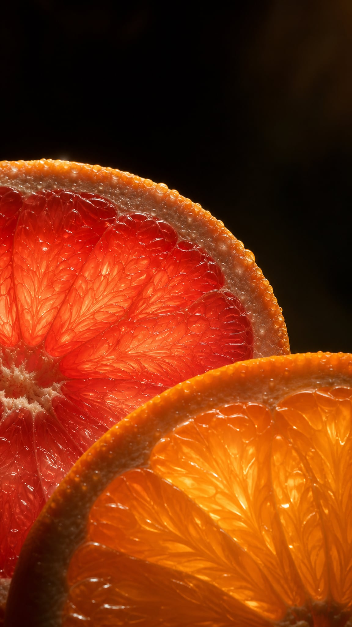
- Macro-scale natural details: close-up leaf veins, water droplets, petal textures, crystal formations
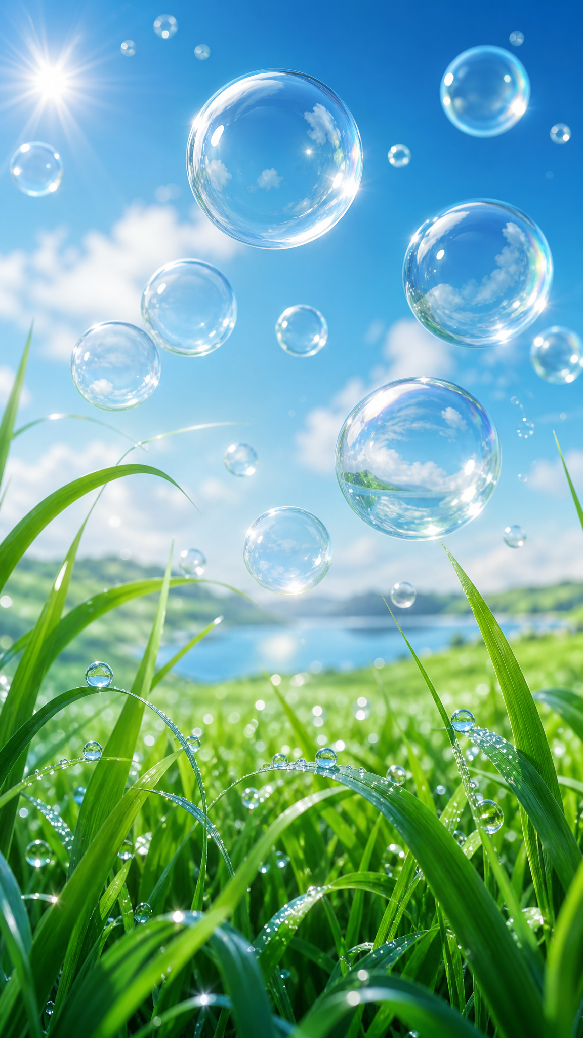
- Flowing water elements: streams, rain, ocean surfaces, or fog as compositional devices
- Absence of hard edges or mechanical structures — everything feels grown rather than built
活用例
Desktop wallpapers for professional environments where a calm, non-distracting background is valued
Phone lock screens using vertical botanical compositions — tall grasses, tree trunks, hanging vines — that suit portrait orientation
Ultrawide displays where panoramic landscape compositions naturally fill the horizontal format
Home office setups where nature imagery supports focus and reduces screen fatigue (biophilic design principle)
Seasonal rotation sets — spring, summer, autumn, winter — for users who change wallpapers by season
Ambient display or smart-frame use where the wallpaper functions as digital nature art
類似スタイル
異なる点
プロンプトガイド
プロンプトの方向性
- Start with the natural subject: 'forest canopy wallpaper,' 'misty mountain landscape,' 'macro leaf texture,' or 'botanical pattern with ferns and wildflowers'
- Specify the palette through natural references: 'autumn forest tones,' 'cool moss and stone palette,' 'warm golden-hour light,' or 'muted sage and terracotta'
- Define the scale and perspective: 'wide panoramic view,' 'close-up macro detail,' 'overhead botanical flat lay,' or 'eye-level forest path'
- Add atmospheric conditions for mood: 'morning fog,' 'soft rain,' 'dappled sunlight through leaves,' or 'overcast diffused light'
- For wallpaper usability, request composition balance: 'softer detail in center for icon placement' or 'rich edges with open middle area'
- Layer natural elements for depth: 'foreground ferns, mid-ground stream, background misty mountains'
ヒント
- Internal editorial suggestion: Muted, slightly desaturated palettes produce more sophisticated nature wallpapers than vivid, saturated greens; think 'observed nature' not 'nature documentary poster.'
- Internal editorial suggestion: Fog, mist, or soft rain as atmospheric elements add depth and mood while naturally softening detail in areas where icons need to sit.
- Internal editorial suggestion: Seasonal sets (4 wallpapers, one per season, same subject or composition style) are a strong content strategy for nature-inspired collections.
- Internal editorial suggestion: Macro textures (leaf veins, water droplets, bark patterns) work exceptionally well for phone wallpapers because they are inherently vertical and scale-independent.
おすすめキーワード
避けること
よくある失敗
- Over-saturation — AI models often boost greens and blues beyond natural range; use 'muted,' 'soft,' or 'natural color' to restrain
- Generic stock-photo look — without atmospheric cues (fog, specific light, season), the result can feel like a default screensaver; add weather and time-of-day context
- Composition too busy — filling every area with detailed botanicals leaves no resting space for icons; request breathing room or a simpler focal point
- Losing the wallpaper format — landscape images may have a strong focal point that fights with desktop icons; ask for distributed interest or pattern-like composition
- Defaulting to tropical — many models default to tropical palms and bright flowers; specify temperate, alpine, or specific regional flora when needed