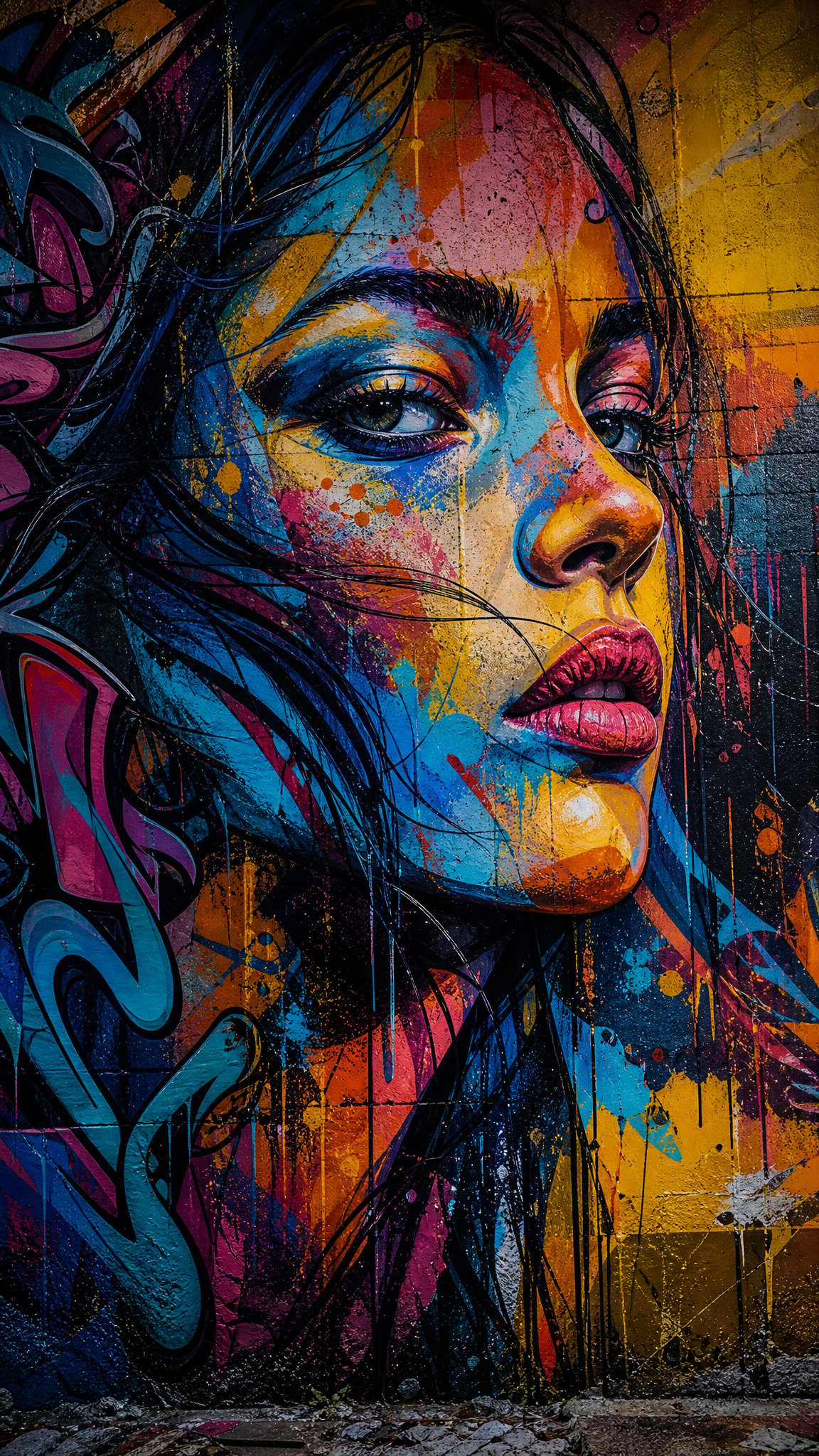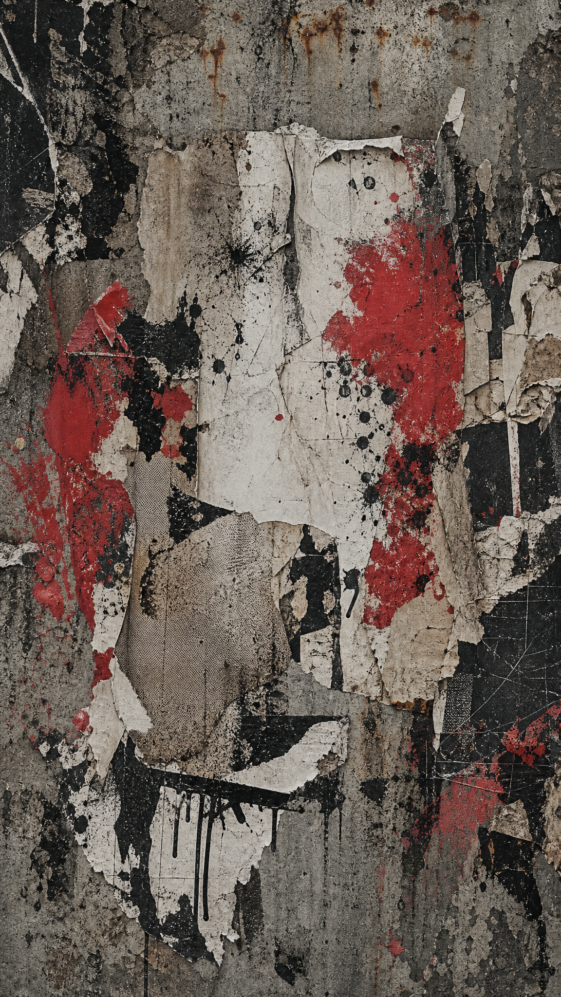
#Grunge
Grunge wallpapers push design toward abrasion: distressed texture, dirty surfaces, broken grids, and type that feels battered rather than crisp, giving the image a raw 1990s anti-clean energy.
Acerca del arte de Grunge
The verified sources support a limited but usable lineage. The long-form grunge typography article ties the look to 1990s editorial and David Carson-era visual breakdown, while the art-history style piece consolidates its distressed, DIY, anti-polish visual vocabulary. In batch JSON, grunge should be framed as a 1990s design mood rooted in editorial disorder and worn materiality, not as a museum-defined fine-art movement.
Rasgos visuales
- Distressed paper, scratches, stains, and rough texture
- Broken or anti-grid layout decisions
- Type that looks worn, torn, or partially degraded
- Dark, dusty, or dirty palettes with raw surface tension
Casos de uso
Band or poster-like wallpapers
Streetwear-adjacent device backgrounds
Editorial or magazine-inspired mood boards
Textures for rebellious or anti-clean visual packs
Estilos similares
Diferente de
Guía de prompt
Indicaciones para el prompt
- Name grunge directly and pair it with material words like distressed paper, photocopy texture, torn poster, dirty print
- Keep one readable focal cluster so the wallpaper does not collapse into noise
- Use dark neutrals, dusty reds, or washed blacks instead of glossy color
- If the output looks like generic vintage, add harsher texture and anti-grid layout cues
Consejos
- Internal editorial suggestion: Grunge wallpapers work best when one visual system stays dominant instead of splitting attention across too many motifs.
- Internal editorial suggestion: specify crop intent early because phone wallpapers usually need one stronger vertical anchor than desktop versions.
- Internal editorial suggestion: cross-link this style with punk only when the user intent clearly overlaps.
- Internal editorial suggestion: keep factual claims inside the verified evidence boundary and treat prompt advice as editorial guidance only.
Palabras clave recomendadas
Evitar
Errores comunes
- The image becomes generic vintage instead of distinctly grunge
- Texture overwhelms hierarchy and everything becomes unreadable
- The result slides into punk collage without the worn material logic