#Sepia
1Wallpapers
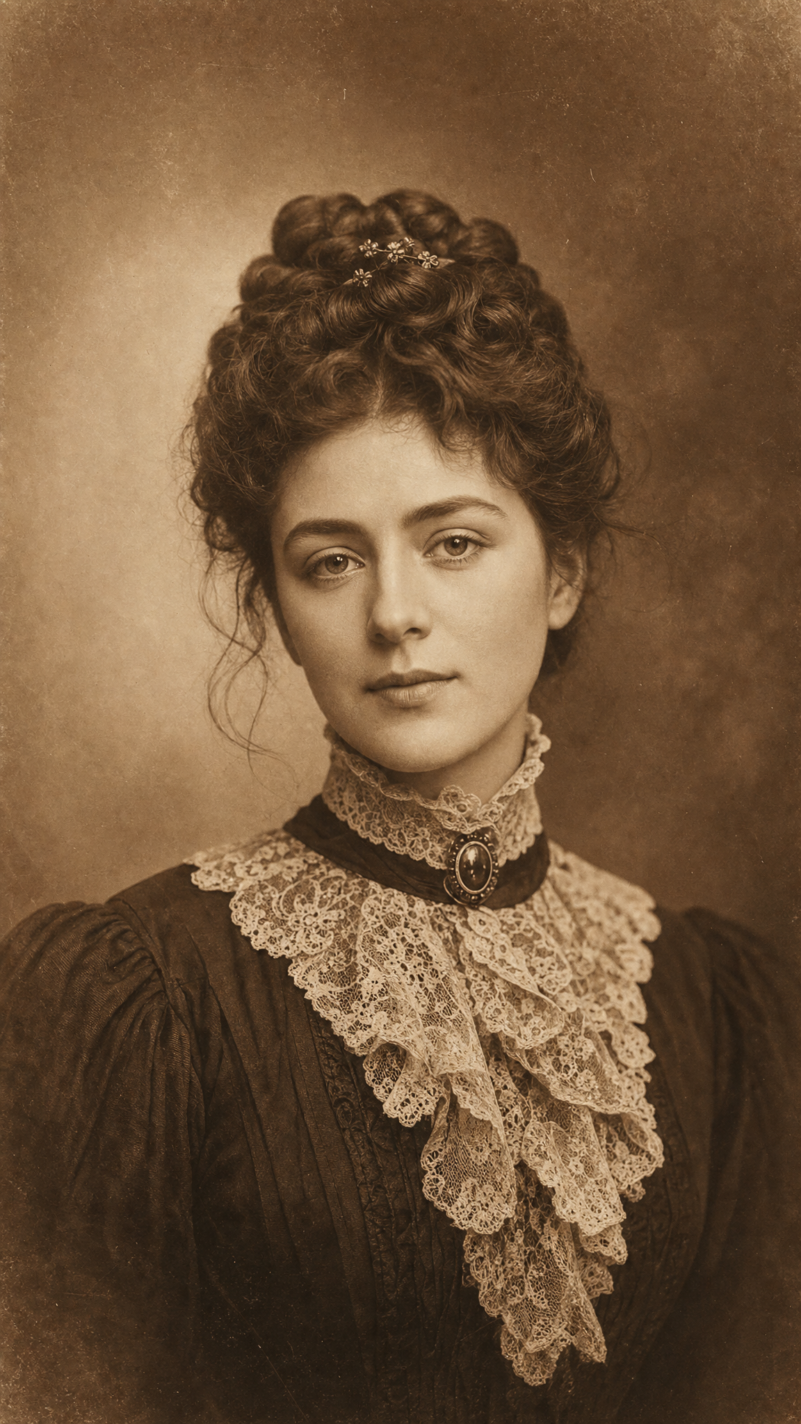
Sepia wallpapers use warm brown monochrome to evoke age, memory, softness, and material history, sitting somewhere between drawing medium, photo chemistry, and nostalgic tone control.
Warm brown monochrome or near-monochrome…Softened contrast and aged tonal moodAssociations with historical documents, …A restrained palette that still feels wa…
About Sepia Art
The verified sources make sepia unusually easy to ground. Britannica establishes sepia as a historic drawing medium, while MFA Boston’s CAMEO entry confirms it as a specific pigment/material term. That allows the style to be written as both a historical material language and a photographic mood filter without guesswork.
Visual Traits
- Warm brown monochrome or near-monochrome toning
- Softened contrast and aged tonal mood
- Associations with historical documents, drawings, and old photographs
- A restrained palette that still feels warmer than black-and-white
Use Cases
Vintage-photo wallpapers
Historical-document or archive-inspired backgrounds
Soft nostalgic phone wallpapers
Monochrome poster studies with warmer emotional tone
Similar Styles
retro vintage — both can feel nostalgic, but sepia is specifically tone-based
polaroid — both evoke memory, though sepia is more monochrome and less frame-led
Different From
black and white — sepia is warmer and more historical in feel
full-color retro styles — sepia depends on controlled monochrome restraint
Prompt Guide
Prompt Directions
- Specify sepia tone or sepia drawing medium depending on whether you want photo or illustration behavior
- Keep the palette narrow and warm, not fully desaturated gray
- Use words like aged paper, archive warmth, historical tone, soft brown monochrome
- If the result becomes ordinary brown, increase the old-photo or drawing-medium context
Tips
- Internal editorial suggestion: Sepia wallpapers work best when one visual system stays dominant instead of splitting attention across too many motifs.
- Internal editorial suggestion: specify crop intent early because phone wallpapers usually need one stronger vertical anchor than desktop versions.
- Internal editorial suggestion: cross-link this style with retro-vintage only when the user intent clearly overlaps.
- Internal editorial suggestion: keep factual claims inside the verified evidence boundary and treat prompt advice as editorial guidance only.
Recommended Keywords
sepia wallpaperwarm monochrome photoaged paper tonehistoric drawing mediumbrown archival color
Avoid
full-spectrum neon palettecold grayscaleplastic digital gloss
Common Failures
- The image becomes plain brown instead of sepia-specific
- Contrast is too strong to feel aged or gentle
- The palette drifts into full color and loses tonal discipline
Explore Styles
FAQ
What defines Sepia wallpapers?
Sepia wallpapers use warm brown monochrome to evoke age, memory, softness, and material history, sitting somewhere between drawing medium, photo chemistry, and nostalgic tone control.
How is Sepia different from retro-vintage?
Sepia can overlap with retro-vintage, but it works best when its own core cues stay dominant rather than borrowing the full logic of adjacent styles.
How do I prompt AI for stronger Sepia wallpapers?
Start with the scene or focal object, then add the lighting, texture, and atmosphere cues that make the style recognizable.
When does Sepia fail as a wallpaper style?
It usually fails when it drifts too far toward black-and-white or when the scene loses one clear focal system for color, shape, or texture.