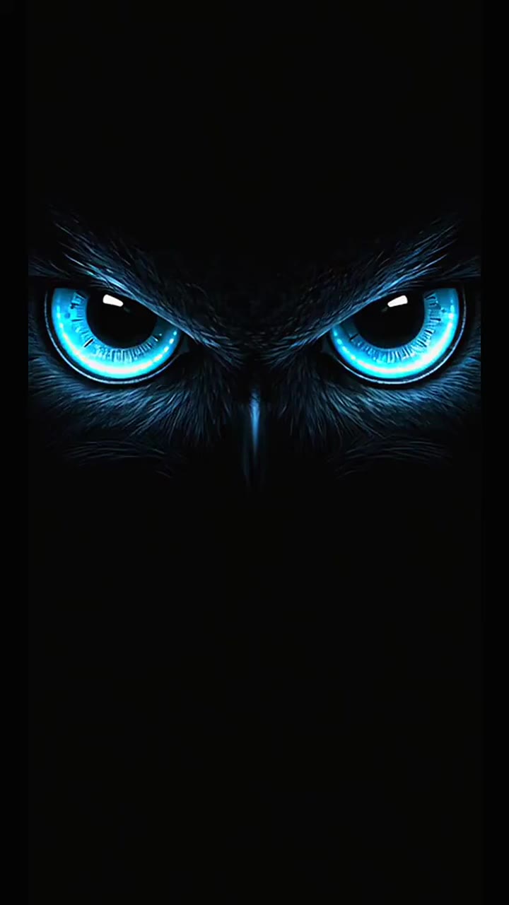
#Dark Mode
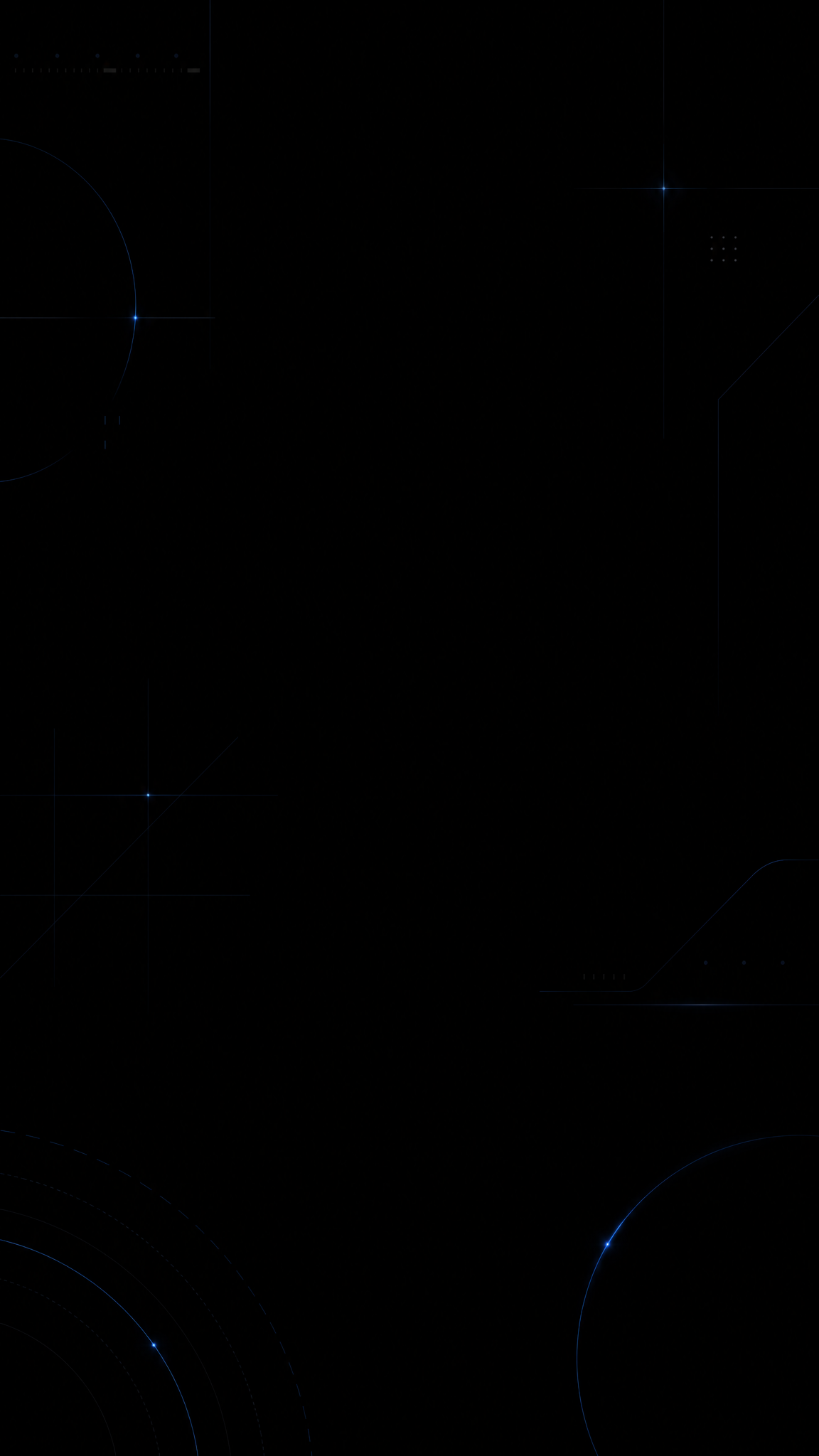
Dark-mode wallpapers borrow from interface dark-theme logic: low-luminance surfaces, controlled contrast, restrained highlights, and a screen experience designed to feel calmer in low light than bright themes. Unlike generic dark wallpaper, dark-mode style is shaped by usability rules as much as by mood, which is why it often feels cleaner, flatter, and more system-aware than cinematic darkness.
About Dark Mode Art
The verified sources support dark mode as a platform and UX pattern rather than a purely aesthetic trend. Material Design and Apple's Human Interface Guidelines both define dark-theme rules around surfaces, contrast, materials, and semantic color behavior. NN/g adds the user-behavior layer by documenting how people think about dark mode and where readability issues arise, while the PMC paper adds a research-based reminder that benefits around fatigue and comfort should not be overstated. Together, these sources justify dark mode as a mature digital design system with both aesthetic and usability dimensions.
Visual Traits
- Low-luminance background surfaces rather than pure photographic darkness
- Controlled accent color instead of full-spectrum saturation
- Layered contrast built through hierarchy, not glare
- Text and interface-inspired spacing that feels clean and readable
- Muted grays, charcoal, graphite, and off-black bases
- Highlights used sparingly to define hierarchy and focus
- Less visual fatigue from large bright fields in dark environments
- A polished, system-level digital mood rather than theatrical shadow
Use Cases
Phone wallpapers that need to sit comfortably behind dark-theme UI
Desktop setups where bright wallpapers clash with dark app chrome
Night-use device themes designed for lower visual aggression
Minimal interface-inspired wallpapers with subtle accent lighting
Productivity backgrounds for users who prefer software-dark ecosystems
Similar Styles
Different From
Prompt Guide
Prompt Directions
- Name the style directly, such as 'dark-mode wallpaper' or 'system dark theme background'
- Use surface language like graphite, charcoal, muted gray, low-luminance panel, or subtle glow
- Keep accent colors limited so the wallpaper remains compatible with dark interfaces
- If the result looks cinematic instead of interface-led, ask for flatter surfaces and calmer hierarchy
- If the image feels too flat, add one controlled light edge, icon, or subtle gradient to define depth
Tips
- Internal editorial suggestion: dark-mode wallpapers are strongest when they feel compatible with interface chrome, not just artistically dark.
- Internal editorial suggestion: charcoal and off-black often work better than absolute black for broader device compatibility.
- Internal editorial suggestion: cross-link with `amoled-black`, `glassmorphism`, and `minimalist` helps users navigate adjacent device-native looks.
- Internal editorial suggestion: use one accent family consistently rather than scattering many colored highlights.
Recommended Keywords
Avoid
Common Failures
- The wallpaper becomes generic black art with no dark-theme logic
- Contrast is too low and the image feels muddy instead of calm
- Accent color is so strong that it fights with dark-mode app chrome
- The result looks cinematic and dramatic when it should feel system-clean