#Gradient
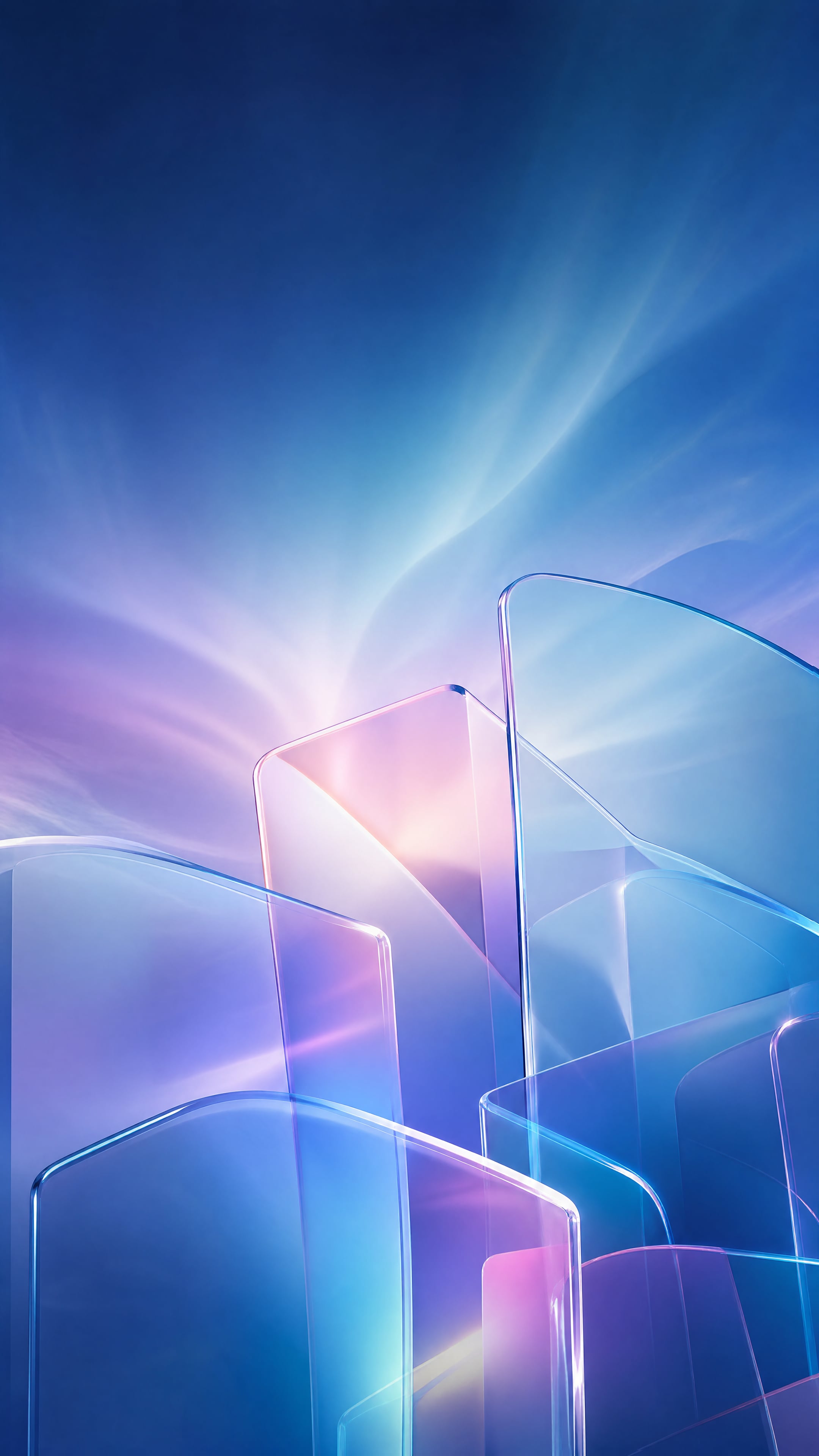
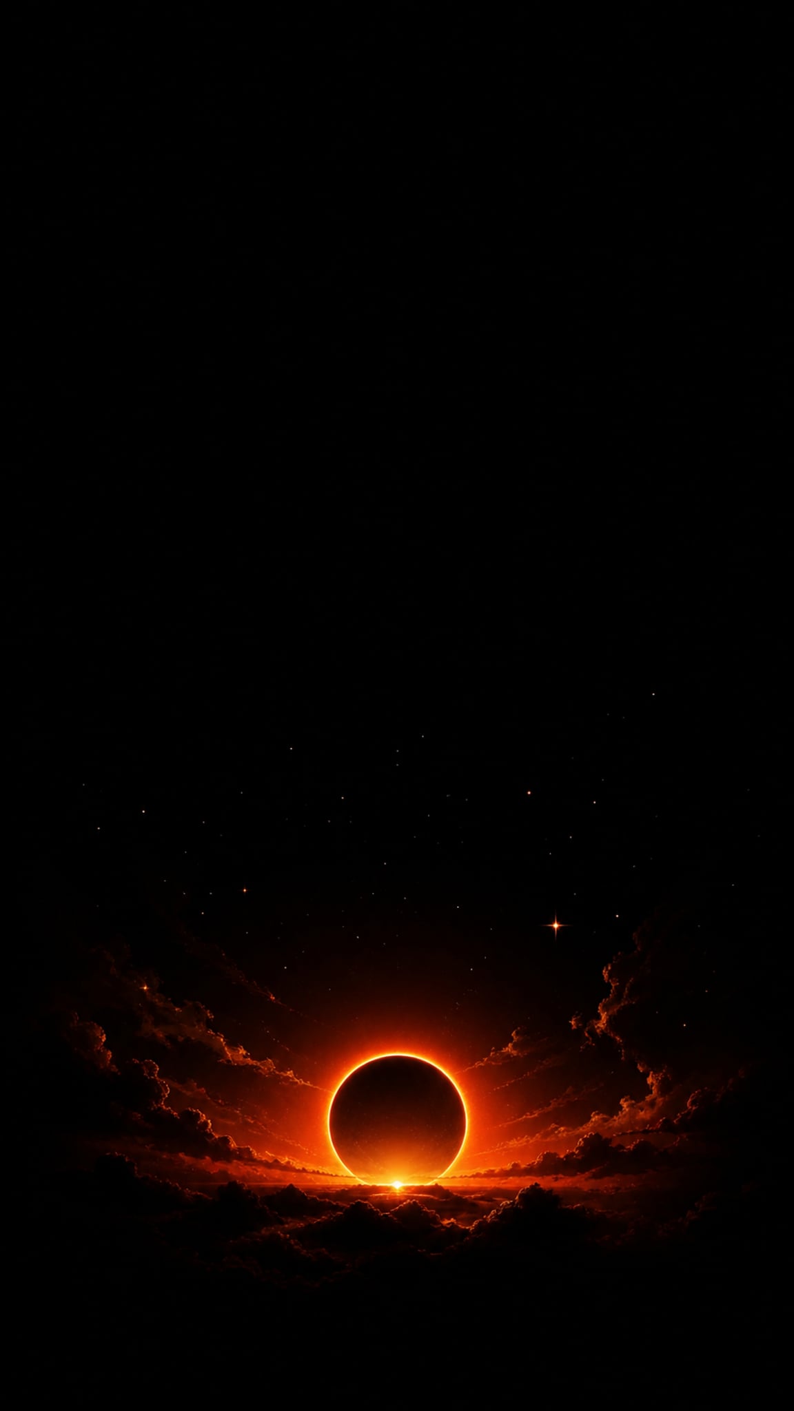
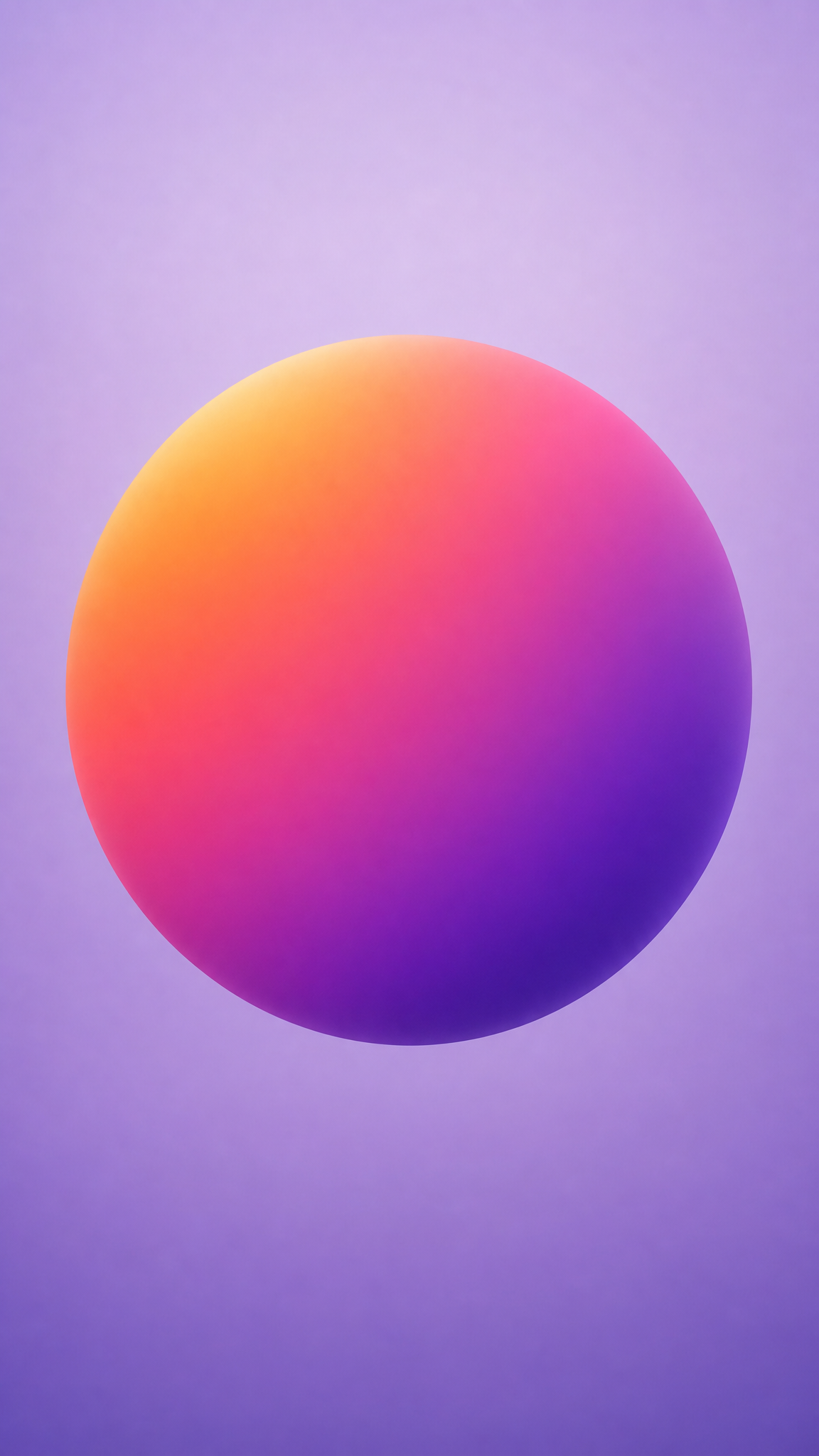
Gradient wallpapers treat color transition as the main subject: one hue becoming another, or several fields bleeding into each other to create depth, movement, or atmosphere without relying on objects. The style can be soft or electric, artistic or brand-like, but the constant is that color flow itself becomes the composition.
About Gradient Art
The verified sources support gradients as both a broad artistic phenomenon and a current digital design language. Walker Art Center's essay gives the broadest cultural and artistic framing, Instagram's brand documentation confirms gradient as a modern first-party brand system, and 99designs grounds gradient as an active digital-design style. Together, these sources justify gradient as a style that has both deep visual-history breadth and everyday relevance in contemporary digital branding and wallpaper design.
Visual Traits
- Smooth color transition instead of hard-edged block separation
- A sense of motion or atmosphere created purely through hue change
- Low-object abstraction where color fields do the visual work
- Strong palette identity even without figurative content
- The ability to feel soft, electric, dreamy, or highly branded depending on the palette
- A composition that can suggest depth without literal perspective
- A polished digital finish that still scales well to wallpaper use
- A high sensitivity to palette choice and blending quality
Use Cases
Minimal device wallpapers that want color without clutter
Brand-friendly backgrounds inspired by app and product identity systems
Soft mood wallpapers for work, reading, or low-distraction environments
Abstract phone backgrounds that rely on color flow rather than object detail
Creative desktop themes where the screen should feel energetic but clean
Similar Styles
Different From
Prompt Guide
Prompt Directions
- Name the style directly, such as 'gradient wallpaper' or 'soft abstract color transition background'
- Choose a clear palette family first, then describe the blend quality: smooth, luminous, airy, vivid, or moody
- If you want a minimal result, avoid extra objects and let the gradient occupy the whole field
- If the output becomes too generic, specify the direction of flow or the emotional register of the palette
- If banding or hard edges appear, ask for smoother blended color transitions
Tips
- Internal editorial suggestion: good gradients usually start with a palette logic, not with random color choice.
- Internal editorial suggestion: two or three strong hues often outperform a rainbow blend for everyday wallpaper use.
- Internal editorial suggestion: cross-link with `aura-gradient`, `gradient-mesh`, and `aurora` helps users move between adjacent color-field styles.
- Internal editorial suggestion: reserve the center area for calmer color if icons or text need to sit on top.
Recommended Keywords
Avoid
Common Failures
- The gradient is technically smooth but emotionally flat because the palette has no identity
- Too many hues create visual mud instead of depth
- The wallpaper introduces extra objects that weaken the color-field focus
- The image suffers from banding or visible steps instead of smooth transition