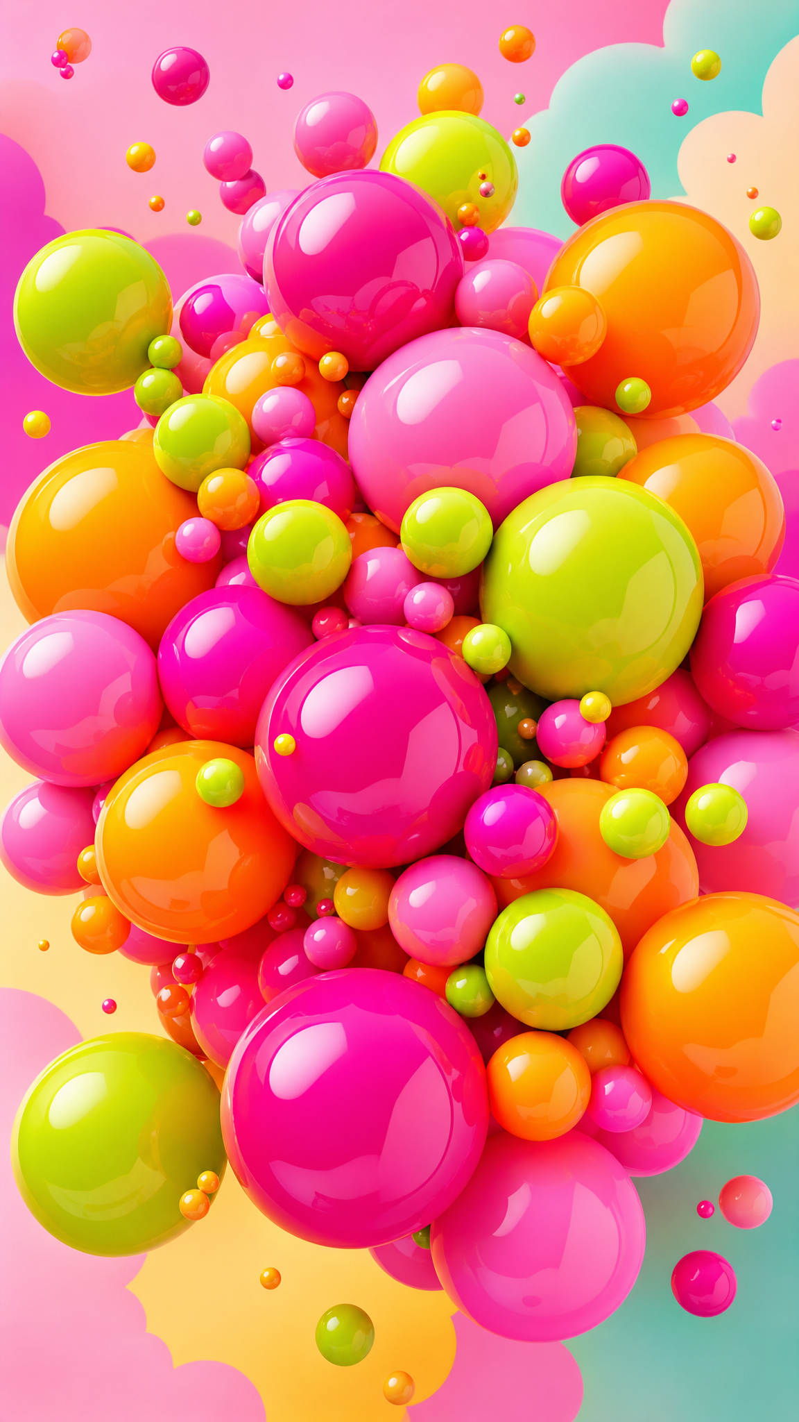
#Dopamine Design
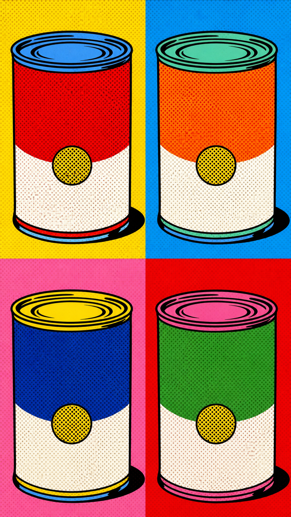
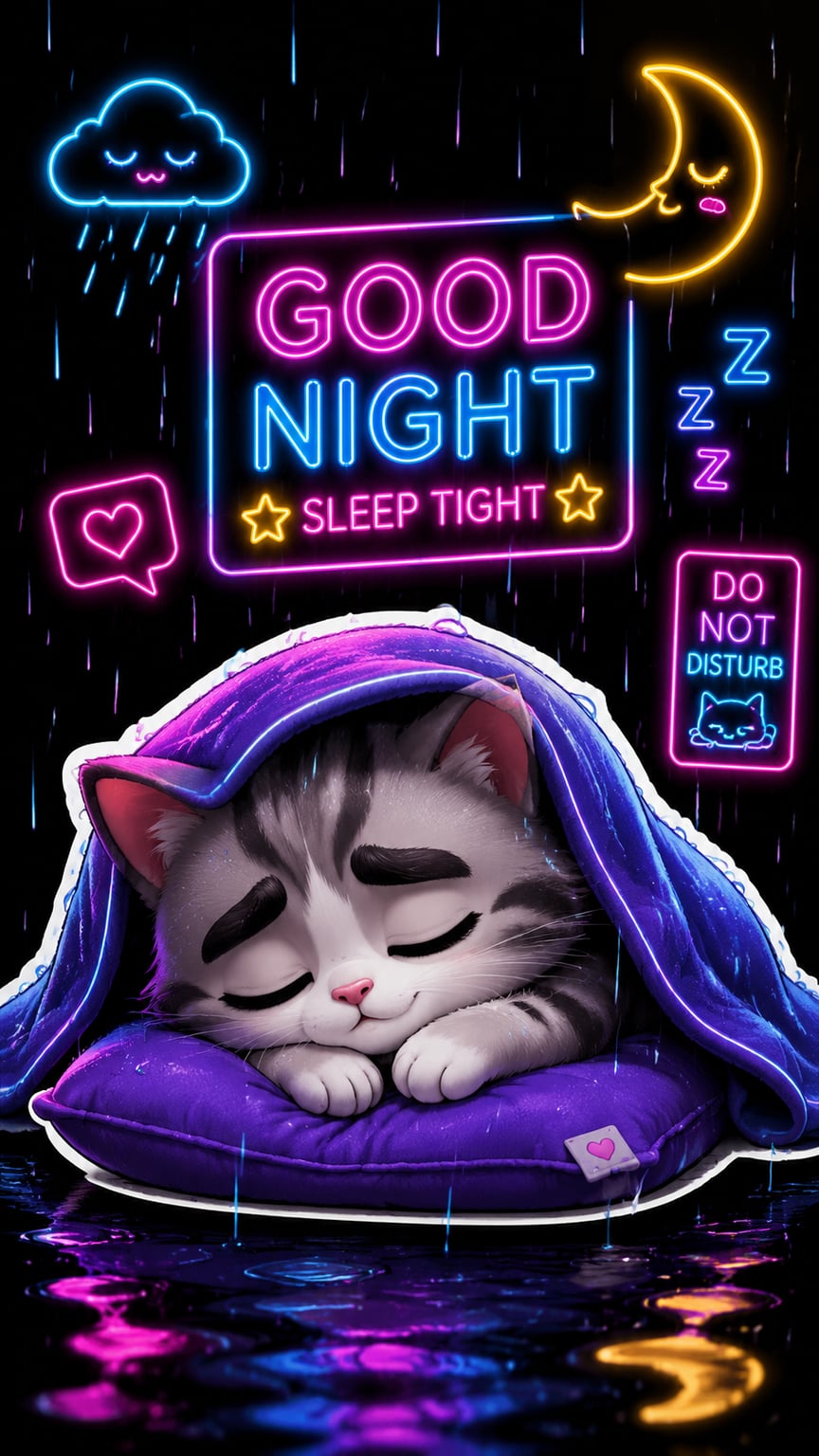
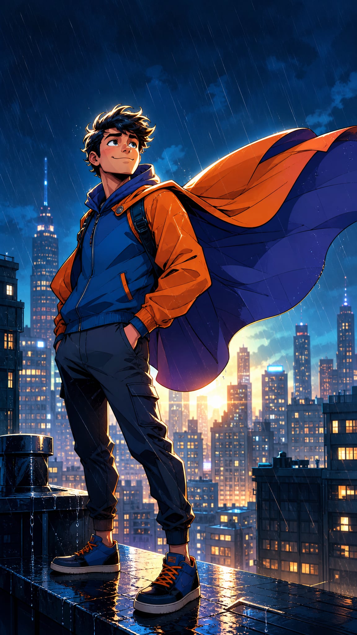
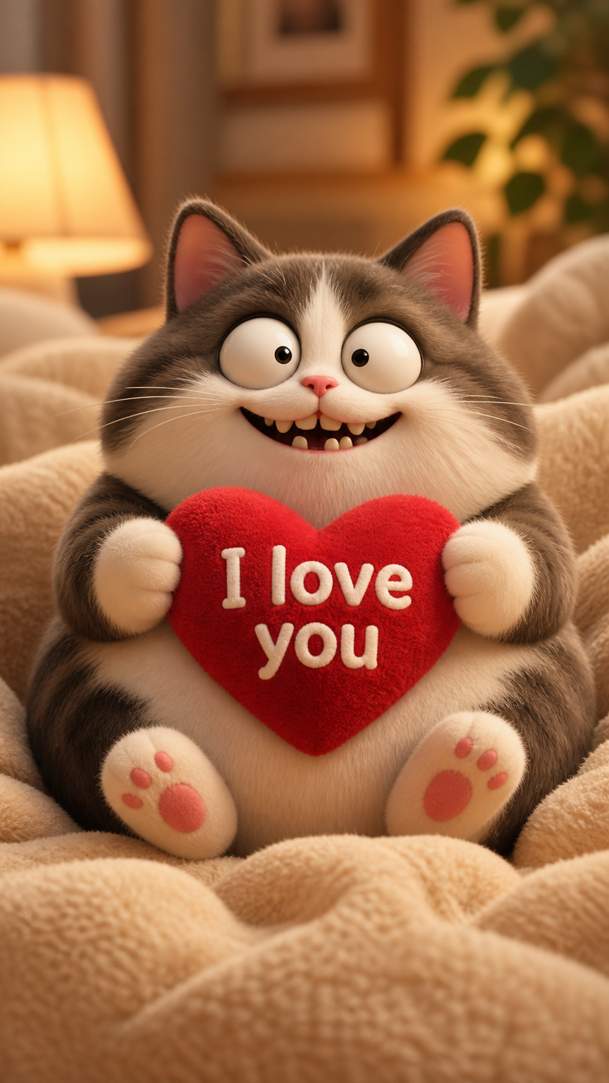
Dopamine-design wallpapers use color and playful excess as a mood tool: saturated palettes, cheerful contrast, bold pattern, and a feeling that the screen should energize rather than merely behave. The style comes from the wider dopamine-decor and dopamine-dressing conversation, where joy, personality, and anti-beige reaction matter more than strict formal rules.
About Dopamine Design Art
The verified source set supports dopamine design as a recent joy-led trend rather than a deeply historical movement. Aesthetics of Joy frames dopamine decor through emotional and experiential design rather than literal biochemical proof, Domus places it inside a return-of-color conversation in contemporary design, and Istituto Marangoni confirms the Gen Z and bold-colour trend framing. Together, these sources justify dopamine design as a current, color-forward, personality-heavy visual style shaped by reaction against muted sameness.
Visual Traits
- High-saturation, pleasure-seeking color palettes
- Confident contrast between warm and cool bright hues
- Pattern and decoration used for delight rather than restraint
- Playful or unexpected object combinations
- A strong anti-beige, anti-muted visual attitude
- Shapes that feel cheerful, bold, and emotionally immediate
- A mood of energy, optimism, or expressive self-styling
- Visual abundance that still tries to stay personally meaningful
Use Cases
Phone wallpapers for users who want mood lift rather than calm neutrality
Desktop backgrounds for creative spaces that benefit from color energy
Gen-Z or youth-oriented device themes with bold personal taste
Pattern-led wallpapers built around pleasure, play, and expressive self-branding
Anti-minimal digital themes that reject beige sameness
Similar Styles
Different From
Prompt Guide
Prompt Directions
- Name the style clearly, such as 'dopamine-design wallpaper' or 'joyful bold-color wallpaper'
- Choose a palette family with emotional energy: hot pink, orange, cobalt, lime, bright yellow, cherry red, or candy blue
- Add pattern and shape cues like playful blocks, clashing stripes, bold florals, checkerboards, or layered cutouts
- If the result becomes chaotic, anchor it with one dominant hue and one supporting contrast pair
- If it becomes generic maximalism, add anti-beige and mood-lift cues so the image feels emotionally bright, not just crowded
Tips
- Internal editorial suggestion: dopamine design works best when the palette feels chosen, not accidental.
- Internal editorial suggestion: one dominant color plus two strong companions usually beats equal-opportunity rainbow clutter.
- Internal editorial suggestion: cross-link with `maximalist`, `kawaii`, and `pop-art` helps users navigate adjacent cheerful styles.
- Internal editorial suggestion: phone crops often need fewer patterns than desktop crops to stay readable.
Recommended Keywords
Avoid
Common Failures
- The wallpaper becomes random color noise with no emotional coherence
- Too many bright hues compete equally and flatten the hierarchy
- The result feels childish instead of intentionally joyful and confident
- Pattern density overwhelms the screen and hurts everyday usability