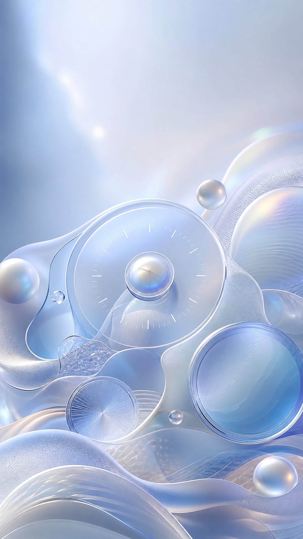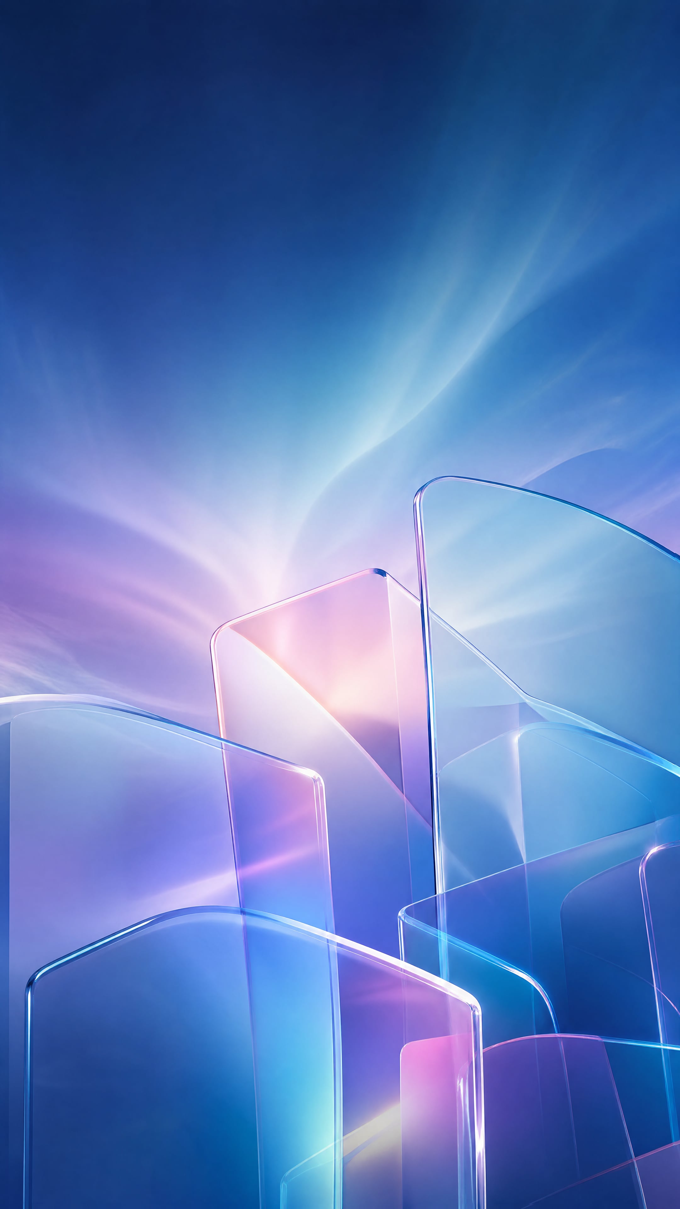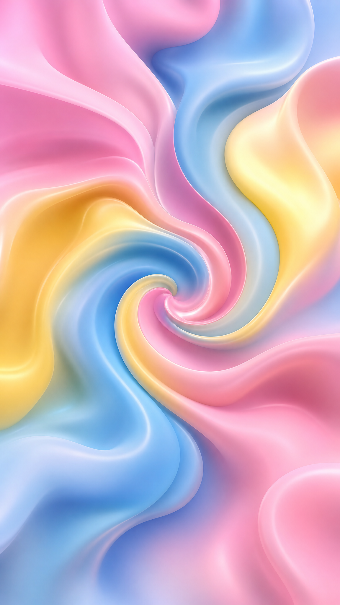
#Gradient Mesh
Gradient-mesh wallpapers turn gradients from simple color fades into sculpted color structures: multiple control points, more organic transitions, and a richer field that can feel almost airbrushed or digitally painted. The style is rooted in Illustrator and design-tool workflows, but it now reads as a contemporary visual language for premium abstracts, soft lighting effects, and high-depth digital backgrounds.
About Gradient Mesh Art
The verified sources support gradient mesh as a tool-driven digital style rather than a long historical art movement. Adobe's Illustrator article confirms the mesh tool as a core workflow for building abstract gradient graphics, CreativePro provides professional workflow grounding for gradient-mesh effects in Illustrator, and LS Graphics confirms mesh gradients as a current modern-design treatment. Together, these sources justify gradient mesh as an Illustrator-born design technique that evolved into a recognizable abstract-background language.
Visual Traits
- Multiple color points shaping one continuous blended field
- Less linear blending than standard gradients
- A richer and more sculpted color surface
- Soft pseudo-lighting and dimensional color flow
- An abstract finish that can feel premium and digitally polished
- Organic curves and nuanced transition zones
- Color depth built from structure rather than visible texture
- A stronger sense of crafted design-tool control
Use Cases
Premium abstract phone and desktop wallpapers with richer color depth
Hero backgrounds for design, SaaS, or creative-product themes
Soft digital backdrops that need more nuance than a flat gradient
Interface or poster backgrounds where color needs to feel crafted
Modern visual systems that sit between pure abstraction and smooth UI color
Similar Styles
Different From
Prompt Guide
Prompt Directions
- Name the style directly, such as 'gradient-mesh wallpaper' or 'mesh-gradient abstract background'
- Describe the palette as a coordinated family rather than random rainbow mixing
- Ask for multiple soft color centers and smooth organic blending instead of one simple directional fade
- If the image becomes a regular gradient, ask for richer multi-point color structure and sculpted blending
- If it gets too noisy, reduce the number of hues and keep the mesh broad and breathable
Tips
- Internal editorial suggestion: mesh gradients feel strongest when three or four coordinated hues do most of the work.
- Internal editorial suggestion: one cool family or one warm family often reads better than full-spectrum mixing.
- Internal editorial suggestion: cross-link with `gradient`, `aura-gradient`, and `glassmorphism` helps users compare related digital-color styles.
- Internal editorial suggestion: leave some quieter zones so the wallpaper remains usable behind icons.
Recommended Keywords
Avoid
Common Failures
- The output looks like a standard gradient and never develops mesh-like depth
- Too many hues make the color surface feel confused instead of premium
- The image becomes over-smoothed and loses any structured color interest
- Bright hotspots are scattered with no overall field logic