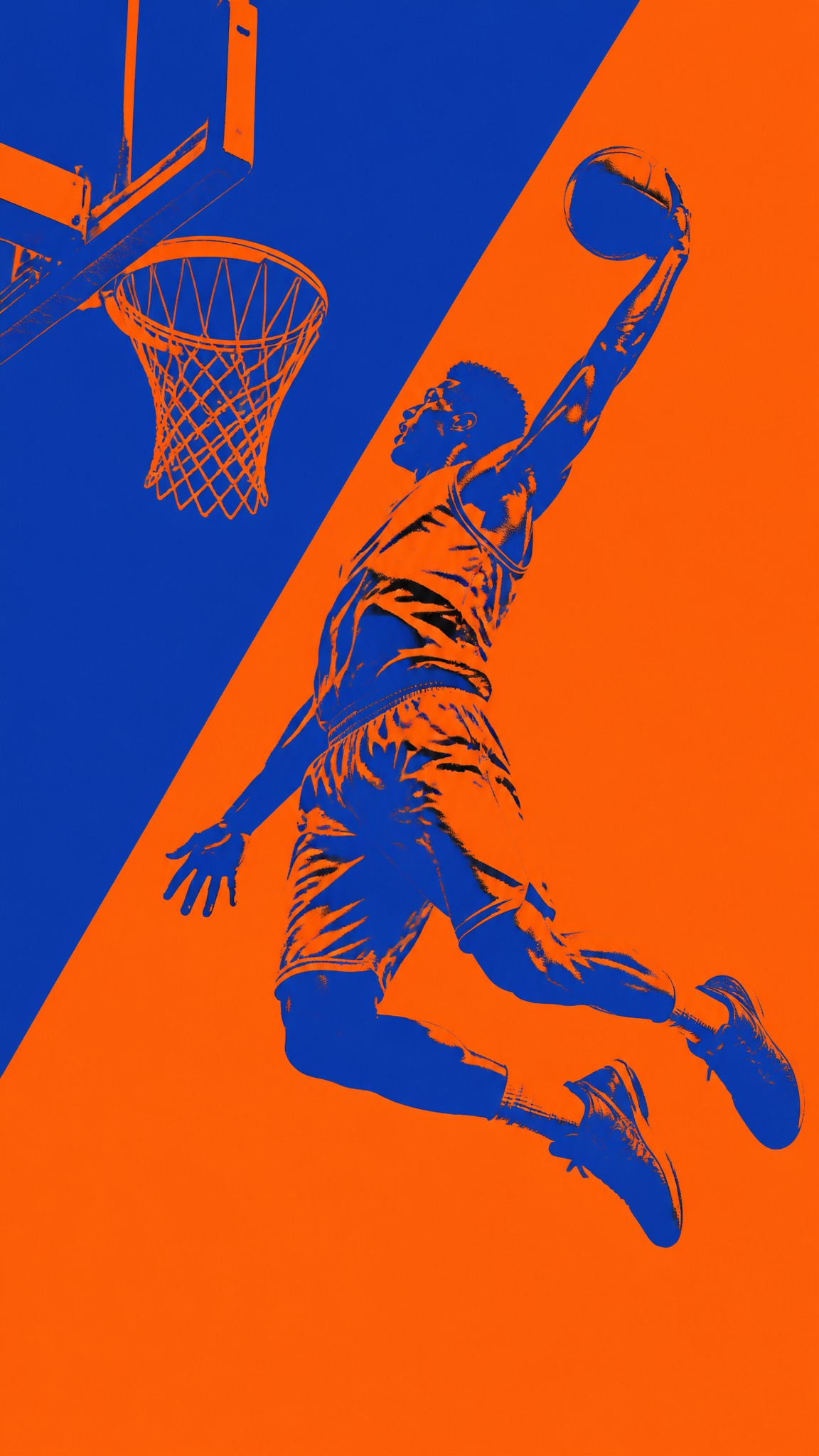
#Duotone
Duotone wallpapers compress imagery into two dominant ink-like colors, producing a look that feels graphic, poster-ready, and instantly stylized. The style sits between print history and digital revival: old enough to have a technical printing lineage, modern enough to feel at home in web design, music branding, and interface-era visual systems.
About Duotone Art
The verified sources support duotone as both a print technique and a digital design effect. B&B Printing grounds the term in print-production language around duotones, tritones, and quadtones, while 99designs explains how duotone works visually and why it became a recognizable digital style again. Designmodo confirms duotone's web-design relevance and broader digital resurgence. Together, these sources justify duotone as a style that began in print logic and later became a modern, intentionally stylized color treatment for digital media.
Visual Traits
- Two dominant colors replacing full-spectrum realism
- Strong tonal contrast compressed into a limited palette
- A poster-like, graphic, and highly stylized finish
- Images feeling printed, screen-processed, or brand-system ready
- Simplified color storytelling with immediate visual identity
- A strong relationship between highlight color and shadow color
- Easy adaptation to music, editorial, and web imagery
- A modernized print-memory aesthetic
Use Cases
Music and artist wallpapers that need bold visual identity
Poster-like phone wallpapers with clean two-color impact
Editorial-style desktop backgrounds where one palette dominates
Web- and brand-inspired wallpapers with strong color coding
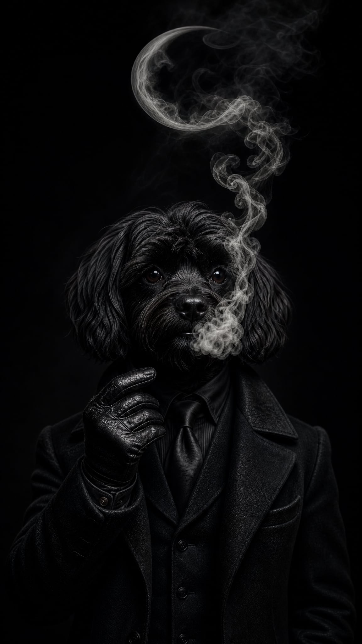
Portrait or architectural wallpapers simplified into graphic contrast
Similar Styles
Different From
Prompt Guide
Prompt Directions
- Name the style directly with the subject, such as 'duotone portrait wallpaper' or 'duotone city poster wallpaper'
- Specify the two colors clearly, especially one for highlights and one for shadows
- Use print and poster language like graphic contrast, stylized ink look, or screen-printed mood if you want a stronger visual identity
- If the result becomes too naturalistic, ask for stronger two-color compression and less realistic color detail
- If the image feels flat, increase the tonal separation between the two selected colors
Tips
- Internal editorial suggestion: duotone gets stronger when one color is clearly assigned to light and the other to shadow.
- Internal editorial suggestion: portraits, logos, skylines, and architecture usually survive two-color reduction especially well.
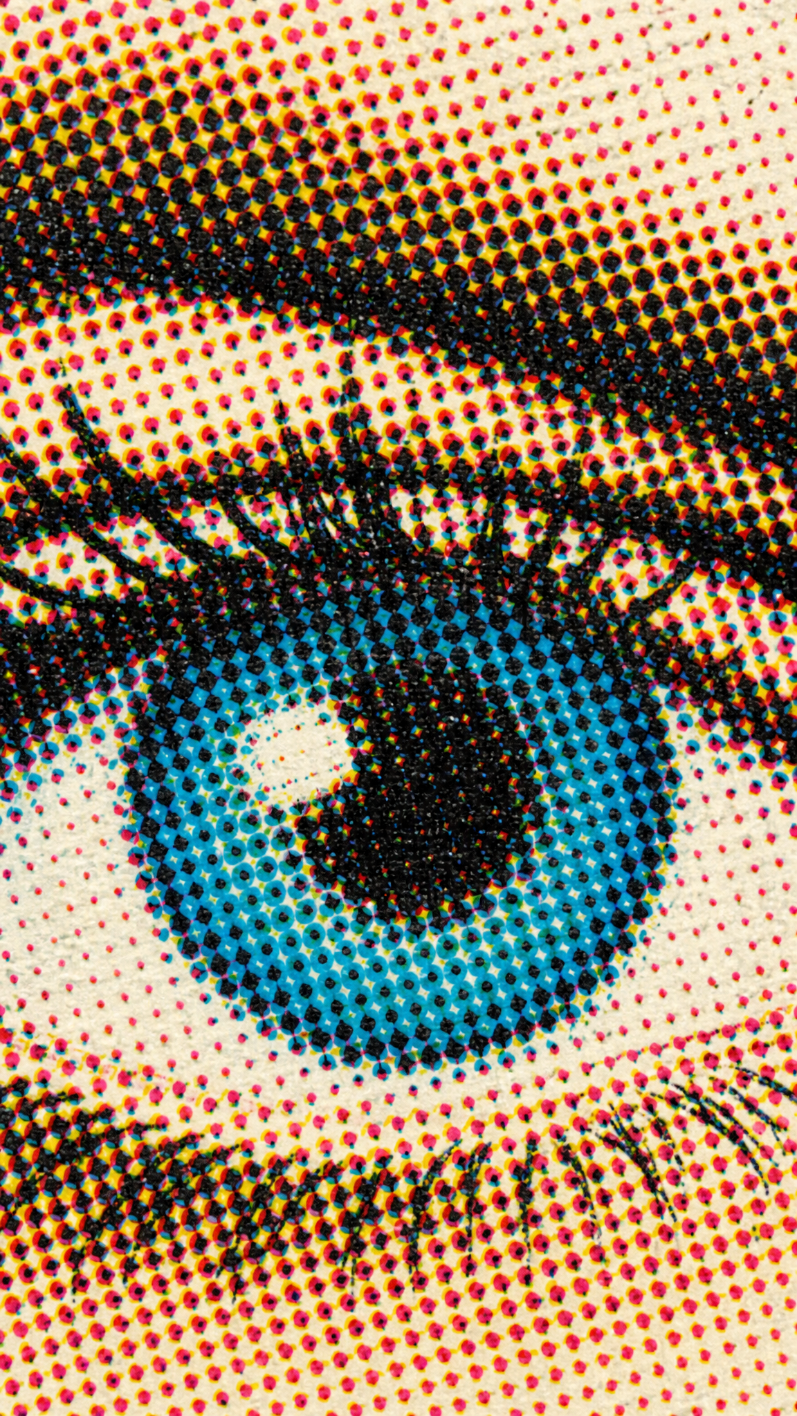
- Internal editorial suggestion: cross-link with `black-and-white`, `halftone`, and `pop-art` helps users explore adjacent print-memory styles.
- Internal editorial suggestion: choose high-contrast color pairs before adding texture.
Recommended Keywords
Avoid
Common Failures
- The two colors are too close in value and the image loses punch
- The wallpaper keeps too much natural color information and stops reading as duotone
- The palette feels arbitrary instead of intentional and brand-like
- Fine detail becomes messy because tonal separation was too weak