#Y2K
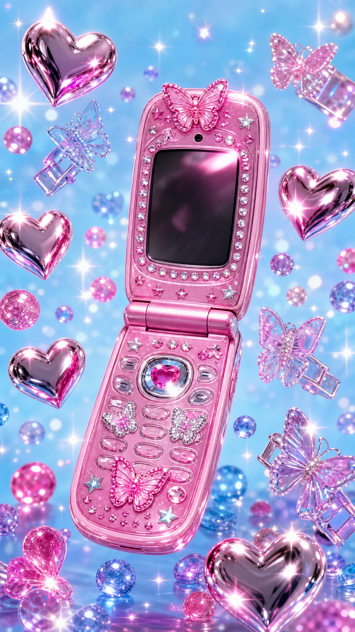
Y2K is a visual aesthetic rooted in the design culture of approximately 1997-2004, centered on the millennium transition and dot-com era techno-utopianism. Defined by chrome and silver surfaces, translucent plastics, icy blues, blobby 3D CGI shapes, and futuristic optimism, the style was systematized as a design category in 2016 by Evan Collins of the Consumer Aesthetics Research Institute. As a wallpaper style, Y2K delivers clean, glossy, futuristic compositions with metallic sheen and bright accent colors that complement both light-mode interfaces and tech-forward setups.
About Y2K Art
The Y2K aesthetic refers to design and visual culture from roughly 1997 to 2004, centered on the millennium transition. The name 'Y2K' comes from the Year 2000 computer bug abbreviation, originally created by programmer David Eddy. The term 'Y2K aesthetic' as a design category was defined and popularized starting in 2016 by Evan Collins of the Consumer Aesthetics Research Institute (CARI), who established the Y2K Aesthetic Institute. The cultural driver was the dot-com boom, rapid consumer technology adoption, and techno-utopian optimism about the digital future. Apple's iMac G3 (1998), with its translucent, colorful plastic casing, became the era's defining design object. The British graphic design collective The Designers Republic is associated with popularizing Y2K graphic design. The aesthetic re-emerged in mainstream culture during the early 2020s, especially during and after the COVID-19 pandemic. Wikipedia notes that 'Cybercore' is now used to distinguish the original retrofuturistic Y2K movement from the broader umbrella of 2000s fashion that 'Y2K' has come to encompass in popular use.
Visual Traits
- Chrome/silver base with metallic, reflective surfaces
- Color palette: icy blue, glossy white, black base with electric/lime green, hot pink, bright orange, citrus yellow accents
- Translucent plastic materials — inspired by iMac G3 and consumer electronics of the era
- Holographic and iridescent finishes
- Blobby organic 3D shapes ('blobitecture') — smooth, inflated, liquid-metallic renders
- Abstract spheres, tubes, and glossy gradients
- Ray-traced reflections and smooth CGI surfaces
- Chunky/rounded bubble fonts and futuristic sans-serifs
- Metallic/glossy 3D extruded lettering
- Clean vector shapes mixed with early CGI maximalism
- Technology motifs — CRT monitors, early cell phones, CD-ROMs, loading bars
- PVC/inflatable materials aesthetic and wet-look surfaces
Use Cases
Desktop (16:9, ultrawide) — chrome/metallic abstract 3D renders are resolution-independent and scale well
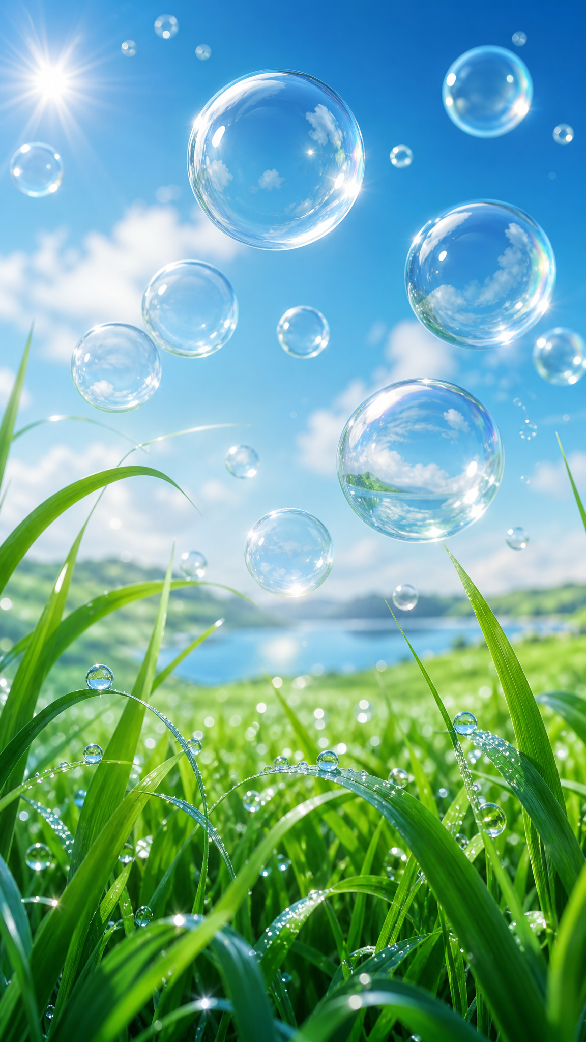
Mobile (9:16) — vertical gradient compositions with floating 3D blob elements; bold colors read clearly on small screens
Multi-monitor/gaming setups — high-contrast chrome-and-neon palette pairs with RGB lighting
Light mode complement — bright whites, icy blues, and clean metallics complement light-mode OS themes
Tech and creative workspaces — signals digital-native identity with optimistic futurism
High-resolution (4K+) — glossy surface reflections and metallic details reward high pixel density
Similar Styles
Different From
Prompt Guide
Prompt Directions
- Start with material/surface: 'chrome metallic surface,' 'translucent plastic,' 'glossy 3D render' establishes the Y2K material language
- Specify colors: 'icy blue and silver,' 'chrome with hot pink accents,' 'lime green on glossy white'
- Include signature motifs: 'blobby 3D shapes,' 'liquid metallic spheres,' 'iridescent bubbles,' 'abstract tubes'
- Add era references: 'Y2K aesthetic,' 'early 2000s digital,' 'dot-com era futurism'
- For typography-focused designs: 'chrome bubble text,' 'metallic 3D lettering,' 'futuristic sans-serif'
- Always specify aspect ratio: '--ar 16:9' for desktop, '--ar 9:16' for phone
Tips
- Internal editorial suggestion: 'Chrome' + 'glossy' + 'icy blue' is the most reliable keyword combination to anchor Y2K aesthetic.
- Internal editorial suggestion: For desktop wallpapers, abstract 3D metallic compositions with floating blob shapes and clean gradients create strong, icon-friendly backgrounds.
- Internal editorial suggestion: Reference the iMac G3 era — 'translucent colored plastic,' 'Bondi blue' — to ground the aesthetic in its definitive product design moment.
- Internal editorial suggestion: For phone wallpapers, vertical gradient compositions with a single chrome 3D element centered works best.
- Internal editorial suggestion: If results look too 'modern 3D art,' add 'early 2000s CGI,' 'circa 2000 digital aesthetic' to nudge toward the right era.
Recommended Keywords
Avoid
Common Failures
- Confusing Y2K with synthwave — Y2K is chrome/silver/icy blue, not neon-on-dark-purple
- Making it too dark — Y2K is bright and optimistic; it needs clean whites and light metallics
- Using neon colors exclusively — Y2K uses metallic base tones with selective bright accents, not all-neon
- Producing flat 2D graphics — Y2K is defined by glossy 3D surfaces, reflections, and dimensionality
- Forgetting translucency — transparent/translucent plastic is a core Y2K material