#Watercolor
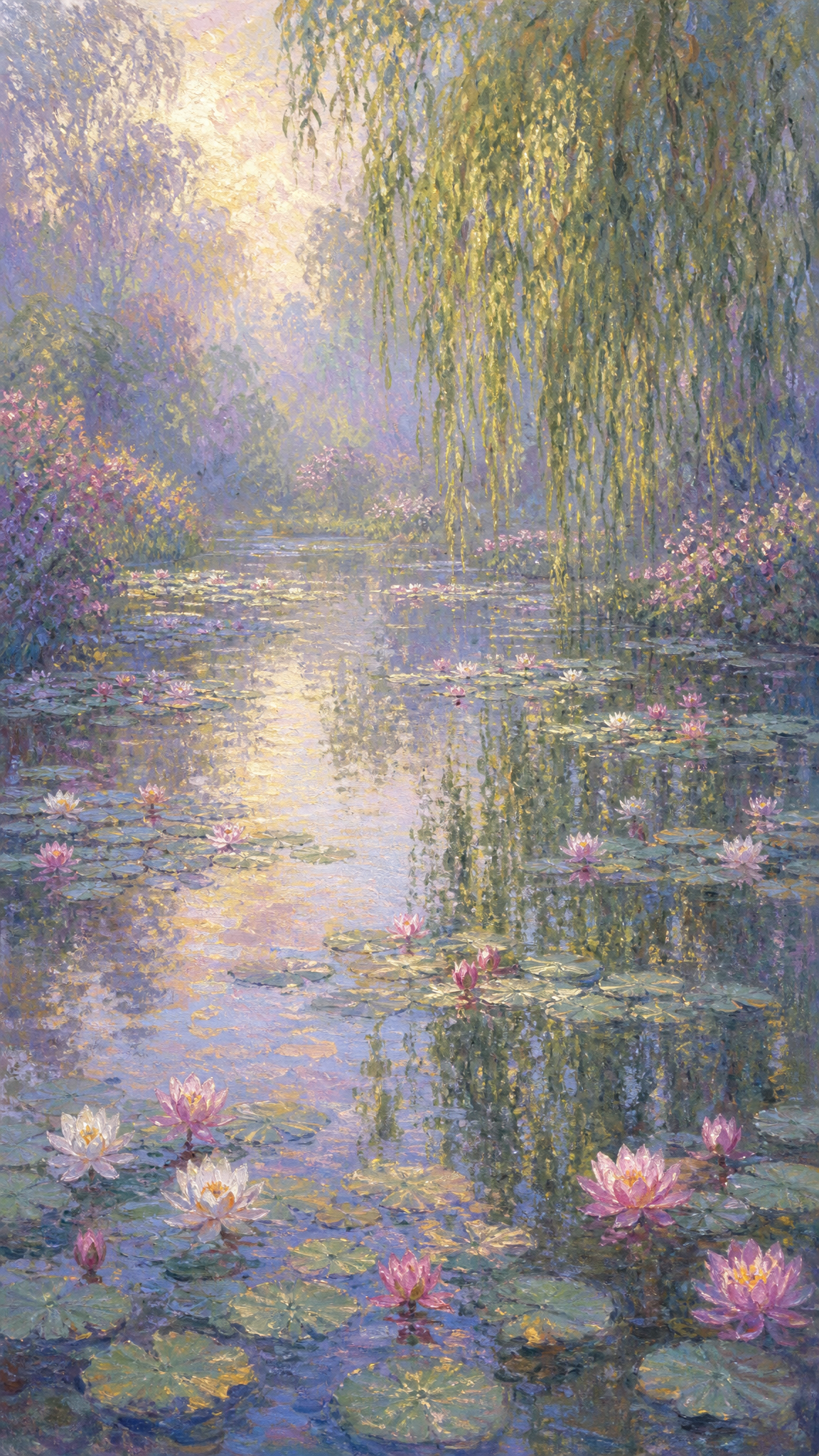
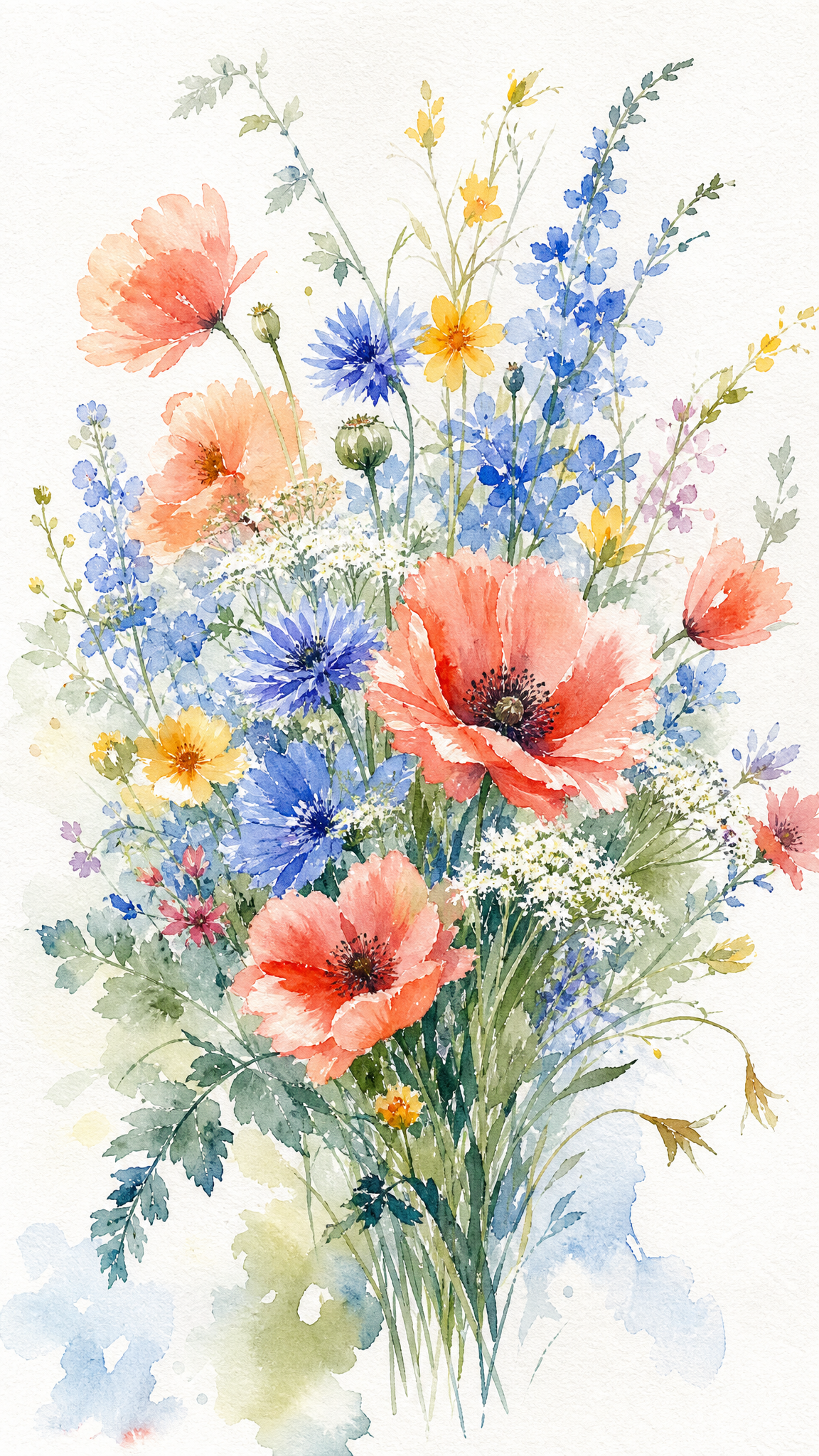
Watercolor is one of the oldest and most distinctive painting mediums, characterized by its defining transparency — pigments suspended in gum arabic absorbed by paper, allowing the white surface to glow through. The medium gained prominence as a serious art form in 18th-century England and reached its height with masters like J.M.W. Turner. As a wallpaper style, watercolor delivers soft, luminous compositions with organic color bleeding, gentle gradients, and visible paper texture — ideal for calm, light-themed desktop environments.
About Watercolor Art
Water-based pigments date back to Paleolithic cave paintings and ancient Egyptian manuscript illustration, but watercolor's continuous history as a recognized art medium begins with the Renaissance. Albrecht Durer (1471-1528) is generally considered among the earliest exponents, with his botanical, wildlife, and landscape watercolors. Hans Bol (1534-1593) led an important German watercolor school as part of the Durer Renaissance. In the 18th century, England elevated watercolor to a distinct national art form. Three English artists are credited with establishing it as an 'independent, mature painting medium': Paul Sandby (1730-1809), called the 'father of the English watercolor'; Thomas Girtin (1775-1802), a pioneer of large-format romantic landscape painting; and J.M.W. Turner (1775-1851), who brought watercolor 'to the highest pitch of power and refinement.' The Society of Painters in Water Colours was founded in London in 1804, and the New Water Colour Society in 1832. By the 1850s, watercolor was considered a uniquely British national art form. In the 19th century, the English school's influence popularized transparent watercolor in France, adopted by Eugene Delacroix, Honore Daumier, and others.
Visual Traits
- Transparency — the defining characteristic; white paper serves as the light source, glowing through diluted pigment
- Luminosity — whites created by leaving paper bare, not by applying white paint
- Soft edges and bleeding — colors spreading and blending on wet paper, creating gradual transitions
- Wash technique — diluted pigment applied evenly in flat or graduated washes
- Wet-on-wet effects — pigment on damp paper for soft, diffused color pools
- Wet-on-dry effects — pigment on dry paper for sharper edges and greater control
- Glazing — transparent layers of color over dried paint building depth
- Dry-brush texture — pigment-laden brush dragged across rough paper for granular effects
- Visible paper texture — the grain/tooth of the paper is integral to the final appearance
- Color palette tending toward soft, muted, or delicate tones; dilution shifts hues
- Organic, flowing composition with areas of intentional negative space (bare paper)
Use Cases
High-resolution displays (Retina, 4K+) — subtle texture, paper grain, and translucent gradients benefit from high pixel density
Light-themed desktop environments — watercolor's inherent luminosity and light palette pair naturally with light-mode interfaces
Phone/tablet screens (9:16, 4:3) — botanical and floral watercolor subjects have strong vertical composition tradition
Calm, focused work environments — the soft, muted palette provides a non-distracting background
Tablets and e-readers — the 'paper' aesthetic pairs naturally with reading-oriented devices
Seasonal wallpapers — watercolor's softness suits spring and summer floral themes particularly well
Similar Styles
Different From
Prompt Guide
Prompt Directions
- Start with medium declaration: 'watercolor painting' or 'watercolor illustration' to anchor the rendering style
- Specify a subject suited to the medium: 'floral bouquet,' 'landscape scene,' 'botanical illustration,' 'bird portrait'
- Add watercolor-specific modifiers: 'wet-on-wet,' 'color bleeding,' 'soft washes,' 'visible brushstrokes'
- Include paper reference: 'on white paper,' 'textured paper background,' 'visible paper grain' for authenticity
- For wallpaper output, add: 'white negative space,' 'clean background,' 'centered composition' to leave room for desktop icons
- Always specify aspect ratio: '--ar 16:9' for desktop, '--ar 9:16' for phone
Tips
- Internal editorial suggestion: Add 'on white watercolor paper' to every prompt to ensure the paper-as-light-source quality comes through.
- Internal editorial suggestion: Botanical subjects (flowers, leaves, birds) are the most reliable watercolor subjects — they suit the medium's soft, organic qualities.
- Internal editorial suggestion: For desktop wallpapers, request compositions with generous white space on one side for desktop icon placement.
- Internal editorial suggestion: Adding 'loose brushwork' or 'impressionistic watercolor' produces more authentic results than 'detailed watercolor.'
- Internal editorial suggestion: For phone wallpapers, single-subject vertical compositions (one flower, one branch, one bird) work better than complex multi-element scenes.
Recommended Keywords
Avoid
Common Failures
- Producing overly sharp, digital-looking results — true watercolor should have soft edges and organic color flow
- Making the image too opaque or heavily pigmented — watercolor's beauty is in its transparency
- Filling the entire canvas with color — watercolor compositions need breathing room and white paper areas
- Using dark or black backgrounds — watercolor depends on white paper for its luminosity
- Over-detailing small elements — watercolor is inherently loose and expressive, not hyper-precise